Founders usually ask me about a rebrand to move upmarket right after a particular kind of loss. A larger client liked the work, took the call, and still picked another firm. A new logo feels like the fix because it is the most visible thing on the site. On my projects, it has rarely been the thing that lost the deal.
Watch the buyer you want for ten minutes. She is comparing three firms for a contract bigger than anything you have signed. She has a meeting at the top of the hour. She is not grading your typeface. She is looking for one sentence that says you do this work for firms like hers, and one piece of proof that you have done it before.
This post separates three jobs that get lumped together as “rebranding”: brand positioning (who you serve and what you are known for), page structure (where a buyer finds that out) and visual identity (how it looks). I’ll show where each one mattered on my client projects, what the research says, and the four situations where a rebrand to move upmarket earns its cost.
In this guide
Do you need a rebrand to move upmarket?
Usually not as the first move. A rebrand to move upmarket means a new name, logo or visual identity, chosen because you want premium clients who pay more. Most of the time the thing stopping those clients is not the look. It is that the site never says, in their words, that you serve firms their size, and the proof they need sits where nobody reads.
There is old evidence for this. Horsky and Swyngedouw studied 58 companies that changed their names between 1981 and 1985. For most, the change came with better stock market performance, but the authors found no support for the idea that the new name itself raised demand. The name change worked as a signal that real changes to products and the organization were coming (Horsky and Swyngedouw, 1987).
That is the order I work in. Decide what changes in the business first: which client you are moving toward, what you will sell them, and what proof you have. Then change the pages so those buyers find it. A new identity, if you still want one, comes last and announces something that is already true.
One note on my scope. I do not design logos or brand identities, and my about page says so. I design and build websites, and I work on brand positioning and page structure with founders. Read this as the view of the person you would hire for the structure, not the logo.
What do premium clients look for before they buy?
A bigger contract means more is at stake for the person who signs it. Premium clients cannot test your work before they sign, so they read signals instead. Marketing research calls this signaling unobservable quality: when buyers cannot see quality up front, firms show it through choices the buyer can observe, such as price, warranties and brand names (Kirmani and Rao, 2000).
On my projects, the signals that premium clients and enterprise buyers check on a website are mostly concrete. A plain sentence about who you serve. Work for organizations their size, placed before the ask. A described process, so they can picture month two. Proof from a third party, such as an authorization, a licence or a client they recognise. The logo is on that list, but it is one signal among several.
One study is worth weighing before you plan a rebrand to move upmarket. Fogg and colleagues asked 2,684 people to judge the credibility of live websites. The site’s “design look” came up most often, in 46.1% of comments. The next most common topics were information structure and information focus (Fogg et al., 2003). So looks matter. But two of the top three were about structure and focus, which is where positioning shows up on a page.
How Rufous & Co put brand positioning before the logo
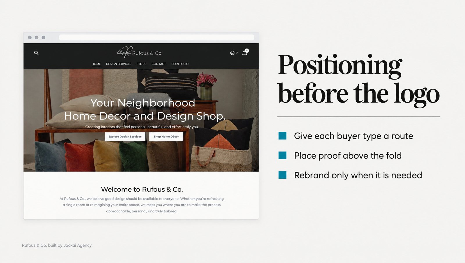
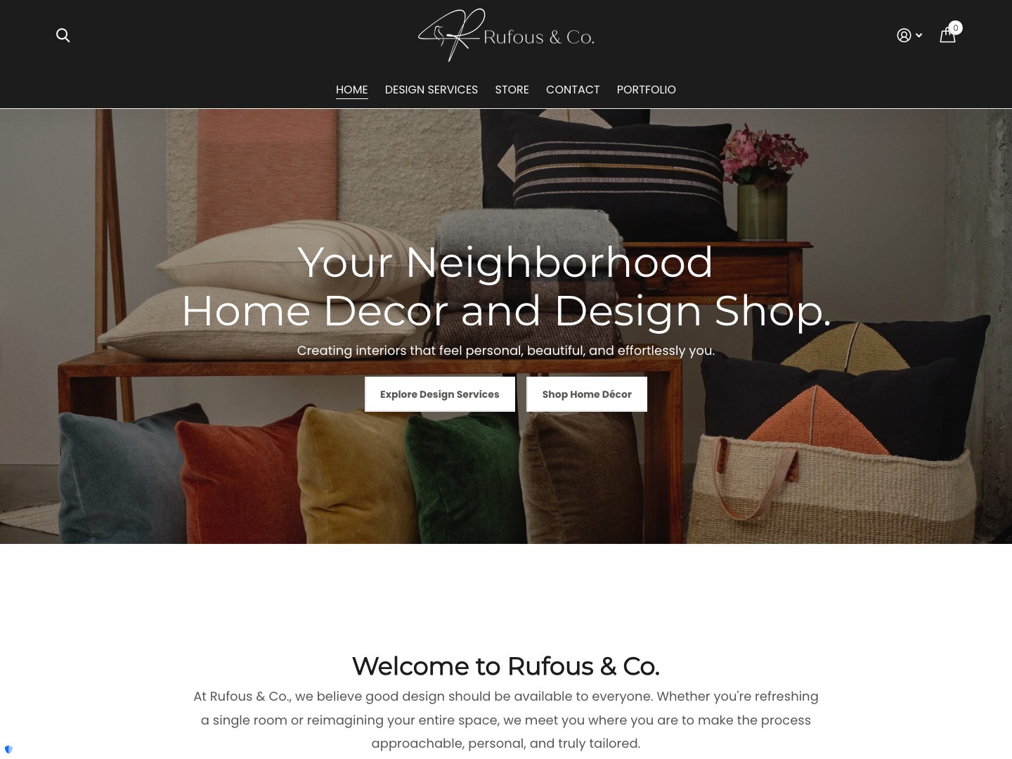
Rufous & Co is a Seattle interior design studio. When I started with the founders, the business ran as two things at once: a services practice and a home-decor shop. We agreed the move was to reposition it from a home-decor shop to an interior-design studio. Only after that did I design and build the site on Shopify.
The old pages showed the problem plainly. A visitor arrives wanting to buy one print. Another arrives wanting to commission six months of design work. They read the same sentence, which tries to be true for both and is specific to neither. The print buyer cannot find the price. The design client cannot find the process. Both scroll to one contact form and decide to deal with it later.
Visitors like the second one are the premium clients the studio wanted, and the old site gave them the same door as a print buyer. A new logo would not have changed that. The fix was a brand positioning decision, which business leads, carried into the structure of every page. It is the clearest case I have of why a rebrand to move upmarket starts with positioning.
Here is what changed on the site:
- Two routes on the homepage. One for hiring the studio, one for buying from the store, each named for its reader.
- A services page with scope first. It says what an engagement includes and how it runs, then asks for the brief once.
- A portfolio arranged for the buyer. It reads in one scroll, with the work visible before any click.
- A contact page that asks for the brief. The old one opened with pleasantries.
- One design system for studio and store. The store no longer looks like a separate business.
The two routes work because of what Pirolli and Card call information scent. People judge where valuable information is from the cues in front of them, and they adjust how they search to get the most value for their effort (Pirolli and Card, 1999). A route labelled for the design client is a strong cue. One blended sentence is a cue for nobody.
One honest limit. No performance data was verified for this project, so the Rufous & Co case study carries no result number, and neither does this post. What it shows is the order: brand positioning with the founders first, structure second, build third.
Why S.T. Dupont Vancouver needed proof, not a new identity
S.T. Dupont Vancouver is the authorized S.T. Dupont flagship store in Canada, selling the maison’s luxury goods. A rebrand to move upmarket was never an option. The brand belongs to the maison, and the store’s job is to sell it. That makes it a clean test of what a site can do for premium clients when the identity cannot change.
On the old Wix site, the authorized dealer status sat in the footer, where first-time buyers do not look. The case study describes what that cost: a buyer who trusts the product but doubts the shop, and phones the store to ask whether it is real. Each of those calls was a sale the site did not close on its own. The product was not in question. The seller was.
When I moved the store from Wix to WordPress and WooCommerce on Bricks, the dealer proof moved above the fold and onto every product page. I migrated 290 products with their taxonomy, pricing and product copy intact, added filters by maison, finish and price, and connected Clover POS and tested it at checkout.
Online sales grew 5x in the first 90 days, against the last 90 days the old Wix store could sell. Same licence, same products, same store. That number belongs to the whole migration, not to the dealer line alone, and I cannot split it between the parts. What I can say: nothing about the brand changed, while the proof a careful buyer needed moved to where they look first. The build is in the S.T. Dupont Vancouver case study.
The dealer authorization is a signal in the Kirmani and Rao sense: an observable fact that stands in for quality a buyer cannot check from a screen. Most B2B firms have an equivalent that enterprise buyers look for, such as a licence, a certification or a client they recognise. Ask where yours sits on the page before you ask whether your logo looks expensive enough.
When is a rebrand to move upmarket the right call?
Sometimes the identity really is what keeps premium clients away. Muzellec and Lambkin looked at 166 rebranded companies and found the decision was most often provoked by structural change, mergers and acquisitions in particular. They also found that a change in marketing aesthetics affects brand equity less than other factors, such as how employees behave (Muzellec and Lambkin, 2006).
From that research and my own projects, these are the four situations where I would back a full rebrand to move upmarket:
- The structure of the business changed. A merger, an acquisition, a split or a new owner has made the old name inaccurate.
- The name signals the wrong category. A playful consumer look on a compliance product that enterprise buyers must approve, or a name that says “shop” on a firm that now sells consulting.
- The name blocks the market you want. A local place name when you now sell across the country, or a founder’s name after the founder has left.
- The brand carries damage. Search results, reviews or press tie the name to a problem you have fixed but cannot outrun.
Notice what is missing. “Our logo looks dated” is not on the list, because that calls for a visual refresh, not a rebrand. Lindgaard and colleagues showed that people judge a page’s visual appeal in about 50 milliseconds, and those ratings closely matched ratings given after 500 milliseconds (Lindgaard et al., 2006). A tired look costs you in that first glance. Type, color and layout can fix it while you keep the name and the recognition behind it.
Positioning, structure or identity: a five-person test
Before you brief a rebrand to move upmarket, run a cheap test on your current site. Ask five people outside the company, ideally people who resemble your enterprise buyers, to find the page written for an organization the size of the client you want. Time each one. Then ask each person to say what you do, and for whom, in one sentence.
| What happens | What it points to | Where to start |
|---|---|---|
| They find the page fast but describe you wrongly | Brand positioning | Rewrite the brand positioning sentence; an identity change may follow later |
| They describe you correctly but cannot find their page | Page structure | One route per buyer, segment pages, proof moved up |
| They fail both | Positioning, then structure | Fix positioning first; a new logo will not tell anyone what you do |
| They pass both but call the site “old” or “cheap” | Visual identity | A visual refresh; a rename only if one of the four situations applies |
| They pass everything | Not the website | Look at the offer, the price or the sales process |
Five people is not a study. It is a quick way to see which of the three jobs is broken before you pay for the wrong one. Two counts add to it. Count the clicks from your homepage to the page for your largest target segment; past three, I treat it as a leak. Then open that page on a phone, because a page that breaks on a small screen never gets to make a brand impression.
The fixes in the middle rows, routes and proof placement, are the work I describe under B2B conversion web design.
What does a rebrand to move upmarket cost, and what comes first?
I can’t quote you a logo. I don’t design them, and a guess from me about another studio’s prices would not help you. Here is the website side, from my own price table dated October 3, 2026.
- Website Audit: CA$995, a one-week teardown, credited in full against a build. Current terms are on the offers page.
- Custom B2B Website, up to 5 pages: CA$8,950 on WordPress, or from CA$7,450 on Framer.
- Marketing Site, 8 to 15 pages: from CA$10,495, over 4 to 6 weeks.
Each is a fixed quote with two revision rounds per phase, and you own the site, domain and hosting. The full list is on the pricing page, and the website redesign cost guide explains what moves a quote up or down.
The order matters more than the totals. Brand positioning and page structure carry over if a rebrand follows: the routes enterprise buyers follow, the proof placement and the segment pages all survive a new logo and palette. Do it the other way round and you often pay for the structure twice, once to put the new identity on the old pages, and again when those pages still fail the five-person test.
Snappy Kraken, a B2B FinTech SaaS for financial advisors, shows the other half. My scope was a website redesign, a rebuilt pricing page and a design system, taken from Figma to production on HubSpot CMS in 3 weeks. The work influenced 7 figures of annual recurring revenue (ARR). Influenced, not attributed: sales, pricing and product all moved in the same period, as the Snappy Kraken case study says. The site carried a business change. It did not make one on its own.
If you do rebrand, how do you keep what already works?
If you land on one of the four situations and go ahead with a rebrand to move upmarket, the research offers some rules. Merrilees and Miller set out six principles for corporate rebranding and tested them on a Canadian leather goods retailer. Among them: keep the core values, link the existing brand to the revised one, target the new segments on purpose, and get stakeholders on board (Merrilees and Miller, 2008).
Homburg, Klarmann and Schmitt studied more than 300 B2B firms and found that brand awareness drives market performance. The strength of that link depends on the market: how alike competing products are and how fast the technology changes. It also depends on the buyers: how mixed the buying group is and how much time pressure they face (Homburg et al., 2010). A new name puts some of that awareness at risk.
On a website, that turns into a short checklist I would follow on any rename:
- Say “formerly” for a while. Keep the old name on the about page and in the footer, so returning buyers know they are in the right place.
- Keep the proof. Case studies, client names and credentials carry over. Do not archive them with the old look.
- Keep old addresses working. Redirect every old URL to its new page so links and rankings follow you.
- Brief the team first. Muzellec and Lambkin’s data suggest staff behaviour moves brand equity more than aesthetics, so the people answering the phone need the new brand positioning before launch.
None of this is glamorous. It is what stops enterprise buyers who knew the old name from wondering whether the firm they trusted still exists.
How to brief the work for enterprise buyers
Whether or not you commission a rebrand to move upmarket, the brief starts the same way. These are the six steps I would take before any designer opens a file:
- Write the brand positioning sentence. Who you serve, what you do for them, and your proof, in under 30 words. If you cannot write it, no logo will write it for you.
- Name one segment. Pick the client size or industry you are moving toward. “Bigger clients” is not a segment.
- List your proof at their scale. Which projects, credentials or authorizations would enterprise buyers recognise? Note the gaps honestly.
- Map one route per buyer. Each type of buyer gets a labelled path from the homepage, the way Rufous & Co got one route for the studio and one for the store.
- Move the proof up. Put your strongest signal where S.T. Dupont Vancouver put its dealer status: above the fold, where premium clients look before they decide.
- Test, then decide on identity. Run the five-person test on the new structure. If people still call the site “cheap”, brief a visual refresh. If one of the four situations applies, brief a rebrand.
What I would not do: launch a new logo on the same pages, rename to sound bigger without changing the offer, or delete the work for smaller clients that got you here. Those projects still show your method. Label them by type of work, put the ones closest to your new segment first, and let premium clients see the pattern for themselves.
Book a call before you brief a designer
If you are weighing a rebrand to move upmarket, spend thirty minutes with me first. I’ll look at your homepage and the page your target buyer would land on, and tell you whether the gap between your site and the enterprise buyers you want is positioning, structure or identity. If it is identity, I’ll say so, and you can take that to a brand designer.
Book a thirty-minute call and bring the one sentence you want premium clients to read first.
Sources
Peer-reviewed research
- Fogg, B. J., Soohoo, C., Danielson, D. R., Marable, L., Stanford, J., and Tauber, E. R. (2003). How do users evaluate the credibility of Web sites? Proceedings of the 2003 Conference on Designing for User Experiences (DUX ’03), 1 to 15.
- Homburg, C., Klarmann, M., and Schmitt, J. (2010). Brand awareness in business markets: When is it related to firm performance? International Journal of Research in Marketing, 27(3), 201 to 212.
- Horsky, D., and Swyngedouw, P. (1987). Does it pay to change your company’s name? A stock market perspective. Marketing Science, 6(4), 320 to 335.
- Kirmani, A., and Rao, A. R. (2000). No pain, no gain: A critical review of the literature on signaling unobservable product quality. Journal of Marketing, 64(2), 66 to 79.
- Lindgaard, G., Fernandes, G., Dudek, C., and Brown, J. (2006). Attention web designers: You have 50 milliseconds to make a good first impression! Behaviour and Information Technology, 25(2), 115 to 126.
- Merrilees, B., and Miller, D. (2008). Principles of corporate rebranding. European Journal of Marketing, 42(5/6), 537 to 552.
- Muzellec, L., and Lambkin, M. (2006). Corporate rebranding: Destroying, transferring or creating brand equity? European Journal of Marketing, 40(7/8), 803 to 824.
- Pirolli, P., and Card, S. (1999). Information foraging. Psychological Review, 106(4), 643 to 675.