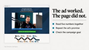
A producer needs a communications expert on air in 90 minutes. She opens one consultancy’s site and gets a paragraph about the practice. The credential is further down. The topics sit inside a document. She books the next name on her list. A B2B website redesign exists to fix that moment, and most of them never look at it.
Producers like her are one of four audiences W Communications, a Seattle communications and speaking practice, had to serve from one homepage: media, clients, event bookers and readers. All four got the same paragraph. The fix was not a new color palette. It was a website rebuild with a separate path for each of them.
This guide is how I redesign a B2B website for better conversions, in the order I do it. Each step says what to measure, what to build and what I’d skip. It’s for owners and marketing leads at firms of about 10 to 200 people, mostly on WordPress.
In this guide
What should a B2B website redesign actually change?
A B2B website redesign should change what a buyer can do on the site, not only how the site looks. If the new version has a better font and the same dead ends, you paid for a website rebuild and kept the problem.
For a B2B firm, “what a buyer can do” has a narrow meaning. A person who fits your client profile arrives, finds the answer to the question that brought them, sees proof that you’ve solved it before, and takes one next step that lands in your CRM with its source attached. Once your sales team agrees that person is worth a call, I count them as a qualified lead. That count is the number the whole redesign project is built to move.
Pirolli and Card (1999) describe people looking for information as foragers. They judge where to go next from the cues in front of them, such as link labels and headings, and shift their effort toward whatever promises the most useful information for the time spent. In my experience, a buyer who sees no cue for their question doesn’t dig. They open the next site on their list.
Looks still count. In a study of 2,684 people judging live websites, Fogg and colleagues found design look was the feature mentioned most when people judged credibility, in 46.1% of comments. It just can’t rescue a page that answers the wrong question.
Step 1: What should you measure before a B2B website redesign?
Write down the starting numbers before anyone opens Figma. Without them, you can’t tell whether the redesign project did anything, and neither can the person who signs off the budget.
Here is what I record on day zero of every B2B website redesign:
- Leads per month, by source. Organic search, paid, referral, email, social, direct, and AI assistants such as ChatGPT, each counted on its own.
- Visitor-to-lead rate per page. Form submissions divided by visitors, for every page that carries a form or a booking link.
- The page each lead converted on. This shows which pages do the work and which only collect traffic.
- Mobile and desktop rates, side by side. In my experience, a wide gap points to a form or layout problem on phones.
- Which leads sales accepted. Ask sales to mark the last 20 leads as worth a call or not. That ratio is your quality baseline.
If your CRM can’t tell you where a lead came from, fix that before the redesign project, not after. Attribution usually breaks in one of four places: untagged links, forms that drop the tags, no record of the page the lead converted on, and AI referrals lumped in with direct. My lead attribution case study walks through the chain.
Then export everything. On the W Communications redesign, no analytics survived the website rebuild, so that case study carries no before-and-after number. The pages are live. Their effect on inquiries can’t be shown. Export your analytics, form entries and Search Console history to files you own before the old site changes.
Step 2: Who arrives at the site, and what does each person need?
Most firms start a B2B website redesign with one buyer in mind. On my projects, the analytics rarely agree. One professional-services homepage might serve a prospective client, a referral partner, a journalist and a job candidate at once.
B2B buying is also a group decision. Johnston and Bonoma (1981) studied purchases of equipment and industrial services across 31 firms. They treated the buyer as a buying center: a group whose makeup shifted with the type of purchase and the structure of the firm. Your site has to answer the person who finds you and the colleagues they forward the link to.
On the W Communications and In Communications redesigns, four audiences arrived at one page: media, clients, event bookers and readers. In Communications is a B2B professional-services firm. Each website rebuild gave every audience its own path from the first screen. The W Communications homepage now names each group and sends it to a page built for it, so a producer never reads the paragraph written for a client.
How do you find your audiences? Talk to people. I run audience research before design on every redesign project: interviews with recent clients, a read through the sales inbox, and a look at where people enter the site. You don’t need dozens of interviews. Guest, Bunce and Johnson (2006) found that new themes stopped appearing within the first 12 interviews in their study, and the basic themes were there after 6.
Ask each person three questions. What were you trying to get done when you first looked us up? What nearly stopped you from getting in touch? What did you type into Google or ChatGPT? Write down their exact words. Those words become the headings and link labels in your buyer journey map.

Step 3: How do you map the buyer journey to real pages?
A useful buyer journey map is a table, not a poster. Each row is a question a real buyer asks, roughly in order, and the page that answers it. Lemon and Verhoef (2016) describe customers meeting a firm through many touchpoints, across several channels, over time. That’s why your site can’t assume everyone starts on the homepage.
Here is the shape I use for a professional-services firm:
| Stage | What the buyer is asking | Page that answers it | One next step |
|---|---|---|---|
| Problem | Is this problem common, and what causes it? | Blog post or guide | Read the related service page |
| Options | Who solves this, and how do they do it? | Service page | Read a case study |
| Proof | Have they done this for a firm like mine? | Case study | Book a call |
| Risk | What does it cost, how long does it take, what if it fails? | Pricing or process page | Book a call |
| Committee | Can I send this to my boss without explaining it? | Case study or about page | Forward the link |
Two rules keep a buyer journey map honest. Every page gets one primary next step, worded the same way everywhere it appears. And every row gets a page. If buyers ask about price and no page answers it, the buyer journey breaks at the point where they were ready to talk.
Use your buyers’ words for headings and link labels. A menu item called “Solutions” gives a forager nothing to follow. “Accounting for dental practices” does, if that’s how your buyers describe the job. The buyer journey map also shows which pages to skip. A page with no row has no job, and I’d cut it from the redesign project before anyone designs it.
Step 4: Do you need a redesign, a website rebuild or a migration?
Not every B2B website redesign needs new code. The right scope for a redesign project depends on whether the platform is the problem or the pages are.
| Situation | What I’d do | Why |
|---|---|---|
| The platform is fine, the pages don’t convert | Redesign the templates and rewrite the key pages on the current platform | Fastest path, and URLs and tracking can stay put |
| Marketing can’t publish without a developer | A website rebuild on a design system the team can edit | Every future page ships without a queue |
| The platform blocks what you need, such as CRM forms or page speed | A migration to a new platform, with or without a redesign | Working around a platform limit gets more expensive every year |
| The pages convert, there just aren’t enough visitors | No redesign; content and search work instead | A new site won’t add visitors on its own |
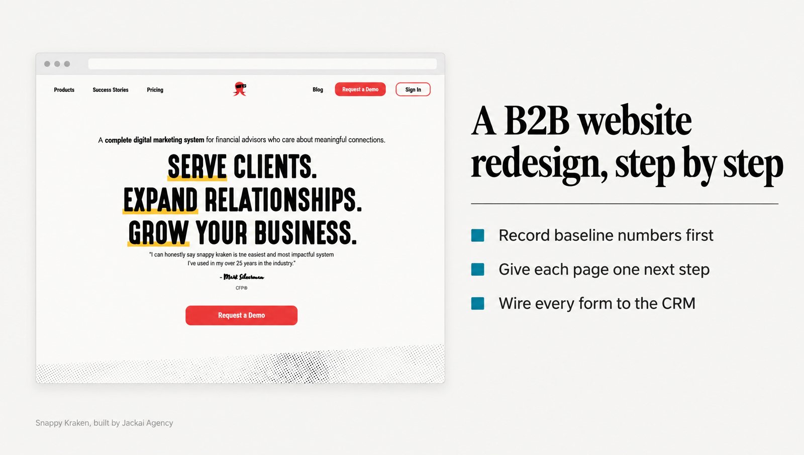
The second row is the one firms underrate. Snappy Kraken is a B2B FinTech SaaS that sells marketing systems to financial advisors, and its marketing team owned a roadmap bigger than it could build. That website rebuild took six pages from Figma to production on HubSpot CMS in 3 weeks, bound to a design system, so the in-house team can edit and ship pages without a designer.
The work influenced 7 figures of ARR (annual recurring revenue). That figure is influenced, not attributed: sales, pricing and product all moved in the same period, and the case study doesn’t separate them. I’d rather show you the caveat than a cleaner number.
Pick the platform your team already uses. If marketing lives in HubSpot, a HubSpot CMS redesign keeps forms, workflows and reporting in one place. On WordPress, a WordPress website redesign usually costs less than moving. If URLs will change, the redirect plan is its own job, covered in website migration without losing SEO.
Step 5: Where does the proof go, and how many next steps should a page have?
Before any layout on a B2B website redesign, I build a proof inventory. List every piece of evidence the firm has: case studies, client results with dates, credentials, clients you’re allowed to name, and reviews. Then assign each item to the row of the buyer journey map where it answers a doubt. Proof on a separate results page nobody visits does no work.
Placement matters because first impressions form fast. Lindgaard and colleagues (2006) found people rated the visual appeal of a home page within 50 milliseconds, and those ratings closely matched the ones they gave after 500 milliseconds. A buyer has formed a view of the page long before paragraph four.
On the W Communications biography page, the strongest fact sat below several paragraphs of story. That fact was a credential: former Starbucks senior vice president. The redesign project moved it above the narrative. Same credential. Same practice. It now sits where the reader is still deciding.
Next steps follow the same logic. Snappy Kraken’s old homepage repeated its main action four times in four different phrasings, so each version read like a separate choice. The website rebuild uses one action, in identical words, down the page. In field and lab studies by Iyengar and Lepper (2000), people were more likely to buy jam or chocolates when offered 6 options than when offered 24 or 30.
My working rule is one primary next step per page, plus a quieter second option for people who aren’t ready yet, such as reading a case study. Not a chatbot, a newsletter pop-up, a demo button and a phone number, all fighting for the same screen.

Step 6: How do you connect every page to the CRM?
A B2B website redesign that adds forms without wiring them builds a brochure with input boxes. Every page in the buyer journey that asks for something should hand the lead to your CRM with its source, the page it converted on, and a follow-up that runs without anyone remembering it.
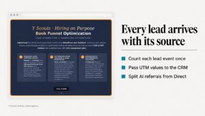
Y Scouts, an executive search firm in Scottsdale, had strong content and no path from it. The blog and the HubSpot CRM ran as two separate systems, so a reader who arrived from a post had no next step that reached the CRM. I wired every blog post into a HubSpot blog-to-lead-gen flow and built three lead-capture pages: Hiring on Purpose, the Executive Interview Guide and Role Visioning.
The Hiring on Purpose funnel converts visitors to leads at 17.7% (166 of 938), measured in the client’s own HubSpot. Across Q3 2025, the work contributed to marketing-qualified leads rising from 17 to 30 and scheduled demos from 22 to 37. That quarter also ran a short-form video program cut from interviews already on file, so the site is one contributor, not the cause.
Keep the forms short and plain. Seckler and colleagues (2014) applied 20 form guidelines to forms taken from real company websites. People finished the improved forms faster, needed fewer attempts to submit them, and reported higher satisfaction. For a first contact, I ask for a name, a work email and one question about the project. Everything else can wait for the call.
If the reporting side is what’s missing, Lead Source Reporting sets it up in two weeks with no design change.
Step 7: How do you test the new site before and after launch?
Test a B2B website redesign with buyers, not with the people who built it. Give four to six people who match your client profile a task from the buyer journey map, such as “find out whether this firm has worked with a company like yours, then book a call.” Watch them try. Don’t help.
Small tests find most of the problems. Nielsen and Landauer (1993) modeled 11 studies and found that problem discovery follows a predictable curve. For a medium-sized project, they put the best return per test at about four evaluations, with up to 16 still worth the cost. Run a few sessions, fix what they find, then run a few more.
Before launch, I also check:
- Every form, end to end. Submit it on a phone and on a laptop, then confirm the lead lands in the CRM with its source and page.
- Every primary next step. Click each one from each audience’s path.
- Old URLs. Each one either still works or redirects to its closest new page.
- Analytics events. Each form submission and booking fires once, not twice.
- Speed on a mid-range phone. Test on a real device over mobile data, not only on office Wi-Fi.
After launch, compare against the day-zero numbers at 30, 60 and 90 days. In my experience, B2B sales cycles run long enough that one month of data can point the wrong way. Then decide who keeps publishing once the redesign project ends. At Y Scouts, when publishing paused in Q4, YouTube views fell back to 483 a month. A website rebuild is a starting line. The publishing rhythm after it is what holds the numbers.
How much does a B2B website redesign cost, and what can go wrong?
At Jackai Agency, a B2B website redesign is priced by scope. These are my current prices in US dollars, with Canadian dollars in parentheses:
- Custom B2B website, up to 5 pages: from CA$7,450 on Framer, CA$8,950 on WordPress, CA$9,350 on Shopify and CA$9,700 on HubSpot.
- Marketing site, 8 to 15 pages: from CA$10,495, over 4 to 6 weeks.
- Migration with a rebuild, 5 pages: from CA$9,200.
- Lead Source Reporting: CA$2,600, over 2 weeks.
Every redesign project gets a fixed quote with two revision rounds per phase, and you own the site, the domain and the hosting. You can build an exact number with the pricing calculator.
The risks I see most often on a B2B website redesign are not design risks:
- Lost history. Analytics and form data that don’t survive the move, as happened on W Communications.
- Late content. On a redesign project, delays come from copy and case studies far more often than from code. Name one owner for content before the build starts.
- A launch without tracking. The site goes live, leads arrive, and nobody can say which page or channel sent them.
- Scope creep by committee. Each stakeholder adds a section. Tie every request to a row in the buyer journey map, or park it for phase two.
Here is what I would not do on a B2B website redesign. I wouldn’t start from a competitor’s homepage, or add a chatbot because a competitor has one. I wouldn’t rewrite every page when a handful carry most of the leads. And I wouldn’t call it finished on launch day, because the day-90 numbers are the only ones that show whether it worked.
Where should your B2B website redesign start?
Start with the pages that already carry your leads. That’s the job of my CA$995 Website Audit. In one week, I read your analytics and funnel page by page and hand you a ranked list of what’s costing you leads, with the reason for each item, plus a free AI Visibility Report.
The document is yours whether or not you hire me. If you go ahead with a build, the fee is credited against it (terms on the offers page). Same site. Same traffic. A short list of what to change first, in order. Book the CA$995 Website Audit.
Sources
Peer-reviewed research
- Fogg, B. J., et al. (2003). How do users evaluate the credibility of Web sites? Proceedings of the 2003 Conference on Designing for User Experiences, 1 to 15.
- Guest, G., Bunce, A., and Johnson, L. (2006). How many interviews are enough? Field Methods, 18(1), 59 to 82.
- Iyengar, S. S., and Lepper, M. R. (2000). When choice is demotivating: Can one desire too much of a good thing? Journal of Personality and Social Psychology, 79(6), 995 to 1006.
- Johnston, W. J., and Bonoma, T. V. (1981). The buying center: Structure and interaction patterns. Journal of Marketing, 45(3), 143 to 156.
- Lemon, K. N., and Verhoef, P. C. (2016). Understanding customer experience throughout the customer journey. Journal of Marketing, 80(6), 69 to 96.
- Lindgaard, G., et al. (2006). Attention web designers: You have 50 milliseconds to make a good first impression! Behaviour and Information Technology, 25(2), 115 to 126.
- Nielsen, J., and Landauer, T. K. (1993). A mathematical model of the finding of usability problems. Proceedings of the INTERCHI ’93 Conference on Human Factors in Computing Systems, 206 to 213.
- Pirolli, P., and Card, S. (1999). Information foraging. Psychological Review, 106(4), 643 to 675.
- Seckler, M., et al. (2014). Designing usable web forms. Proceedings of the SIGCHI Conference on Human Factors in Computing Systems (CHI 2014), 1275 to 1284.