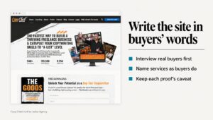
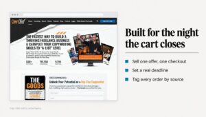
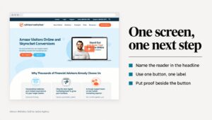
A buyer at a mid-sized firm has three vendor sites open and a meeting on Thursday where she has to recommend one. She isn’t looking for the prettiest site. She’s looking for a reason to cross two names off the list, and the usual B2B website design mistakes give her that reason before anyone on your team knows she visited.
Procurement reads the same pages with different questions. What does this cost, roughly, so a budget line can open? Who owns the work when the contract ends? Is there a real company behind the contact form, with an address and a person who replies?
This isn’t a list about taste. It’s the design mistakes I look for when a B2B firm tells me enterprise buyers visit the pricing page twice and then go quiet, with the first fix for each.
In this guide
What do enterprise buyers check before they contact a vendor?
Enterprise buyers rarely decide alone. Webster and Wind’s model of organizational buying (1972) treats a purchase as a group decision made by a buying center. That group includes the people who will use the product, the people who influence the choice, the buyer who runs the purchase, the decider who signs, and the gatekeepers who control what information reaches the group.
Most of those people read your website, usually not at the same time. The user reads for fit, and the decider reads for proof. Procurement often sits in the buyer or gatekeeper seat and reads for price, terms and the risk of signing. A page that answers only one of them leaves the others to do extra work for a vendor they haven’t met.
They also judge quickly. In three studies, Lindgaard and colleagues found that people’s ratings of a homepage’s visual appeal after 50 milliseconds closely matched their ratings after 500. In a study of 2,684 people judging live websites, Fogg and colleagues found the “design look” of a site came up in 46.1% of comments about its credibility, more often than anything else.
So the first pass isn’t a reading but a screening, and each of the B2B website design mistakes below fails it for at least one person in the group. Most are about a missing answer, not color or type. On an audit, I read the site once for each seat at the table:
- The user: does this vendor understand the problem I deal with every week?
- The decider: is there proof from a client like us, with a number I can repeat?
- Procurement: is there a price range, a set of terms and a company I can verify?
- The gatekeeper: is there one page I can forward that answers the first round of questions?
Which B2B website design mistakes start on the pricing page?
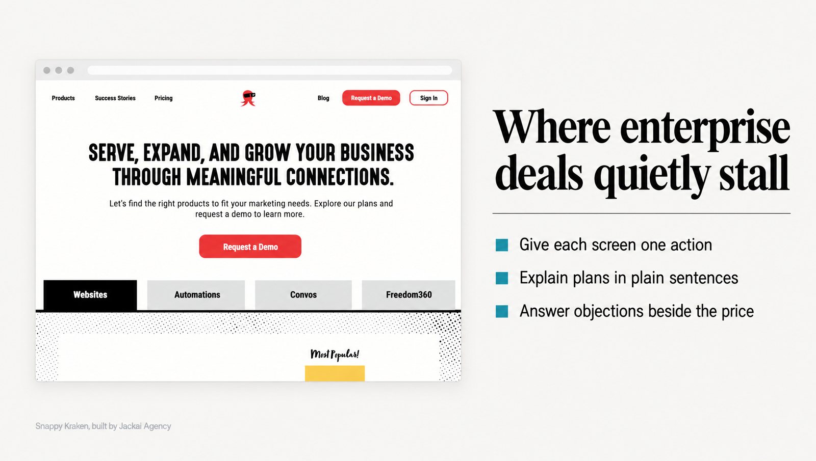
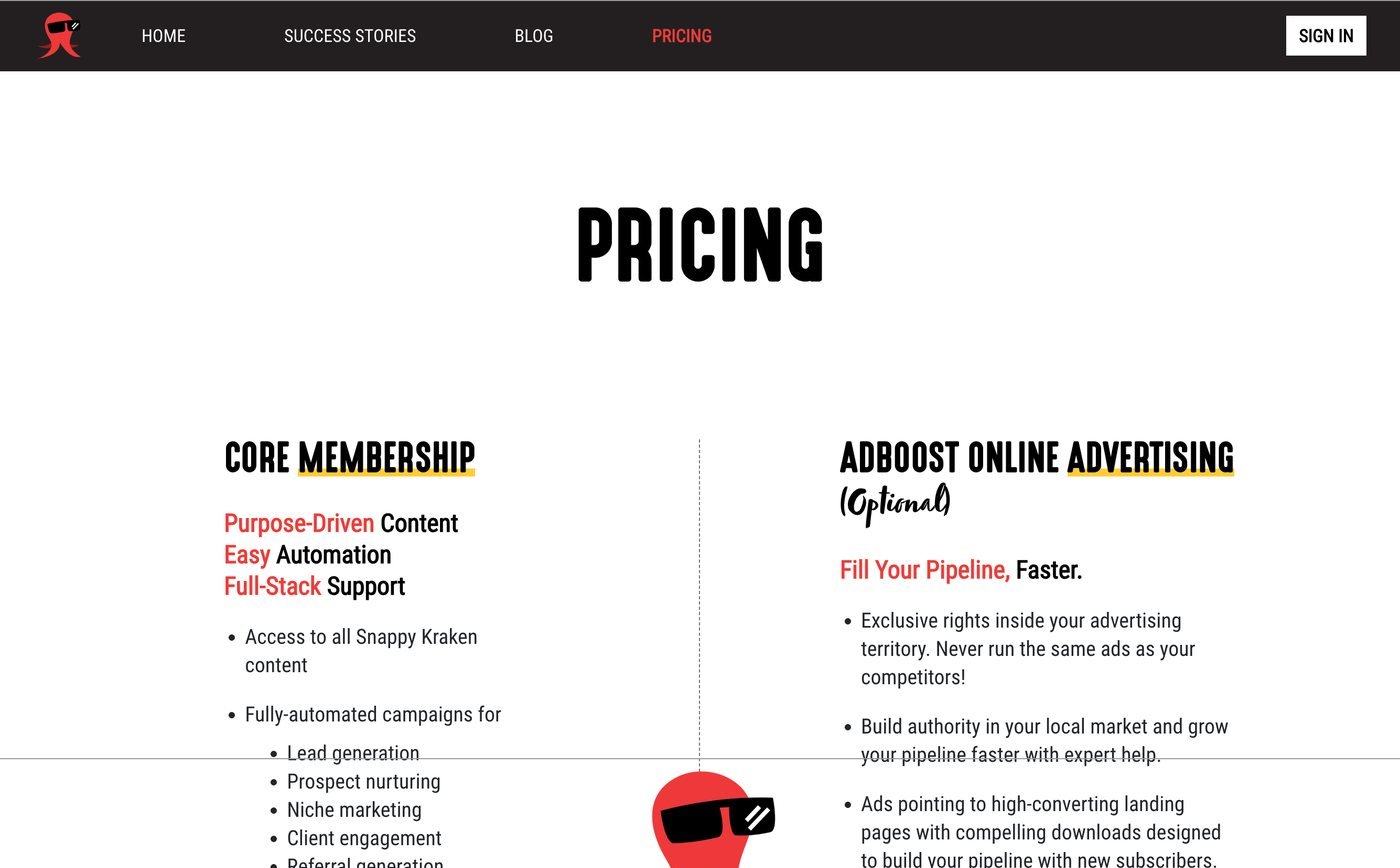
Snappy Kraken is a B2B FinTech SaaS company that sells marketing systems to financial advisors. When I started on its site, the pricing page carried the most traffic and had the least design. It was a 3-column plan table with 9 rows of feature names and ticks. Nothing on it said what changed between tiers, and no sentence was written for a person who has to justify the number to someone else.
Picture the buyer: an advisor who has already watched the demo. She has 40 minutes between client meetings and a budget to defend to a partner. She isn’t asking what the software does. She’s asking what it costs, what happens in month 2, and who holds it when it breaks. The table answers none of that, so she opens a second tab.
The mistake isn’t too little information. It’s too much on one screen, with no help deciding. Jacoby, Speller and Kohn tested this in 1974. As the information per brand went up, shoppers felt more satisfied and less confused, yet they made poorer purchase decisions. A pricing page can do the same thing to enterprise buyers: they feel informed and still can’t pick a tier.
This is one of the B2B website design mistakes that hides in plain sight, because a full table looks thorough. Here is what I changed on the Snappy Kraken pricing page:
- One focal action per screen. Each tier gets its own space and one next step, so the buyer makes one decision at a time.
- Differences in sentences. What changes between plans is written in plain words beside each tier, not implied by a column of ticks.
- The objection beside the number. The reason a buyer might hesitate is answered next to the price, not at the bottom.
The honest part: the pricing page change wasn’t measured alone. The 6 pages went from Figma to production on HubSpot CMS in 3 weeks, and the engagement influenced 7 figures of annual recurring revenue (ARR). Influenced, not attributed, because sales, pricing and product all moved in the same period. The full before and after is in the Snappy Kraken HubSpot redesign case study.
Why does “contact us for pricing” stall procurement?
The opposite mistake is a pricing page with no price on it. Every tier says “Contact us,” which for a founder buying alone is only a speed bump. For procurement, it’s a request to do your sales team’s first job for them: find out whether you’re even in range before anyone books a meeting.
Price disclosure doesn’t have to scare buyers off. Mohan, Buell and John (2020) studied when and why disclosing the costs behind a product can raise buyers’ purchase interest. My read for B2B: you’re not posting a discount. You’re showing what the number is made of, so the person holding the budget can defend it.
Hiding the price is one of the B2B website design mistakes procurement notices first, and the fix can be small. You don’t need a full rate card. You need four things a procurement reader can paste into an email:
- A “from” price for your most common engagement.
- The two or three things that move the price up.
- What’s included, and what’s billed separately.
- Your standard terms in one paragraph.
On my own pricing page, a Custom B2B Website of up to 5 pages starts at CA$7,450 on Framer and CA$8,950 on WordPress. The terms sit beside it: a fixed quote, two revision rounds per phase, and the client owns the site, domain and hosting. That last line is there for procurement, not for the person who likes the design.
The edge case is real variance. If your contracts range widely, publish the drivers and a floor, not a fake average. Never post a “starting at” number lower than anything you’d sign. Procurement will find the gap on the first call, and then every number on the site is in doubt.
What happens when one homepage has to serve every reader?
W Communications is a strategic communications and speaking practice in Seattle. Before I rebuilt its WordPress site, 4 audiences were arriving at the same homepage: media, clients, event bookers and readers. All four got the same opening paragraph about the practice. The proof existed, but it sat below the fold.
On the biography page, the strongest credential, a former Starbucks senior vice president, sat below several paragraphs of story. A producer who needs an expert on air in 90 minutes doesn’t scroll for it. She books the next name on her list.
Pirolli and Card’s information foraging theory (1999) explains why. People follow “information scent,” the cues that suggest the answer is close, and they move to another source when the scent gets weak. A general paragraph gives off almost no scent for anyone in particular.
The rebuild ran to 8 pages. The homepage now names each audience and sends it to the page built for it, and the biography opens with the credential, with the story underneath. Same credential. Different position. No analytics survived the rebuild, so there’s no before and after number here, and I won’t invent one. The W Communications case study shows the captures.
For enterprise buyers, the buying committee plays the role of those 4 audiences, and this is where B2B website design mistakes stack up. The user, the decider and procurement all land on your homepage with different questions. If the first screen speaks to one of them, give the other two a visible path: a line and a link each.
How many ways to say “talk to us” is too many?
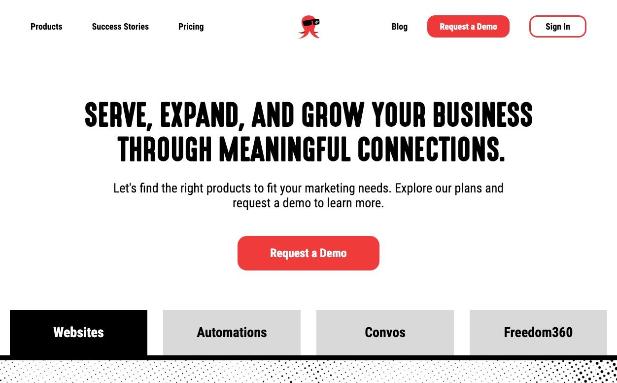
Snappy Kraken’s homepage had a quieter version of the same problem. The primary action appeared 4 times, in 4 different phrasings. When one action wears four labels, a buyer can’t tell whether “Book a demo” and “Talk to sales” lead to the same place. The easiest click on the page becomes a puzzle.
Iyengar and Lepper showed the cost of extra options in 2000. In their field and lab studies, people were more likely to buy jams or chocolates when offered 6 choices rather than 24 or 30, and they were happier with what they picked. Four labels for one action aren’t 24 jars of jam, but they push in the same direction: more apparent choices, less commitment.
The fix was one action, repeated in identical words down the page. Of all the B2B website design mistakes here, it’s one of the cheapest to fix. For enterprise buyers I’d add a second, quieter path for procurement: a footer link such as “Vendor details” leading to your legal name, address, terms, privacy notice and a named contact. The gatekeeper gets something to forward.
Which B2B website design mistakes make a vendor look risky?
Buying for an organization is risky, and the people doing it know that. Mitchell’s 1995 review pulls together the research on how managers perceive risk in organizational buying and the strategies they use to reduce it. McKnight, Choudhury and Kacmar describe trust as what helps people get past perceived risk online, so they’ll share their details and act on a vendor’s advice.
On a website, risk reduction looks boring. These are the gaps I check for on every B2B audit, because each one gives procurement a reason to pause:
- No company behind the brand. No legal or trading name and no street address.
- No named person. A form that goes to “the team,” with no stated reply time.
- No ownership terms. Nothing that says who owns the work, the domain and the accounts when the contract ends.
- No privacy notice near the form. A reviewer reading your contact form should be able to see where the data goes.
- Proof with no client names. “A leading financial firm” reads like a stand-in, even when it’s real.
My own site lists Jackai Agency’s street address, 128 W Cordova St #3804 in Vancouver, and my terms promise a reply within 1 business day. Neither line is exciting, but both answer questions procurement would otherwise ask by email.
Slow pages belong on this list of B2B website design mistakes too. Galletta, Henry, McCoy and Polak tested delays from 0 to 12 seconds with 196 participants. Longer delays lowered task performance, attitudes toward the site and intentions toward it, and the drop in performance and intentions began to level off at around 4 seconds. A buyer with three vendor tabs open doesn’t have to wait for yours.
Do your case studies hold up for a skeptical reader?
The weakest case study says the client loved the work. The next weakest gives a number with no scope: “huge growth in leads,” with no metric, no period and no word on what else changed. If your champion forwards that page to a decider who wasn’t on the call, the number has to survive without you.
Precision helps, up to a point. In four experiments, Xie and Kronrod tested numerical precision in advertising claims. Precise numbers made the advertised company look more competent to readers low in ad skepticism, while highly skeptical readers were less affected. Procurement is paid to be skeptical, so a precise number alone won’t carry the page. The caveat does the rest.
Vague proof is one of the B2B website design mistakes that costs you late in a deal, when the decider reads it cold. Here’s the structure I use so a number stands on its own:
- The buyer’s problem, in their words. What the client’s customer was trying to do when the old page failed.
- What was built. The pages, the platform and how long it took.
- The number, with its scope. Which metric, which period, measured where.
- What held flat. The thing that didn’t change while the number moved.
- The honest limitation. What the number can’t tell you.
The two case studies in this post show the pattern. Snappy Kraken’s 7 figures of ARR are labeled influenced, not attributed, with the reason in the next sentence. W Communications has no number at all, and the page says why: no analytics survived the rebuild.
Which fixes can you make this month, and which need a rebuild?
Most B2B website design mistakes don’t need a new site. Some are copy edits and some are a template change, and only a structural problem needs a rebuild. Here’s how I sort the nine in this post:
| Mistake | What the buyer sees | First fix | Size of the work |
|---|---|---|---|
| Feature table with no explanation | Ticks, no reason to pick a tier | Plan differences as sentences | Copy edit |
| Everything on one pricing screen | Every tier and action at once | One focal action per screen | Template change |
| No price signal | “Contact us” on every tier | A “from” price, drivers and terms | Copy edit plus a leadership decision |
| One homepage for every reader | A paragraph written for nobody | Name each audience on the first screen, with a link | Structure change |
| Credential buried in the biography | Story first, proof later | Credential first, story underneath | Copy edit |
| One action, four labels | Four buttons that may or may not differ | One label, identical wording | Copy edit |
| No vendor details | No address, no named contact, no terms | A vendor details page in the footer | New page |
| Slow pages | A blank tab while other vendors load | Smaller images, fewer scripts, phone testing | Developer task |
| Case study numbers with no scope | A number nobody can repeat safely | Metric, period, what held flat, the limitation | Copy edit |
What I wouldn’t do, even when it’s tempting:
- Rebuild the whole site to fix a pricing page. Fix the one template and measure it.
- Add a logo wall you can’t back up. One named client with a scoped number beats a row of logos nobody can check.
- Gate the pricing page behind a form. It turns a quick budget check into a sales step. I’d rather a buyer rule me out in 30 seconds than book a call to do it.
What does it cost to fix B2B website design mistakes?
It depends on how many rows of that table apply. My fixed-quote prices as of October 2026, in US dollars with Canadian dollars in parentheses:
- Website Audit: CA$995, a one-week teardown, credited in full against a build (current terms on the offers page).
- Landing Page Design: from CA$3,795, 1 to 2 weeks.
- Custom B2B Website, up to 5 pages: from CA$7,450 on Framer, CA$8,950 on WordPress and CA$9,700 on HubSpot.
- Marketing Site, 8 to 15 pages: from CA$10,495, 4 to 6 weeks.
For the wider picture, I’ve broken down what a website redesign costs in 2026.
A short brief keeps the fix small. Send whoever does the work these five things:
- The three pages enterprise buyers visit most before they go quiet, from your analytics.
- The roles in your usual buying group, and which one signs.
- The questions procurement asked on your last three deals.
- The things that move your price, and the floor you’d publish.
- The terms you’ll state in public: who owns what, how many revisions, how fast you reply.
If you don’t know which pages buyers visit before they go quiet, that’s a tracking gap, not a design one. My lead attribution method records the source and landing page of every lead in your CRM.
Want a second read before your next enterprise deal?
On W Communications, the credential didn’t change. Its position did. Most of the fixes above work the same way: same offer, same proof, moved to where the right reader finds it.
If you’d like me to read your pricing page for B2B website design mistakes the way procurement will, book a 30-minute call with me. I’ll measure your starting numbers on the call, and you keep them whether or not you hire me.
Sources
Peer-reviewed research
- Fogg, B. J., Soohoo, C., Danielson, D. R., Marable, L., Stanford, J., and Tauber, E. R. (2003). How do users evaluate the credibility of Web sites? A study with over 2,500 participants. Proceedings of the 2003 Conference on Designing for User Experiences, 1 to 15.
- Galletta, D. F., Henry, R., McCoy, S., and Polak, P. (2004). Web site delays: How tolerant are users? Journal of the Association for Information Systems, 5(1), 1 to 28.
- Iyengar, S. S., and Lepper, M. R. (2000). When choice is demotivating: Can one desire too much of a good thing? Journal of Personality and Social Psychology, 79(6), 995 to 1006.
- Jacoby, J., Speller, D. E., and Kohn, C. A. (1974). Brand choice behavior as a function of information load. Journal of Marketing Research, 11(1), 63 to 69.
- Lindgaard, G., Fernandes, G., Dudek, C., and Brown, J. (2006). Attention web designers: You have 50 milliseconds to make a good first impression! Behaviour and Information Technology, 25(2), 115 to 126.
- McKnight, D. H., Choudhury, V., and Kacmar, C. (2002). Developing and validating trust measures for e-commerce: An integrative typology. Information Systems Research, 13(3), 334 to 359.
- Mitchell, V.-W. (1995). Organizational risk perception and reduction: A literature review. British Journal of Management, 6(2), 115 to 133.
- Mohan, B., Buell, R. W., and John, L. K. (2020). Lifting the veil: The benefits of cost transparency. Marketing Science, 39(6), 1105 to 1121.
- Pirolli, P., and Card, S. (1999). Information foraging. Psychological Review, 106(4), 643 to 675.
- Webster, F. E., and Wind, Y. (1972). A general model for understanding organizational buying behavior. Journal of Marketing, 36(2), 12 to 19.
- Xie, G.-X., and Kronrod, A. (2012). Is the devil in the details? The signaling effect of numerical precision in environmental advertising claims. Journal of Advertising, 41(4), 103 to 117.