An advisor registers for a software vendor’s webinar, misses it, and two days later visits the vendor’s homepage to find the recording. The first screen offers several actions of equal weight. None of them leads back to the session she came for. She closes the tab. Nothing on the page was broken. The hero section design never decided who the page was for.
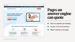
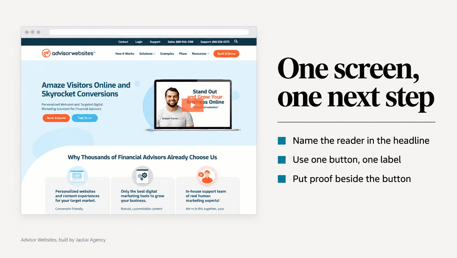
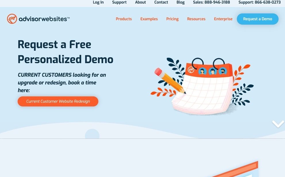
That was the homepage of Advisor Websites, a Vancouver SaaS platform that builds websites for financial advisors, before I rebuilt it. The fix wasn’t more on the screen. It was less: one primary action, plus a visible route into a replay library.
This post covers hero section design at the layout level: what goes in, what to cut, the single next step, and how the screen changes between a phone and a desktop. Headline wording gets its own post. It draws on B2B and retail sites I’ve built, with the research behind each decision.
In this guide
What is hero section design for on a B2B website?
Hero section design covers the block at the top of a page, before the first scroll: a headline, a supporting line, a visual and a button. On most B2B sites it’s the only part of the homepage every visitor sees. Its job is narrow. It helps a stranger decide, in a few seconds, whether to keep reading.
That decision starts before anyone reads a word. In one of three studies by Lindgaard and colleagues, people rated homepages shown for 50 milliseconds, and those ratings were highly correlated with ratings of the same pages shown for 500 milliseconds (Lindgaard et al., 2006).
Novelty doesn’t win that snap judgment. Tuch and colleagues found that visual complexity and prototypicality shaped how attractive a website looked within 17 milliseconds, and pages with low complexity and high prototypicality rated best (Tuch et al., 2012). Prototypical means the page looks like the kind of site the visitor expects. A hero that looks normal for its category, with less on it, starts ahead.
Then the visitor screens the page before reading it. In real browsing logs, Liu, White and Dumais found that a page has to pass an initial screening before people examine it in detail, a pattern they called screen-and-glean (Liu et al., 2010). The first screen is that screening.
So my test for hero section design is blunt. I show the screen to someone outside the firm for five seconds, hide it, and ask two questions: who is this for, and what were you supposed to click? If they can’t answer both, the layout failed, whatever the headline says.
What goes in the first screen, and in what order?
Five things, and the order matters more than the styling. On a B2B services or SaaS site, every hero section design I start uses this inventory:
- Who it’s for, in the headline. Name the reader or their situation. It sits top left on a desktop and first on a phone.
- What changes, in one supporting line. One sentence on the outcome, in the buyer’s own words. Not a paragraph.
- One line of proof. A named client, a credential, or a number with its caveat, placed near the button.
- One primary call to action. A button that says what happens on click: “Book a 30-minute call”, not “Get started”.
- A visual of the real thing. The product screen, the actual store, the founder. Not a stock handshake.
Proof earns its place because credibility gets judged on the surface first. When 2,684 people assessed live websites, the look of the design came up in 46.1% of their credibility comments, more than any other factor (Fogg et al., 2003). A visitor can’t call your references from the hero. She can see whether it looks like the work of a firm that has done this before.
Retail follows the same order with different nouns. S.T. Dupont Vancouver is the authorized S.T. Dupont flagship store of Canada, and its old homepage kept authorized dealer status in the footer, where no first-time buyer reads. On the S.T. Dupont project, I moved it above the fold, beside the collection rail and one primary action. For a luxury buyer, “authorized dealer” is the proof line.
Navigation counts too. A top menu with nine items is nine more choices competing with your button. I keep the header to four pages (services, work, pricing, about) and give the primary button the only solid fill on the first screen.
What should you cut from the hero section?
Most hero section design fails by addition. Someone wanted the awards in, someone wanted the video, someone wanted a second button for the newsletter. This is what I remove first:
- Rotating sliders. Each slide carries a different message, so the visitor gets whichever one happened to be showing.
- Every button after the first. The next section covers why.
- Logo strips. Twelve badges read as decoration. One named client with a result reads as evidence.
- Stock photos. A handshake tells the visitor nothing about you.
- Paragraphs. If the supporting text runs past two lines on a desktop, it belongs further down.
- Autoplay video. It adds weight to the slowest part of the page and gives the eye something to watch instead of read.
Motion is the cut people argue with most. Burke and colleagues found that animated and static banners both slowed visual search, and that people rarely looked straight at them (Burke et al., 2005). They tested ads, not hero sliders, so treat it as a strong hint, not proof.
One more cut: the headline set over a busy photo. Hall and Hanna found that text and background colors with greater contrast were generally more readable (Hall and Hanna, 2004). Over a photo, the contrast changes behind every letter, and on a phone the crop moves. Put the words on a solid area, or darken the photo until they pass a contrast check.
How many calls to action belong above the fold?
One primary call to action. If you need a second link, it should serve a different visitor, look like a text link, and never compete for the same click.
The space is worth guarding. Nielsen Norman Group’s 2018 eyetracking analysis (industry research, not peer reviewed) found 57% of viewing time went to content above the fold. Whatever sits above the fold gets most of the looking, so it should hold one decision, not five.
The best-known evidence on options comes from Iyengar and Lepper. People were more likely to buy gourmet jams or chocolates when offered 6 choices than when offered 24 or 30, and they were more satisfied with what they picked (Iyengar and Lepper, 2000).
The effect isn’t universal. A meta-analysis of 99 observations found four conditions that make choice overload worse: complex options, a hard decision, people unsure what they want, and a goal of saving effort (Chernev et al., 2015). A first-time visitor looking at your first screen often meets all four.
The quiet version of this problem is one action written four ways. Snappy Kraken is a B2B FinTech SaaS that sells marketing systems to financial advisors. On the Snappy Kraken homepage, the old design repeated its primary call to action 4 times in 4 different phrasings, and each one read as a different choice. The rebuilt page names the advisor in the first fold and repeats 1 action in identical words down the page.
Two rules I hold on every build. A call to action label is a verb plus the thing you get. And it stays identical every time it appears, so nobody wonders whether “Book a call” and “Talk to us” are different doors.
How do you choose the one next step for each visitor?
The next step shapes the rest of the hero section design, so pick it from data, not taste. Choose the step for the largest group arriving on that page, then give the next-largest group a quiet route. I start with the GA4 landing page report to see where visitors came from. If most of them show up as “direct”, fix lead source tracking before you redesign anything.
The reason is information scent. Pirolli and Card’s information foraging theory describes how people judge the value of a path from nearby cues and adjust their strategy to get the most useful information for the effort (Pirolli and Card, 1999). A visitor who clicked a link promising a webinar recording is following that scent. If the hero doesn’t continue it, she leaves to find a stronger one.
This is how I match the step to the arrival:
| Who arrives | What they came for | Primary call to action | Quiet secondary |
|---|---|---|---|
| From a webinar or email | The session they were promised | Watch the replay | Book a demo |
| From a paid ad | The ad’s exact promise | The offer, in the ad’s words | None |
| First visit from search | Whether you solve their problem | Book a call or a fixed-price audit | See the work |
| Returning buyer | Price and risk | See pricing | Book a call |
| Retail shopper | The product | Shop the collection | Visit the store |
On Advisor Websites, the first screen had no clear next step for the largest arriving audience, and no route back for the advisor who came from a webinar. The rebuild kept one primary call to action and added a visible route into the replay library. That second path serves a different visitor, so it doesn’t split the decision.
Paid traffic is the strictest case. On the Membership Funnel Redesign for Copy Chief, a membership platform for working copywriters, the sign-up action appeared once, below the fold, and the ad’s promise was missing. The rebuilt page opens with that promise word for word and repeats one action on every screen. That campaign ran at 31x ROAS (return on ad spend), with 215 paid subscriptions from August to October 2023, and the ads and offer share that number with the page. See the Copy Chief case study.
How should hero section design change on mobile and desktop?
Same content, different order, different limits. On many B2B sites I audit, the phone layout is whatever happened when the desktop columns stacked, so the headline sits under a tall photo and the button lands out of sight.
On a phone
Scrolling costs more on a phone. Ghose, Goldfarb and Han found that links at the top of the screen were especially likely to be clicked on mobile phones, a sign of higher search costs on small screens (Ghose et al., 2013).
Attention also sits high. In an eye-tracking study of mobile search, Lagun and colleagues found average attention focused on the top half of the phone screen (Lagun et al., 2014). Their pages were search results, not homepages, but the lesson carries: on a phone, hero section design is a stacking problem, and the top half is where the headline and button have to fit.
- Order: headline, supporting line, button, proof line. The image moves below the button or gets cut.
- Button size: Parhi, Karlson and Bederson found 9.2 mm targets were large enough for one-handed thumb taps on single buttons without hurting speed or accuracy (Parhi et al., 2006). I build mobile buttons at least that tall and close to full width.
- Proof: keep it, cut to one line. A client name fits where a paragraph doesn’t.
- Overlays: cookie banners, chat bubbles and sticky headers all eat the top half. Check the first screen with all three showing.
On a desktop
On a desktop, hero section design is a width problem, and width tempts people to fill it. I keep the headline and button in a column about half the screen wide, with the real visual beside it. Check it on a 13-inch laptop too, which shows less of the page than the monitor you designed on.
Load weight on both
The hero usually holds the biggest image on the page, so it decides how fast the page feels. Nah’s experiment put the tolerable wait for retrieving a web page at about 2 seconds, and found that feedback such as a progress bar stretched it (Nah, 2004). Google’s guidance (vendor data) counts a Largest Contentful Paint under 2.5 seconds as good, and on most homepages I audit, the hero image is that largest element.
My limits: export the image at the size it displays, in WebP or AVIF, preload it, and never lazy-load it. No autoplay video in the first screen on a phone.

What did three real first screens change?
| Client | Before | After | What the result belongs to |
|---|---|---|---|
| Advisor Websites, SaaS for financial advisors | Several competing actions, no route back to the webinar | 1 primary call to action, a route into the replay library | +58% organic traffic and +28% MQL (marketing-qualified lead) conversion, from the replay library and opt-in templates, not the hero alone |
| S.T. Dupont Vancouver, luxury retailer | Dealer status in the footer, first product 2 scroll lengths down | Dealer status, collection rail and 1 primary action without scrolling | Online sales grew 5x with the same licence, same products, same store, across the whole Wix to WordPress move |
| Snappy Kraken, B2B FinTech SaaS | Audience not named, 1 action in 4 phrasings | Advisor named, 1 action in identical words | Figma to production on HubSpot CMS in 3 weeks; no hero-level metric reported |
None of these numbers belongs to the hero alone, and I won’t credit it with them. A first screen owns the next click: how many visitors take the primary action, and how many leave without scrolling. Measure those two before and after. The Advisor Websites case study shows that homepage before and after.
How do you audit your own hero section design in 15 minutes?
Checking hero section design takes two screenshots, one colleague and your analytics.
- Screenshot the first screen at 390 and 1440 pixels wide. Only what shows before scrolling.
- Run a five-second test. Show the desktop screenshot to someone outside the firm for five seconds. Ask who it’s for and what they were supposed to click.
- Count the actions. More than one primary call to action means you have to pick.
- Find the proof. Is one named client, credential or number visible above the fold? If not, move one line up.
- Read the button label out loud. Does it say what happens on click?
- Check the sources. In the GA4 landing page report, does the primary action fit the biggest group?
- Test the load. Run PageSpeed Insights on mobile and note the Largest Contentful Paint and the element it names.
- Do the thumb test. Hold your phone in one hand and tap the button. If you have to shift your grip, make the button bigger.
Write down what fails. In my audits, few first screens pass all eight, and the fixes are usually cuts, not additions.
What does a first-screen fix cost, and when is the hero not the problem?
Hero section design fixes get quoted after the audit, from my 2026 price table. Small fixes to a sound site run on the care plan at CA$279 an hour (US$200). Landing Page Design starts at CA$3,795 (US$2,750). A rebuilt Custom B2B Website on WordPress is CA$8,950 (US$6,450) for up to 5 pages. Projects are fixed quotes with two revision rounds per phase, and you own the site, domain and hosting.
Sometimes the hero isn’t the problem:
- The traffic is wrong. Visitors searching for something you don’t sell won’t convert.
- The offer is wrong. A clear button to an offer nobody wants still gets no clicks.
- The page breaks the promise. If the hero says “pricing below” and the price is three clicks away, the visitor leaves anyway.
A few things I wouldn’t do. I wouldn’t A/B test hero variants on a page with a few hundred visits a month; in my experience the test runs for months without a clear winner. I wouldn’t make a services firm’s homepage look like a software startup. And I wouldn’t put a chat pop-up over a phone’s first screen.
Want a second read on your first screen?
Most first screens I rebuild had nothing wrong with the firm behind them. Same services. Same clients. The screen just asked the visitor to do the sorting.
If you want to know what yours is asking, the CA$995 Website Audit (US$725) is a one-week teardown of your site, hero section design included. The fee is credited if you go ahead within 30 days.
Sources
Peer-reviewed research
- Burke, M., et al. (2005). High-cost banner blindness: Ads increase perceived workload, hinder visual search, and are forgotten. ACM Transactions on Computer-Human Interaction, 12(4).
- Chernev, A., Böckenholt, U., and Goodman, J. (2015). Choice overload: A conceptual review and meta-analysis. Journal of Consumer Psychology, 25(2).
- Fogg, B. J., et al. (2003). How do users evaluate the credibility of Web sites? Proceedings of DUX 2003, ACM.
- Ghose, A., Goldfarb, A., and Han, S. P. (2013). How is the mobile Internet different? Search costs and local activities. Information Systems Research, 24(3).
- Hall, R. H., and Hanna, P. (2004). The impact of web page text-background colour combinations on readability, retention, aesthetics and behavioural intention. Behaviour and Information Technology, 23(3).
- Iyengar, S. S., and Lepper, M. R. (2000). When choice is demotivating: Can one desire too much of a good thing? Journal of Personality and Social Psychology, 79(6).
- Lagun, D., et al. (2014). Towards better measurement of attention and satisfaction in mobile search. Proceedings of SIGIR 2014, ACM.
- Lindgaard, G., et al. (2006). Attention web designers: You have 50 milliseconds to make a good first impression! Behaviour and Information Technology, 25(2).
- Liu, C., White, R. W., and Dumais, S. (2010). Understanding web browsing behaviors through Weibull analysis of dwell time. Proceedings of SIGIR 2010, ACM.
- Nah, F. F.-H. (2004). A study on tolerable waiting time: How long are Web users willing to wait? Behaviour and Information Technology, 23(3).
- Parhi, P., Karlson, A. K., and Bederson, B. B. (2006). Target size study for one-handed thumb use on small touchscreen devices. Proceedings of MobileHCI 2006, ACM.
- Pirolli, P., and Card, S. (1999). Information foraging. Psychological Review, 106(4).
- Tuch, A. N., et al. (2012). The role of visual complexity and prototypicality regarding first impression of websites. International Journal of Human-Computer Studies, 70(11).
Industry and vendor data (not peer reviewed)
- Nielsen Norman Group (2018). Scrolling and Attention: 57% of viewing time above the fold.
- Google, web.dev. Largest Contentful Paint: good when it happens within 2.5 seconds.