A plant manager at a 90-person food manufacturer needs a structural engineer. She has your homepage open on her phone in the parking lot, five minutes before a shift meeting. She reads the website headline and the line under it, which is all that fits on the first screen. She isn’t deciding yet whether you’re good. She’s deciding whether this page is for her, and if the top line doesn’t say so, she goes back to the search results.
I design and rebuild websites for B2B and professional-service firms, mostly on WordPress, and I run audience research before any design starts. The website headline comes straight out of that research. Not the logo. Not the color palette. The first sentence a buyer reads.
This post covers the top line of your homepage copy: how to name the reader, state the outcome in her words and put proof where she’ll see it.
In this guide
What does a website headline have to do in the first five seconds?
People judge a homepage before they read it. In studies by Lindgaard and colleagues, ratings of a page’s visual appeal after a 50-millisecond glimpse were highly correlated with ratings after 500 milliseconds (Lindgaard et al., 2006). That’s a gut call on looks. The website headline is the first thing that gets read, and it either backs that call up or overturns it.
What happens next is information foraging. Pirolli and Card describe people judging the value of information from nearby cues, which they call information scent, and deciding where to spend their time based on it (Pirolli and Card, 1999). On a homepage, the website headline is the strongest cue on the first screen. When the scent is weak, the buyer doesn’t dig. She leaves.
The headline also sets how the rest of the page gets read. In experiments with news articles, Ecker and colleagues found that misleading headlines shaped readers’ memory and reasoning about the story under them, and that readers struggled to correct that first impression later (Ecker et al., 2014). Your homepage copy below the headline is read through whatever frame the top line sets.
So a working website headline does three jobs in one sentence, or one sentence and a short line under it:
- Names the reader, so the right person knows the page is for her.
- States the outcome that reader wants, which is your value proposition in her units: days, deadlines, dollars, hours.
- Gives a reason to believe it, something she could check.
Who is the headline for? Name the reader first
Most homepage copy I review opens with the firm, in lines like “Your trusted IT partner since 2004” or “Smarter accounting for growing businesses”. The reader has to work out whether it’s for her, and many won’t.
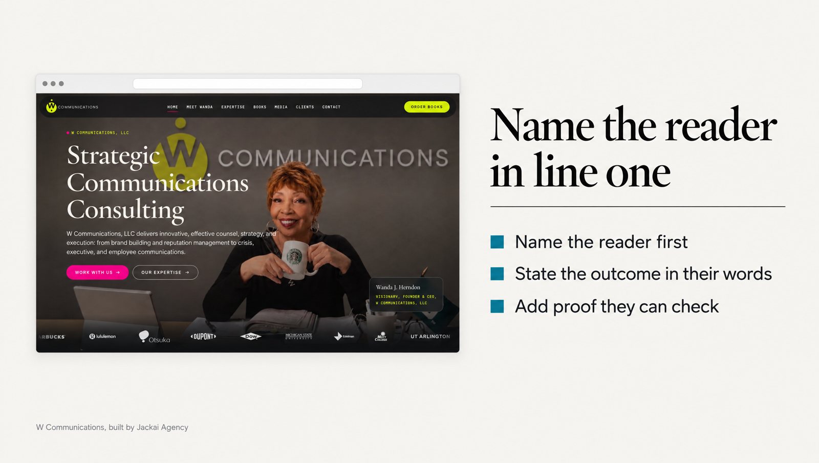
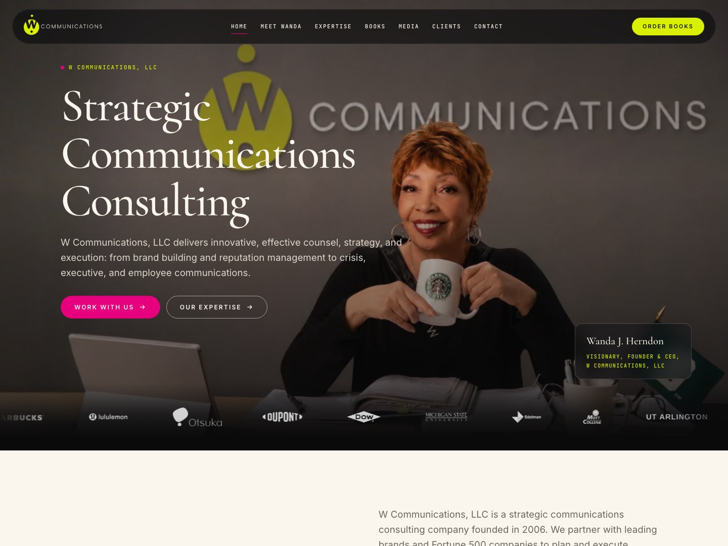
W Communications, a Seattle strategic communications and speaking practice, is a clear case. Four audiences landed on the same homepage: media, clients, event bookers and readers. The page opened with a general paragraph about the practice, and none of the four was named. A producer hunting for an expert couldn’t tell from the first screen whether she was in the right place.
In the rebuild, the homepage names each audience and sends it to the page built for it. No analytics survived the rebuild, so there’s no before and after number, and I won’t make one up. The W Communications case study shows both versions of the page.
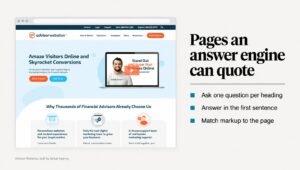
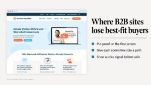
Snappy Kraken, a B2B FinTech SaaS company that sells marketing systems to financial advisors, had the software version of the same problem. The old homepage led with product features and never said who the product was for. The new one names the advisor on the first screen, before it says what the software does. The Snappy Kraken case study has the before and after captures.
There’s research behind naming the reader, and a limit to it. Burnkrant and Unnava found that ad copy written to make readers relate the message to themselves made them think harder about it, and raised persuasion when the arguments were strong (Burnkrant and Unnava, 1995). When other parts of the ad already pushed readers to think hard, the effect shrank or reversed. Naming the reader earns attention. It won’t rescue a weak value proposition.
Name the reader the way she’d describe herself on a sales call. Use a role, a company type, a size or a situation:
- Too broad: businesses, companies, organizations, teams, leaders.
- Specific enough: owner-run manufacturers in Ontario, in-house legal teams of 2 to 10, founders hiring their first sales leader, clinics with 3 to 10 chairs.
If two of those fit you, pick the one your best clients share.
What outcome should the headline promise, and in whose words?
The outcome is the change the reader sees after working with you. This is where your value proposition lives. Not the activity (“we provide managed IT services”). Not an adjective (“reliable”, “trusted”). The thing that’s different on her desk afterwards: fewer support tickets, a filing deadline met, a role filled, a permit approved.
A value proposition written as an activity makes the buyer do the math. Written as an outcome, it does the math for her. If yours takes a paragraph, write the paragraph, then cut it to the result she’d repeat to her boss.
The best source for homepage copy is your buyers, not your team. I led website redesigns for client accounts at In Communications, a B2B digital marketing agency. Each design brief was anchored to one buyer and the words that buyer used for the problem, not the client’s internal description of its product.
For Copy Chief, a copywriting education company, I went further: Perplexity searches to mine pain points, a custom Python scraper feeding Reddit comments to a language model to sort pains from desires, coach interviews and member emails. A 30-person firm rarely needs that much. Its buyers’ words usually sit in three places:
- Sales call notes, especially the first five minutes, where the buyer says why she called.
- Lost-deal emails, where buyers say what they chose instead and why.
- Questions asked before signing, which show what the homepage didn’t answer.
Keep the words plain. Oppenheimer had people rate the authors of texts written with simple or needlessly complex words. The complex versions made the authors seem less intelligent, not more, and the effect ran through how hard the text was to read (Oppenheimer, 2006). A headline that needs a second read has lost the person skimming it on her phone.
Where does the proof go: in the headline or just under it?
Proof is anything a skeptical reader could check: a number, a credential, a named client type, a time frame, a price. It can sit inside the website headline or in the line directly under it, as long as both fit on the first screen. What it can’t do is sit three screens down.
Precise numbers help, with a catch. Xie and Kronrod found that precise figures in ad claims made the advertiser seem more competent to readers who weren’t skeptical of ads, while highly skeptical readers were less affected (Xie and Kronrod, 2012). Many B2B buyers read vendor claims for a living, so plan for the skeptic. A number works best when she can trace it to a named project, a date or a case study.
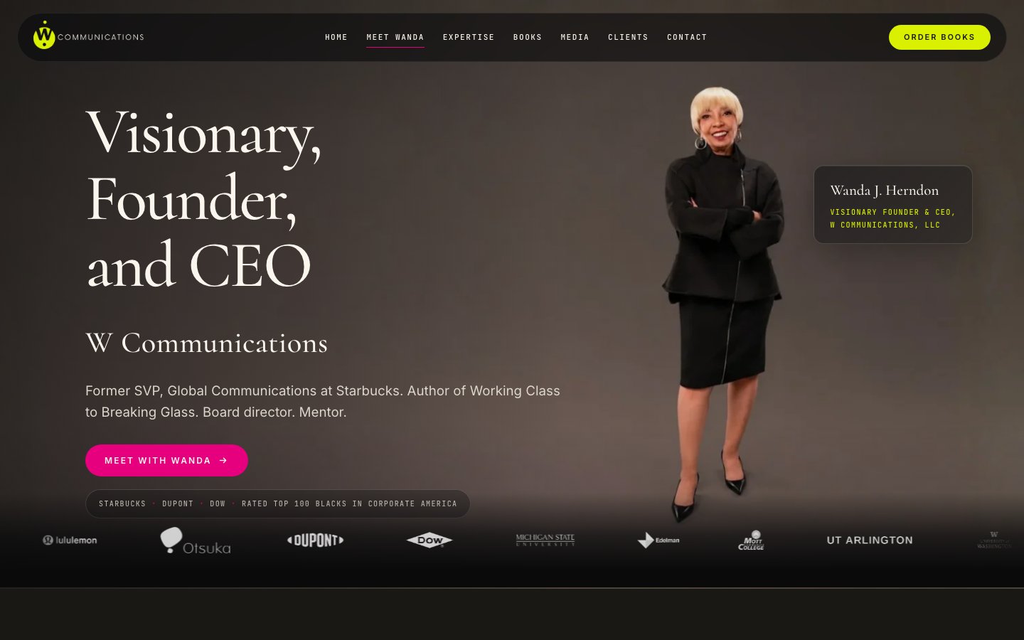
Sometimes the proof is a credential. On the W Communications biography page, “former Starbucks senior vice president” sat below several paragraphs of story. Now it sits above them.
Focus counts as proof too. When 2,684 people wrote down why they trusted or doubted a website, the design look came up most often (46.1% of comments), followed by how the information was structured and how focused it was (Fogg et al., 2003). A website headline that tries to list every service reads as unfocused before anyone checks a credential.
Three rules I use for proof near the top of a page:
- If you can’t link to it, don’t headline it. A claim with no source a click away reads as a slogan.
- Use the real count. “Hundreds of clients” reads as a guess. “[N] audits since [year]”, filled with your real count, reads as a record.
- Say where the number came from in the next line, not in a footnote.
Website headline examples: before and after
These examples are illustrations I wrote for this post. They are not client headlines, the firms are made-up composites, and the square brackets mark where your own verified number goes. Don’t fill a bracket with a number you can’t show a buyer.
| Firm (illustration) | Before | After | What changed |
|---|---|---|---|
| Managed IT provider | Innovative IT solutions for modern businesses | IT support for law firms of 10 to 50 people. A technician on the phone within [your measured response time]. | The reader is named. The outcome is a response time she can hold you to. |
| Accounting firm | Your trusted partner in financial success | Year-end accounting for BC construction contractors, filed before the deadline for [N] years running. | Industry and region named. An adjective became a record. |
| Structural engineering firm | Engineering excellence since 1987 | Structural engineering for mid-rise wood-frame buildings. [N] projects stamped in the Lower Mainland since [year]. | Age of the firm swapped for volume of the exact work the buyer needs. |
| Employment law firm | Experienced legal counsel you can count on | Employment law for BC employers with 20 to 200 staff. Written advice on a termination within [N] business days. | The situation the buyer is in, plus a time frame she can check. |
| B2B software for dental clinics | The all-in-one platform for modern practices | Scheduling software for dental clinics with 3 to 10 chairs. [N]% fewer no-shows in 90 days, measured in your own booking data. | Who it’s for, the result in her units, and where the number comes from. |
Look at what the after versions share. Each names a reader you could find on LinkedIn, states the outcome in the buyer’s units and leaves a slot for proof someone could check. None is clever, and most are longer than the befores. A longer website headline that the right reader recognizes beats a short one that nobody does.
The befores could sit on any competitor’s site and nobody would notice. That’s the quickest test for weak homepage copy: cover your logo and ask whether the line could belong to anyone else in your field.
If you can’t fill the after column for your own firm, the problem isn’t the headline. Either your value proposition isn’t clear yet or you haven’t measured anything you can show. Fix that first.
Should a website headline be short, clever or a question?
Most headline advice comes from news and email, where the headline’s job is to win a click from a list. Kuiken and colleagues studied newspaper headlines rewritten for the online kiosk Blendle and found that most clickbait-style features raised click-through rates, though those features alone couldn’t predict which headline would win (Kuiken et al., 2017).
A website headline on a homepage has a different job. The visitor already clicked. She wants to know if she’s in the right place, and a curiosity gap makes her do the work the headline should have done.
Wording alone does change behavior, though. In Upworthy’s randomized tests of about 105,000 news headline variations, each extra negative word in an average-length headline raised click-through by 2.3% (Robertson et al., 2023). That was news, not B2B, so don’t copy the tactic. Copy the lesson: same page, different first line, measurably different behavior.
Questions work when the reader answers yes and the question names her. “Hiring your first in-house marketer?” passes. “Ready to grow?” fails, because everyone says yes and nobody feels named.
How long should a website headline be? I haven’t found a peer-reviewed study that sets a word count for B2B homepage headlines, so this is my working rule, not research: one sentence that fits on two lines of a phone screen at the site’s heading size. That usually lands between 6 and 14 words. If it needs more, the extra goes in the subheadline.
What should sit directly under the headline?
The headline can’t carry everything. The lines under it finish the job, and they’re the homepage copy most visitors actually read, because they share the first screen. Where they sit is a layout question for another post. Here are the three things I put there.
- A subheadline that says how. One sentence on how you deliver the outcome: the method, the scope or a price signal. For example: “Fixed-fee year-end packages from $[X], quoted before we start.”
- A proof line. Where the headline’s number came from, or the one credential that matters to this reader.
- One call to action, worded the same every time. Snappy Kraken’s old homepage used 4 different phrasings for its main action. The new one repeats 1 action in identical words down the page.
A website headline that promises one outcome should be followed by one next step. A second offer in the subheadline gives the reader two things to judge on one screen.
If the whole first screen needs rework, not just the sentence, that’s a WordPress website redesign rather than a copy edit.
How do you test a website headline before you commit?
You don’t need a lab. You need five people who match your buyer and three honest questions.
- Write five versions. Change one element in each: the reader, the outcome or the proof.
- Run a five-second test. Show each person the first screen on a phone for five seconds, then hide it.
- Ask three questions. Who is this for? What do they get? Why should they believe it?
- Score the answers. If two of five can’t say who it’s for, the reader isn’t named clearly enough. If they repeat your adjectives back (“they’re trusted”), the value proposition is missing.
- Read it to your best salesperson. If they’d never say that sentence on a call, rewrite it in the words they would use.
- Ship one version and leave it alone for 4 to 6 weeks. Track homepage engaged sessions, clicks on the main call to action and form starts in GA4.
Change one thing at a time and hold the rest flat: same traffic sources, same offer, same homepage copy below the headline. Most B2B sites I work on don’t get enough homepage traffic for a clean A/B test, so a dated before and after is the honest version.
Know where your leads come from before you change a word. The lead attribution method I use tags every lead with its source and landing page, so a headline change shows up in the lead count.
Website headline decision table: which shape fits your firm?
Not every value proposition fits the same shape. Here’s how I choose for a client.
| Your situation | Lead with | Shape | Watch out for |
|---|---|---|---|
| One clear buyer, results you can show | Reader and outcome | [Service] for [reader]. [Verified number]. | A number you can’t link to |
| One clear buyer, no public numbers yet | Reader and outcome | [Outcome] for [reader], [how you do it]. | Filling the gap with adjectives |
| Several audiences on one homepage | The situation they share, then the routes | [What all of them need]. [Audience A], [audience B]: start here. | Naming nobody to avoid leaving someone out |
| Founder-led practice | The credential | [Service] from a former [checkable role]. | Leaving the credential inside the bio |
| Regulated field: legal, financial, health | Reader and scope | [Service] for [reader], within [scope]. | Outcome promises your regulator won’t allow |
| Moving to bigger clients | The buyer you want next | [Outcome] for [larger buyer]. | Language still written for the old buyer |
What I would not put in a website headline
- “Welcome to [firm name].” The logo already says it, and the line wastes the first screen.
- The word “solutions”, or any adjective about yourself: leading, trusted, innovative, passionate.
- A list of every service. The first screen has room for the one your best buyer came for. The rest get their own pages.
- A claim your sales team couldn’t defend for ten minutes on a call.
- AI, unless AI is literally what you sell.
Want a second read on your homepage headline?
It’s hard to judge your own first line, because you already know what the firm does. The CA$995 Website Audit ($725 USD) is a one-week teardown. I read your analytics and funnel page by page and give you a ranked list of what’s costing you leads, with the reason for each item. The homepage headline is part of that read.
You keep the document whether or not you hire me. It includes a free AI Visibility Report, and the fee is credited toward a build if you go ahead within the window on the offers page. Build prices are on the pricing page.
Same page. Same traffic. Same offer. The sentence at the top is the cheapest thing on your site to change, and it’s the one every visitor reads.
Sources
Peer-reviewed research
- Burnkrant, R. E., and Unnava, H. R. (1995). Effects of self-referencing on persuasion. Journal of Consumer Research, 22(1), 17-26.
- Ecker, U. K. H., Lewandowsky, S., Chang, E. P., and Pillai, R. (2014). The effects of subtle misinformation in news headlines. Journal of Experimental Psychology: Applied, 20(4), 323-335.
- Fogg, B. J., Soohoo, C., Danielson, D. R., Marable, L., Stanford, J., and Tauber, E. R. (2003). How do users evaluate the credibility of Web sites? Proceedings of the 2003 Conference on Designing for User Experiences, ACM, 1-15.
- Kuiken, J., Schuth, A., Spitters, M., and Marx, M. (2017). Effective headlines of newspaper articles in a digital environment. Digital Journalism, 5(10), 1300-1314.
- Lindgaard, G., Fernandes, G., Dudek, C., and Brown, J. (2006). Attention web designers: You have 50 milliseconds to make a good first impression! Behaviour and Information Technology, 25(2), 115-126.
- Oppenheimer, D. M. (2006). Consequences of erudite vernacular utilized irrespective of necessity: Problems with using long words needlessly. Applied Cognitive Psychology, 20(2), 139-156.
- Pirolli, P., and Card, S. (1999). Information foraging. Psychological Review, 106(4), 643-675.
- Robertson, C. E., Pröllochs, N., Schwarzenegger, K., Pärnamets, P., Van Bavel, J. J., and Feuerriegel, S. (2023). Negativity drives online news consumption. Nature Human Behaviour, 7(5), 812-822.
- Xie, G.-X., and Kronrod, A. (2012). Is the devil in the details? The signaling effect of numerical precision in environmental advertising claims. Journal of Advertising, 41(4), 103-117.
Industry and vendor data (not peer reviewed)
- Jackai Agency price table, published 3 October 2026 (first-party prices). Jackai Agency pricing