
- Constraint
- No analytics survived the rebuild, so no number appears
- Client
- W Communications, a strategic communications and speaking practice
- Scope
- 8 pages across 4 audiences, brand system
- Stack
- WordPress
A strategic communications consultancy rebuilt across 8 pages
WordPress website redesign for a strategic communications consultancy. Client: W Communications, A strategic communications and speaking practice.
A producer needs a communications expert on air in 90 minutes. She has 1 name, 1 browser tab, and no patience. She needs the credential, the topics, a photograph she is allowed to use, and a way to reach somebody who answers. The site opens with a paragraph about the practice. The credential is somewhere further down. The topics are inside a document. The photograph is 400 pixels wide. She does not send an email asking for a media kit, because she does not have 90 minutes to wait for one. She books the second name on her list, who had a page she could read in 40 seconds.
4 audiences cannot be served by 1 page. They can be served by 4 pages that each know who arrived.
What was actually happening?
Media, clients, event bookers and readers all arrived at the same page and were handed the same paragraph. The proof existed and sat below the fold. Nothing on the site was structured so that a producer, or a machine answering a question about the practice, could lift a fact out of it and use it without asking a person first.
Every figure below is a real capture of the live page. Each frame caps its height and scrolls inside itself, so a full-page capture can be read end to end without leaving the figure. Both frames are reachable by keyboard. Nothing here is a mockup or a drawn schematic.
1. What should a consultancy homepage do when 4 audiences arrive at it?
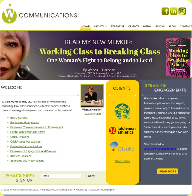
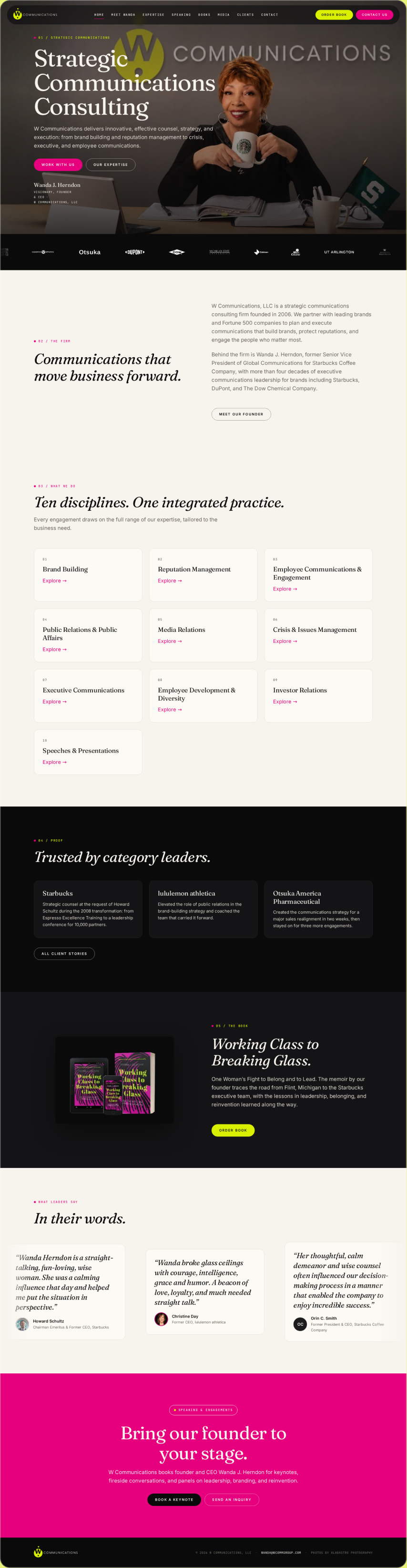
UX and UI analysis, before against after
Before: what the design cost the visitor
- A general paragraph, no named audience. Four distinct audiences arrived at one homepage that addressed none of them. A reader who is not named in the first fold cannot tell whether the page is for them, which the headline research identifies as the first reason people leave. Source: Nielsen Norman Group, 2015.
- Prose where a scanner needed structure. Opening with a paragraph asks the visitor to read, and the research is consistent that most people scan instead. Source: Nielsen Norman Group, 1997.
- The scent stopped at the door. A producer, a client, an event organiser and a reader each followed a different reason to arrive, and the page gave none of them a path to follow. Source: Xerox PARC, Pirolli and Card, Psychological Review, 1999.
After: what changed and why it works
- Each audience named and routed. The homepage states who it serves and sends each group to the page built for them. Naming the reader is the strongest scent a page can offer. Source: Nielsen Norman Group, 2003.
- Four short routes instead of one long paragraph. Chunking the first fold into audience blocks lets a scanner find their block in seconds. Source: Nielsen Norman Group, 2016.
- One decision at the top. The visitor chooses which audience they are and everything after that is relevant, which is the choice reduction the research shows lifts action. Source: Columbia University and Stanford University, Iyengar and Lepper, Journal of Personality and Social Psychology, 2000.
Sources cited in this section
- Nielsen Norman Group (2015), Headings Are Pick-Up Lines: 5 Tips for Writing Headlines That Convert.
- Nielsen Norman Group (1997), How Users Read on the Web (79% of users scan rather than read).
- Xerox PARC, Pirolli and Card, Psychological Review (1999), Information Foraging: people follow the strongest scent toward the answer and leave when it weakens.
- Nielsen Norman Group (2003), Information Scent: how users decide where to click.
- Nielsen Norman Group (2016), How Chunking Helps Content Processing.
- Columbia University and Stanford University, Iyengar and Lepper, Journal of Personality and Social Psychology (2000), When Choice is Demotivating: more options reduced purchase rate roughly tenfold.
2. Where does the credential belong on a personal practice site?
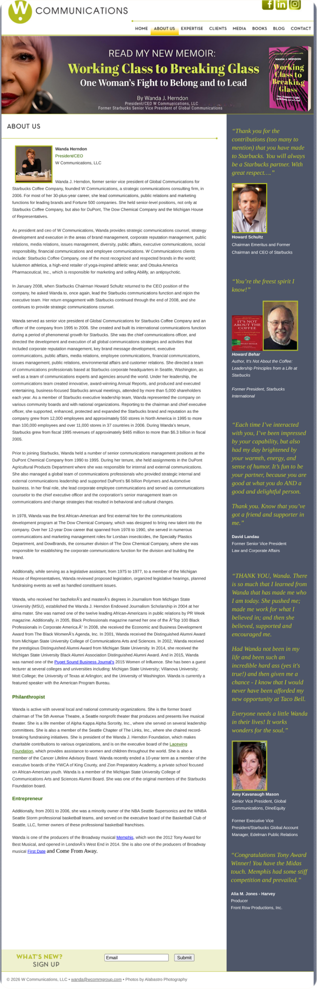

UX and UI analysis, before against after
Before: what the design cost the visitor
- The credential was buried. The former Starbucks senior vice president credential sat below several paragraphs of narrative. Three quarters of viewing time is spent within the first two screens, so the strongest proof on the page was outside most readers’ attention. Source: Nielsen Norman Group, 2018.
- Narrative before evidence. The About Us research finds that visitors go to a biography page to answer a specific question, usually who is this and why should I trust them, and want it answered fast. Source: Nielsen Norman Group, 2008.
- Credibility delayed is credibility lost. Demonstrated expertise is one of the four trust factors, and it only works if it is seen. Source: Nielsen Norman Group, 2016.
After: what changed and why it works
- The credential leads. The page opens with the fact that establishes authority, then tells the story underneath it. That order matches how people use an About page. Source: Nielsen Norman Group, 2008.
- Proof in the attention zone. Placing the credential in the first screen puts it where more than half of viewing time is spent. Source: Nielsen Norman Group, 2018.
- Narrative that now has a reason to be read. Once the credential has earned attention, the story beneath it is read as context rather than as a hurdle. Source: Nielsen Norman Group, 2016.
Sources cited in this section
- Nielsen Norman Group (2018), Scrolling and Attention (57% of viewing time is above the fold, 74% within the first two screens).
- Nielsen Norman Group (2008), About Us: Presenting Information About an Organization on Its Website.
- Nielsen Norman Group (2016), Trustworthiness in Web Design: 4 Credibility Factors.
3. How should expertise be structured so it can be quoted?
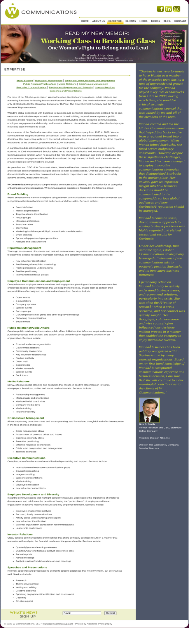
UX and UI analysis, before against after
Before: what the design cost the visitor
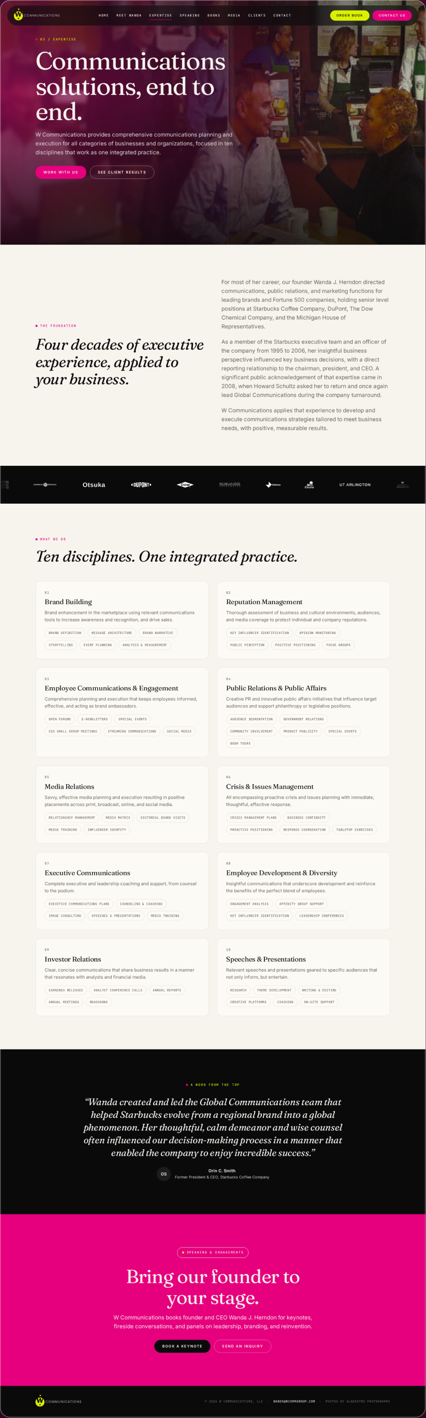
- Topics implied, never listed. Expertise described in flowing prose left the actual subjects unstated. A reader, a producer or a search engine looking for a specific topic could not find it because it was never named. Source: Nielsen Norman Group, 2017.
- Nothing quotable. Answer engines and journalists lift discrete passages. Prose with no headings offers no passage that stands on its own. Source: Google Search Central, 2024.
- Scanning failed. With no headings to catch the eye, the F-shaped scan swept over the page and found nothing to stop on. Source: Nielsen Norman Group, 2017.
After: what changed and why it works
- One topic per section. Each area of expertise has its own heading and its own paragraph. That is chunking applied to a subject list, and it is how a scanner finds the one topic they came for. Source: Nielsen Norman Group, 2016.
- Each section quotable on its own. A heading plus a self-contained paragraph is exactly the unit a search engine, an answer engine or a producer can cite. Source: Google Search Central, 2024.
- Headings that work as pick-up lines. Every topic heading tells the reader what they get if they keep reading, which is the test the headline research sets. Source: Nielsen Norman Group, 2015.
Sources cited in this section
- Nielsen Norman Group (2017), Plain Language Is for Everyone, Even Experts.
- Google Search Central (2024), Creating helpful, reliable, people-first content.
- Nielsen Norman Group (2017), F-Shaped Pattern of Reading on the Web.
- Nielsen Norman Group (2016), How Chunking Helps Content Processing.
- Nielsen Norman Group (2015), Headings Are Pick-Up Lines: 5 Tips for Writing Headlines That Convert.
4. What does a client page have to show a buyer?
UX and UI analysis, before against after
Before: what the design cost the visitor
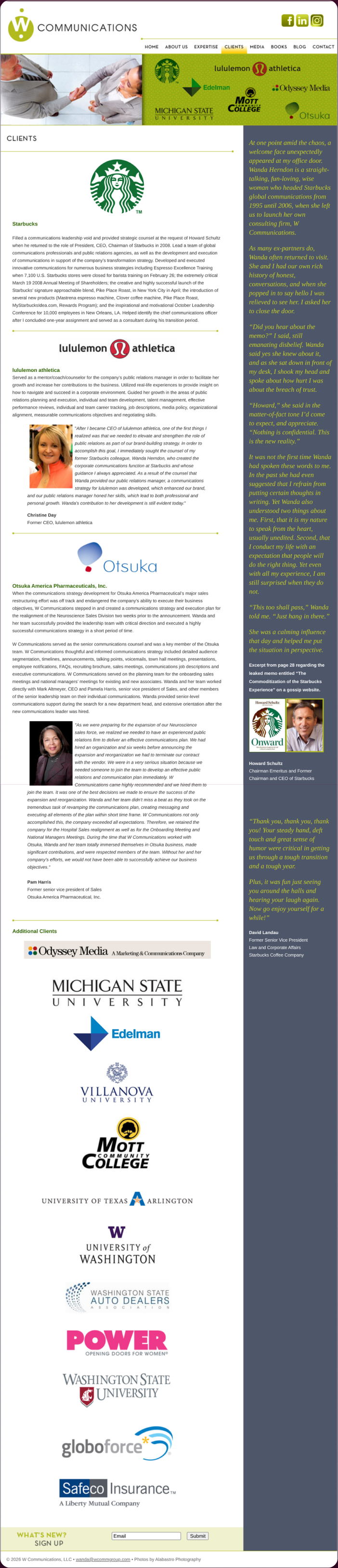
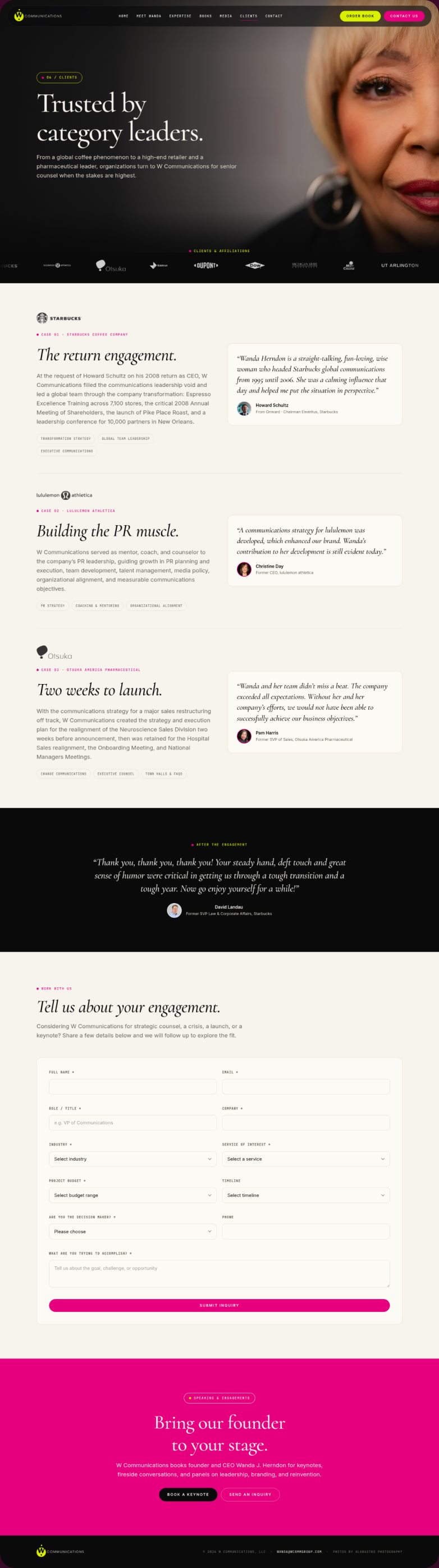
- Names without context. A list of client names with no statement of what the work was leaves the buyer guessing whether it was a keynote, a campaign or a crisis. Evidence of expertise only builds trust when the reader can see what the expertise was applied to. Source: Nielsen Norman Group, 2016.
- Logos as decoration. A logo wall is treated by the eye as decorative, and the eyetracking research shows decorative imagery is skipped. Source: Nielsen Norman Group, 2010.
- The credibility question left open. A buyer asks what did you do for them. A page that only says who was served does not answer it. Source: Stanford Persuasive Technology Lab, Fogg et al., 2002.
After: what changed and why it works
- What the work was, beside each name. Every client entry states the engagement, so the name becomes evidence rather than ornament. Source: Nielsen Norman Group, 2016.
- Informative, not decorative. With a line of context next to it, each logo becomes information the eye stops on, which is the difference the photo research draws between studied and ignored imagery. Source: Nielsen Norman Group, 2010.
- Specific claims a buyer can verify. Naming the work lets the buyer check it, and verifiable specifics are the form of proof the Stanford guidelines rank highest. Source: Stanford Persuasive Technology Lab, Fogg et al., 2002.
Sources cited in this section
- Nielsen Norman Group (2016), Trustworthiness in Web Design: 4 Credibility Factors.
- Nielsen Norman Group (2010), Photos as Web Content (eyetracking: decorative stock photos are ignored, informative photos are studied).
- Stanford Persuasive Technology Lab, Fogg et al. (2002), Stanford Web Credibility Research: 46.1% of credibility comments concerned the visual design of the site.
5. What does a producer need on a media page?
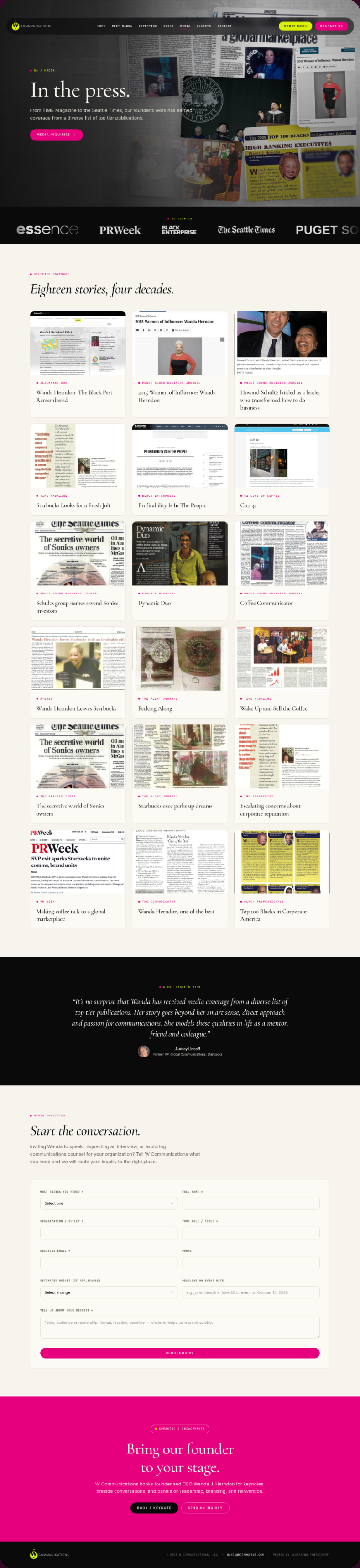
UX and UI analysis, before against after
Before: what the design cost the visitor
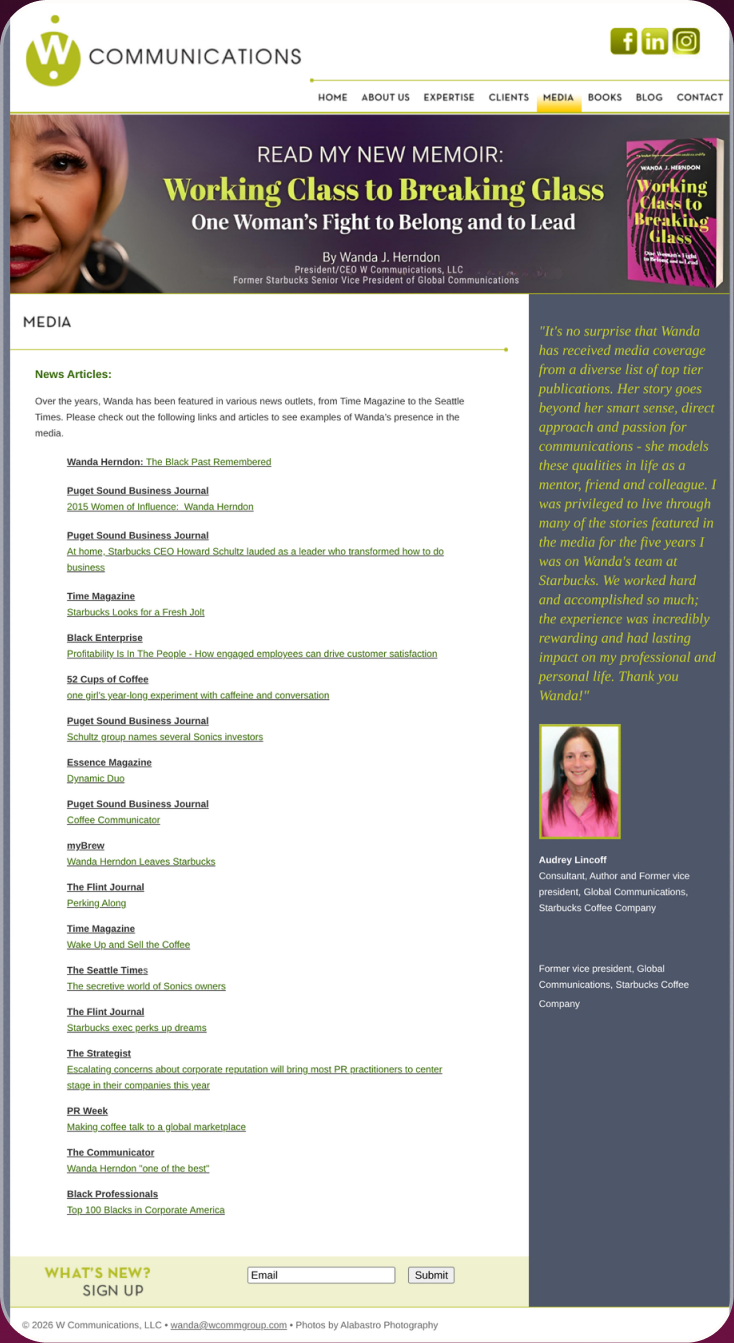
- An email was required before anything was usable. A producer booking a guest on a deadline needs a bio, a headshot and a topic list immediately. Gating them behind an email is a form placed before its purpose, and the form research shows people abandon exactly that. Source: Nielsen Norman Group, 2018.
- The fastest visitor was the most blocked. The person under the most time pressure had to wait for a reply. That is the foraging cost the research says drives people to the next source. Source: Xerox PARC, Pirolli and Card, Psychological Review, 1999.
- No status, no timeline. Nothing told the producer whether or when anything would arrive, which is the visibility failure the heuristics name first. Source: Nielsen Norman Group, 2024.
After: what changed and why it works
- Usable without sending an email. Bio, photos and topics are on the page and downloadable, so a producer can use them in the minutes they have. Source: Nielsen Norman Group, 2018.
- Everything in scan order. The assets a producer needs are chunked and labelled, so they can be found and taken without reading. Source: Nielsen Norman Group, 2016.
- Contact remains, but as a second step. The email route is still there for anything the page does not cover, placed after the value rather than in front of it. Source: Nielsen Norman Group, 2024.
Sources cited in this section
- Nielsen Norman Group (2018), Website Forms Usability: Top 10 Recommendations.
- Xerox PARC, Pirolli and Card, Psychological Review (1999), Information Foraging: people follow the strongest scent toward the answer and leave when it weakens.
- Nielsen Norman Group (2024), 10 Usability Heuristics for User Interface Design.
- Nielsen Norman Group (2016), How Chunking Helps Content Processing.
6. What should a speaking page state before the enquiry?
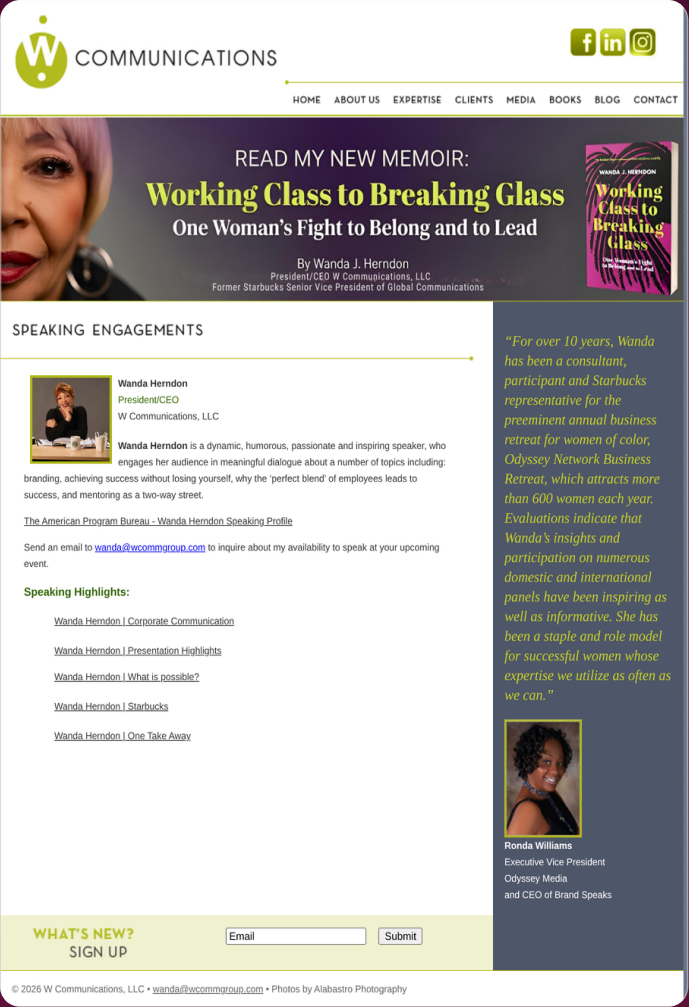
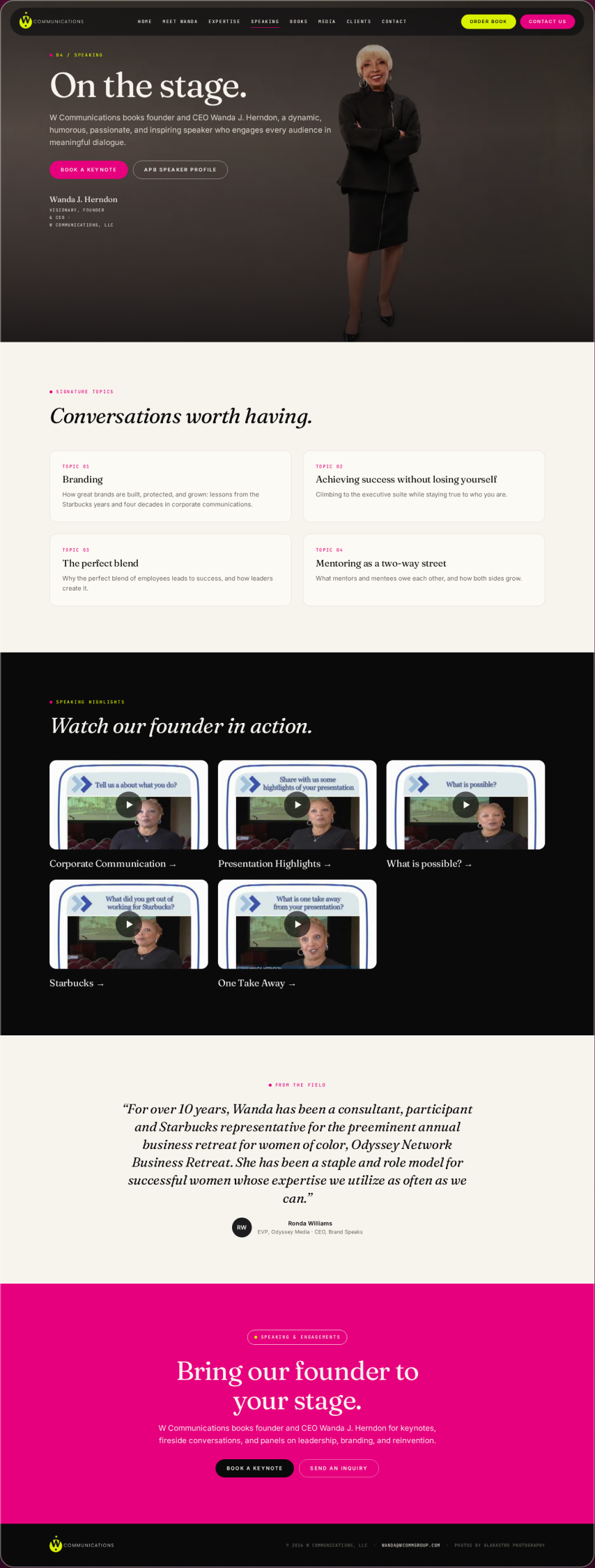
UX and UI analysis, before against after
Before: what the design cost the visitor
- No formats, topics or audience. An organiser deciding whether to book a speaker needs to know what talks exist, how long they run and who they suit. Without those, the enquiry form asked for interest the page had not earned. Source: Nielsen Norman Group, 2018.
- The page could not be scanned for fit. With nothing listed, a scanning reader had no way to match the speaker to their event. Source: Nielsen Norman Group, 1997.
- Trust without evidence. A speaking page that does not show past formats and topics offers no demonstrated expertise, which the credibility research treats as essential. Source: Nielsen Norman Group, 2016.
After: what changed and why it works
- Formats and topics stated. The page lists what is offered, so an organiser can see the fit before contacting anyone. That is disclosure placed before the ask. Source: Nielsen Norman Group, 2016.
- One enquiry action. After the facts, the page asks once. A single action at the end of a clear page is the pattern the choice research supports. Source: Columbia University and Stanford University, Iyengar and Lepper, Journal of Personality and Social Psychology, 2000.
- Structured for comparison. Formats laid out as discrete blocks let the organiser compare options the way the comparison research says people prefer, one difference at a time. Source: Nielsen Norman Group, 2017.
Sources cited in this section
- Nielsen Norman Group (2018), Website Forms Usability: Top 10 Recommendations.
- Nielsen Norman Group (1997), How Users Read on the Web (79% of users scan rather than read).
- Nielsen Norman Group (2016), Trustworthiness in Web Design: 4 Credibility Factors.
- Columbia University and Stanford University, Iyengar and Lepper, Journal of Personality and Social Psychology (2000), When Choice is Demotivating: more options reduced purchase rate roughly tenfold.
- Nielsen Norman Group (2017), Comparison Tables for Products, Services, and Features.
7. How should published work be presented?
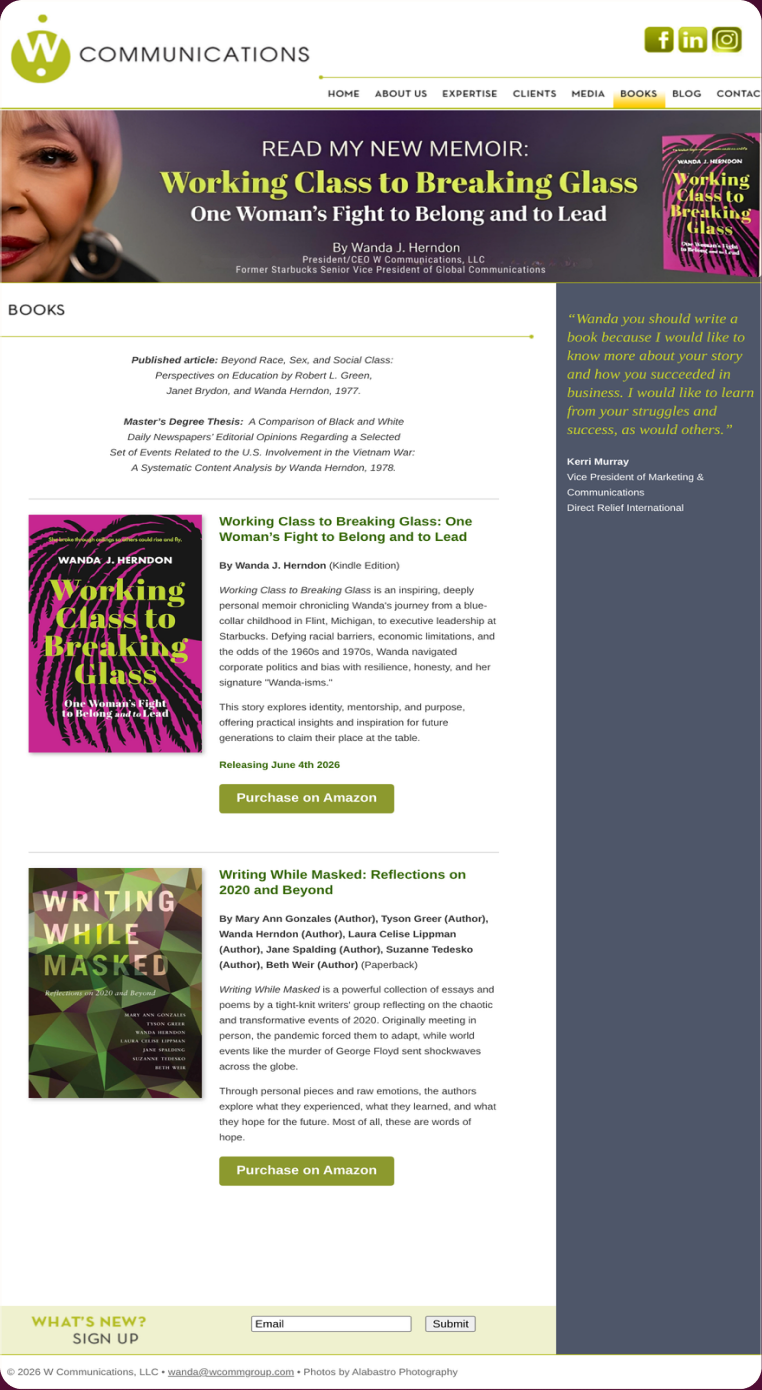
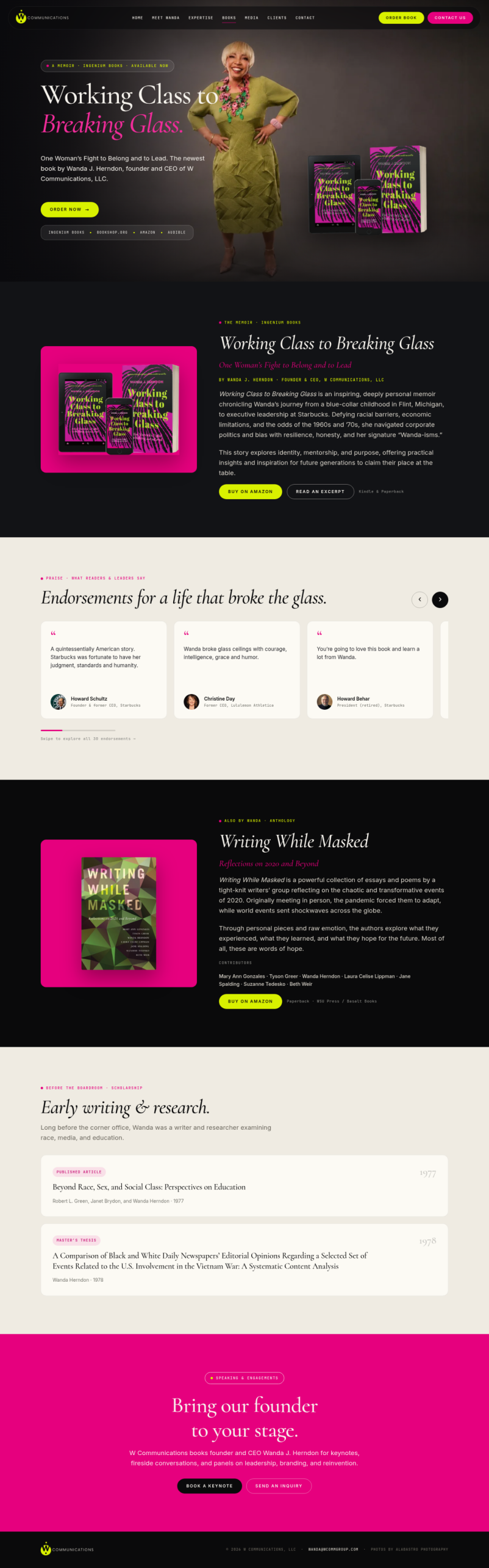
UX and UI analysis, before against after
Before: what the design cost the visitor
- Books as images with no description. A cover image alone tells a reader nothing about the book. The photo research finds that an image without accompanying information is treated as decoration and passed over. Source: Nielsen Norman Group, 2010.
- No route to purchase. The page showed the books but gave no way to buy them, which is a dead end where the visitor’s intent was clearest. Source: Xerox PARC, Pirolli and Card, Psychological Review, 1999.
- Nothing for an engine to cite. Without a title, a description and a link, the books did not exist as answerable facts on the web. Source: Google Search Central, 2024.
After: what changed and why it works
- Description beside each title. Every book now carries a paragraph saying what it is and who it is for, which turns a cover into information. Source: Nielsen Norman Group, 2010.
- A purchase route next to each book. The action sits beside the item, so a reader who decides can act without hunting. Source: Nielsen Norman Group, 2013.
- Citable entries. Title, description and link give search and answer engines a complete fact to return when someone asks what this author has published. Source: Google Search Central, 2024.
Sources cited in this section
- Nielsen Norman Group (2010), Photos as Web Content (eyetracking: decorative stock photos are ignored, informative photos are studied).
- Xerox PARC, Pirolli and Card, Psychological Review (1999), Information Foraging: people follow the strongest scent toward the answer and leave when it weakens.
- Google Search Central (2024), Creating helpful, reliable, people-first content.
- Nielsen Norman Group (2013), Minimize Cognitive Load to Maximize Usability.
8. How many ways to make contact is the right number?
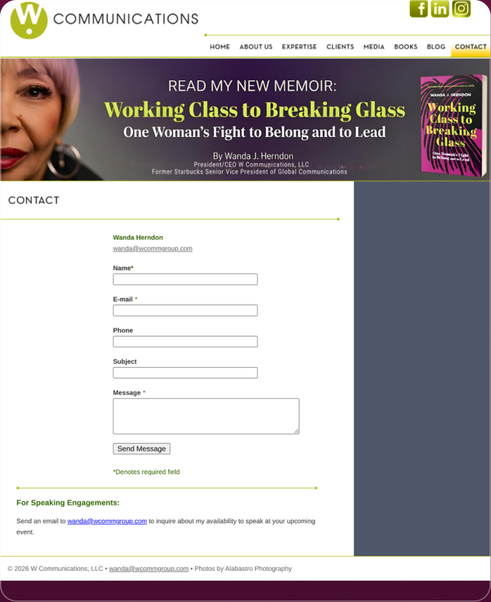
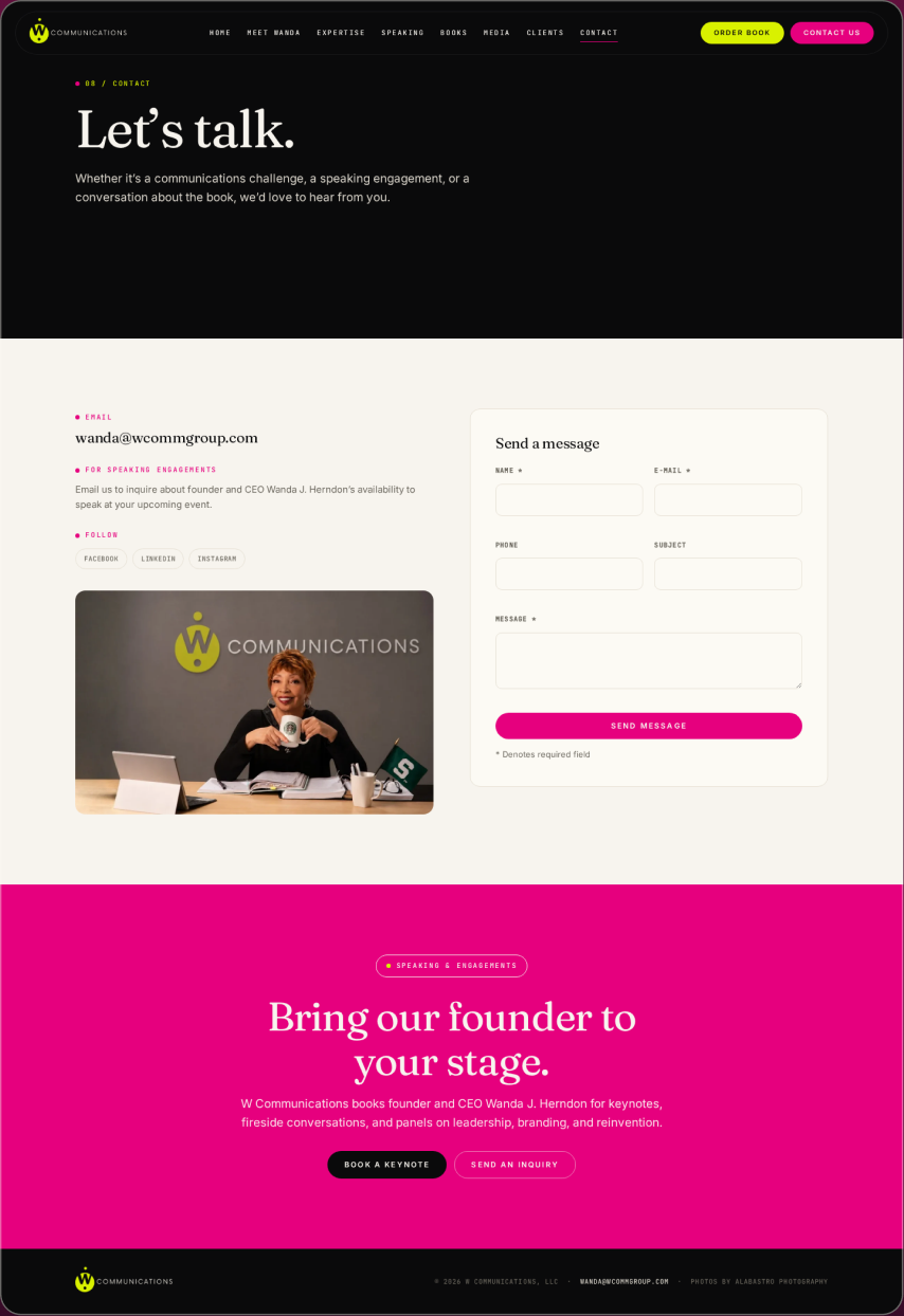
UX and UI analysis, before against after
Before: what the design cost the visitor
- Several competing routes. A contact page offering email, phone, a form and social links with equal weight makes the visitor choose a channel before they have made contact. More equal options lowered the rate at which anyone acted in the choice research. Source: Columbia University and Stanford University, Iyengar and Lepper, Journal of Personality and Social Psychology, 2000.
- No indication of which was fastest. A producer on a deadline needs to know which route gets a reply first. The page did not say, so the fastest visitor had to guess. Source: Nielsen Norman Group, 2013.
- No reply expectation. Without a stated response time, the visitor had no visibility of what would happen after they sent anything. Source: Nielsen Norman Group, 2024.
After: what changed and why it works
- One primary route. The page names the channel to use, with the others secondary. A single recommended path removes the choice the research shows people stall on. Source: Columbia University and Stanford University, Iyengar and Lepper, Journal of Personality and Social Psychology, 2000.
- The reply expectation stated. The visitor is told when to expect a response, which closes the status loop the heuristics require. Source: Nielsen Norman Group, 2024.
- Plain language, one screen. The whole page fits in the zone where attention is concentrated, and says what it needs to in plain words. Source: Nielsen Norman Group, 2017.
Sources cited in this section
- Columbia University and Stanford University, Iyengar and Lepper, Journal of Personality and Social Psychology (2000), When Choice is Demotivating: more options reduced purchase rate roughly tenfold.
- Nielsen Norman Group (2013), Minimize Cognitive Load to Maximize Usability.
- Nielsen Norman Group (2024), 10 Usability Heuristics for User Interface Design.
- Nielsen Norman Group (2017), Plain Language Is for Everyone, Even Experts.
Before against after, with the measured column
| What | Before | After | Measured |
|---|---|---|---|
| Audience routing | 1 page for 4 audiences | 8 pages, 1 audience each | Not measured |
| Credential | Below the narrative | Leads the biography page | Not measured |
| Media access | Email required first | Usable on the page | Not measured |
| Citability | Prose, no structure | Structured headings and metadata | Not measured |
What was built?
- A brand system covering mark, type, colour and layout rules, applied across all 8 pages.
- 8 pages, 1 question each for media, clients, speaking and published work.
- A media page a producer can use without sending an email to get anything.
- Structured headings and metadata so an answer engine can cite the practice without a person in the loop.
What changed, and what is not claimed?
8 pages shipped, each carrying 1 audience and 1 question, on a brand system that covers mark, type, colour and layout. The media page can be used without an email, and the pages are structured so a fact can be lifted out of them and cited correctly.
What this case cannot tell you
- Whether the redesign changed enquiry volume or quality.
- Whether the media page produced more bookings.
- Whether the speaking page shortened the enquiry cycle.
- Whether the structural work increased citations in answer engines.
The honest limitation
No performance data exists for this rebuild. No analytics survived it. Everything on this page is an architecture claim and should be read as one.
This engagement runs as Website Design.
Pick a time. We measure your starting numbers on the call.
Mobile conversion rate, AI-referred traffic and lead count, measured before any work starts. You leave with the window and the number, whether or not you hire me.
If the calendar does not load here, the host is blocking the frame. Open it in a new tab with the link above.
