
- Result
- 290 products, Wix to WordPress
- Client
- S.T. Dupont Vancouver, the authorized flagship store of Canada
- Scope
- Platform migration, storefront design, catalogue build
- Stack
- WordPress, WooCommerce, Bricks, Clover POS
290 products moved from Wix to WordPress for a luxury retailer
WordPress and WooCommerce migration for a luxury retailer in Vancouver. Client: S.T. Dupont Vancouver, The authorized S.T. Dupont flagship store of Canada.
A man is looking at a lighter that costs more than his monthly car payment. He has read about the maison. He knows the finish is lacquer over brass and he knows roughly what that should cost. Then he reaches the product page. The photograph is small. The description is 2 lines. There is no finish, no serial, no country of origin, and no sign that this shop is allowed to sell the brand at all. He does not doubt the lighter. He doubts the shop. So he closes the tab and telephones the store to ask whether they are real. That call happens often enough that the staff have an answer ready. Every one of those calls is a sale the website failed to close on its own.
A storefront is not a catalogue. It is a claim about whether the seller is who they say they are.
What was actually happening?
The catalogue was the problem the client named. The platform was the problem underneath it. Wix held 290 products in a structure that could not carry finishes, variants or serials, so each product page said less than the display case in the store. Payment ran through Clover, which the template treated as an afterthought. The authorized dealer status, the single fact that separates this shop from a reseller, sat in the footer where no first-time buyer reads.
Every figure below is a real capture of the live page. Each frame caps its height and scrolls inside itself, so a full-page capture can be read end to end without leaving the figure. Both frames are reachable by keyboard. Nothing here is a mockup or a drawn schematic.
1. What does a luxury storefront homepage have to prove above the fold?
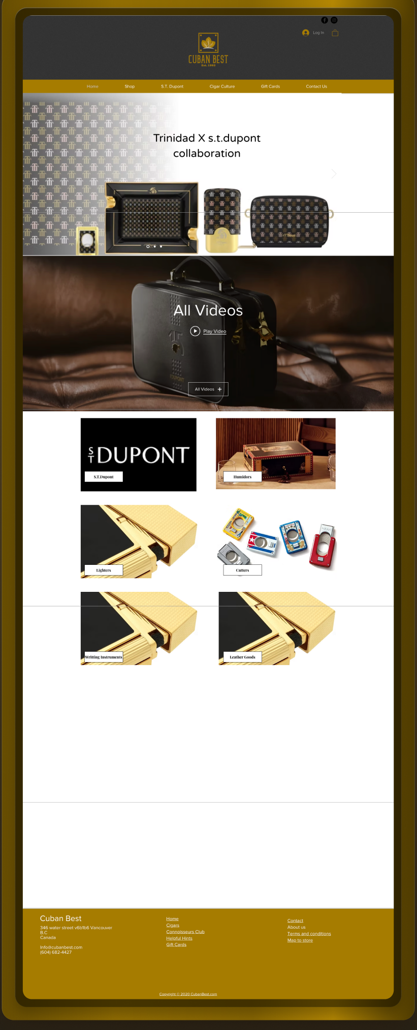

UX and UI analysis, before against after
Before: what the design cost the visitor
- The proof was missing from the first screen. Authorized dealer status, the one fact a luxury buyer needs before trusting a Canadian storefront with a maison brand, did not appear at all. Visitors decide whether a site is credible largely on what they see first, and design was the single most cited factor in Stanford’s credibility research. Source: Stanford Persuasive Technology Lab, Fogg et al., 2002.
- The product sat two scroll lengths down. Fifty-seven percent of viewing time happens above the fold and three quarters within the first two screens, so a first product placed below two screens of template layout was outside the window where most attention is spent. Source: Nielsen Norman Group, 2018.
- The template announced itself. A stock layout with the maison name used once reads as generic, and generic reads as untrustworthy. Trust on the web is built from visual design quality, up-front disclosure and evidence of real expertise, none of which a template first fold supplied. Source: Nielsen Norman Group, 2016.
After: what changed and why it works
- Dealer status leads. The authorized dealer statement is the first credential on the page, which puts the strongest trust signal in the zone where the research shows attention is concentrated. Source: Nielsen Norman Group, 2018.
- The collection rail is visible without scrolling. Product is the reason a storefront exists. Surfacing the rail in the first fold matches the F-shaped scanning pattern, where the eye sweeps the top band and the left edge before anything else. Source: Nielsen Norman Group, 2017.
- One primary action. A single call to action replaces a spread of equal-weight options. Reducing the number of competing choices measurably raises the rate at which people act, a result first shown in the Iyengar and Lepper choice experiments. Source: Columbia University and Stanford University, Iyengar and Lepper, Journal of Personality and Social Psychology, 2000.
Sources cited in this section
- Stanford Persuasive Technology Lab, Fogg et al. (2002), Stanford Web Credibility Research: 46.1% of credibility comments concerned the visual design of the site.
- Nielsen Norman Group (2018), Scrolling and Attention (57% of viewing time is above the fold, 74% within the first two screens).
- Nielsen Norman Group (2016), Trustworthiness in Web Design: 4 Credibility Factors.
- Nielsen Norman Group (2017), F-Shaped Pattern of Reading on the Web.
- Columbia University and Stanford University, Iyengar and Lepper, Journal of Personality and Social Psychology (2000), When Choice is Demotivating: more options reduced purchase rate roughly tenfold.
2. How do you move 290 products without losing the catalogue?
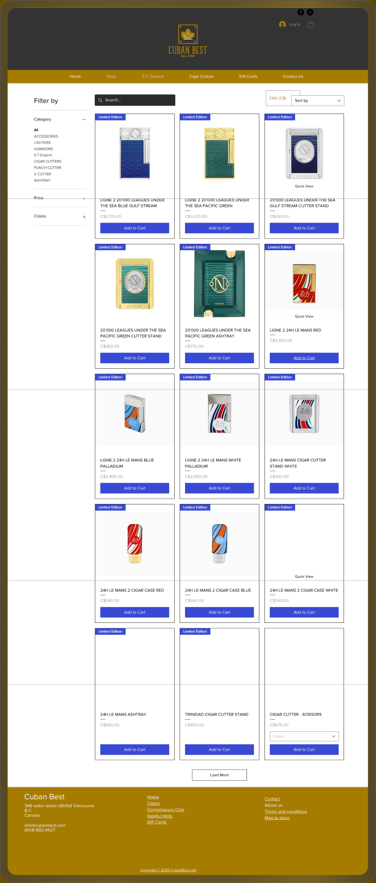
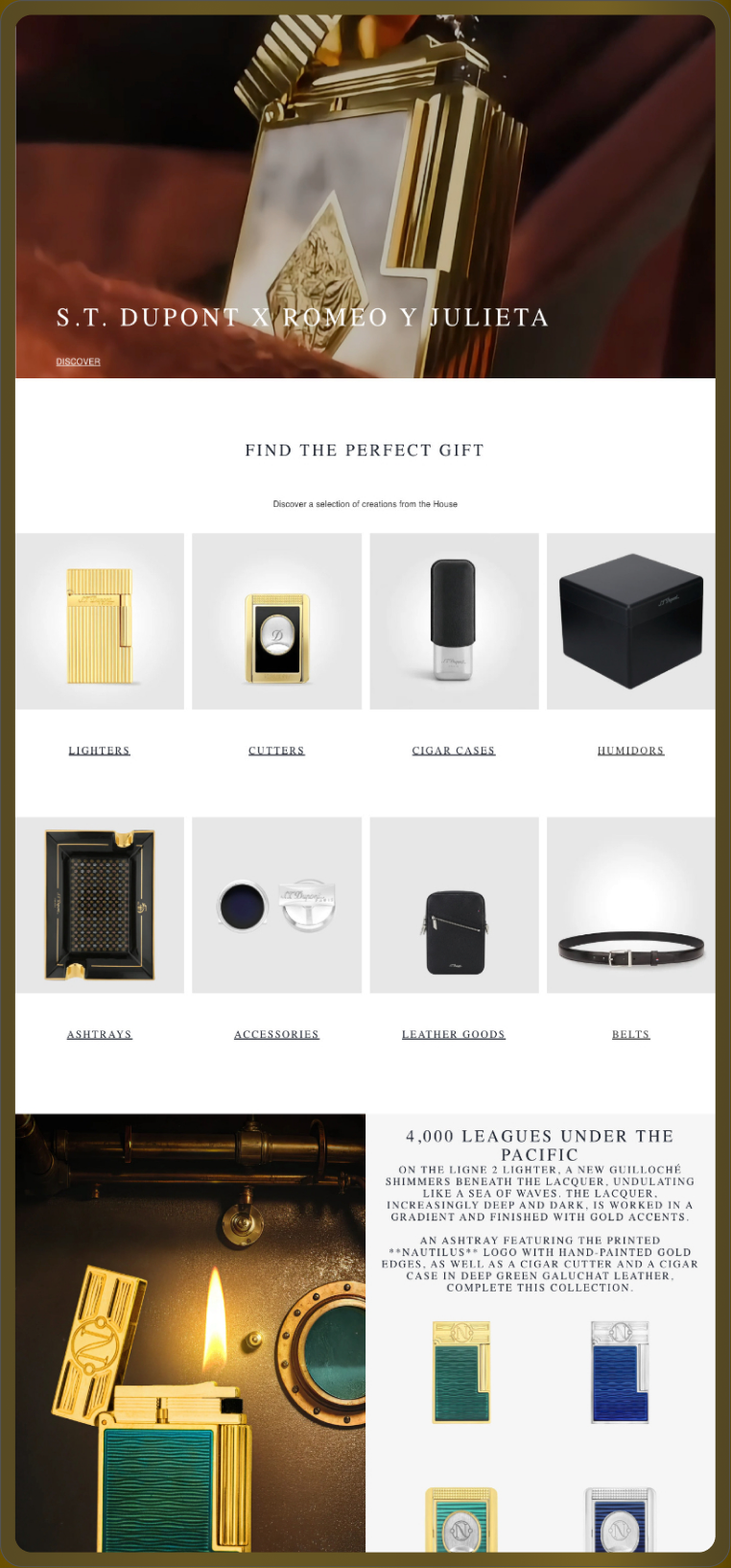
UX and UI analysis, before against after
Before: what the design cost the visitor
- No way to narrow 290 products. A flat grid with no filter for maison, finish or price forces the buyer to scan everything. Baymard’s product list benchmark treats missing category-specific filters as one of the most damaging list-page failures for stores with large catalogues. Source: Baymard Institute, 2023.
- Titles were cut off. Truncated product names hide the finish and the collection, which are the attributes a lighter or pen buyer is actually deciding on. A list item that cannot be told apart from its neighbour cannot be chosen. Source: Baymard Institute, 2023.
- Price was not on the card. Hiding price until the product page adds a click to every comparison. Extra steps in the path to purchase are a leading cause of abandonment in Baymard’s ongoing checkout research. Source: Baymard Institute, 2024.
After: what changed and why it works
- Filters by maison, finish and price. The catalogue can be narrowed the way the buyer thinks about it. Filters that match how people describe the product are the core recommendation of Baymard’s product list research. Source: Baymard Institute, 2023.
- Full titles on every card. Nothing is truncated, so two products can be compared from the list without opening either. This is chunking applied to a catalogue: each card is a complete, self-contained unit of information. Source: Nielsen Norman Group, 2016.
- Price on every card. The number the buyer is weighing sits beside the item. Showing cost early removes the surprise that Baymard records as the single largest reason people abandon a purchase. Source: Baymard Institute, 2024.
Sources cited in this section
- Baymard Institute (2023), Product List and Filtering UX benchmark.
- Baymard Institute (2024), Reasons for Abandonment During Checkout (22% cite a checkout that was too long or complicated).
- Nielsen Norman Group (2016), How Chunking Helps Content Processing.
Before against after, with the measured column
| What | Before | After | Measured |
|---|---|---|---|
| Platform | Wix template | WordPress and WooCommerce on Bricks | Yes, 290 products migrated |
| Catalogue structure | Flat product list | Maison, finish and price taxonomy | Yes, structure verified at launch |
| Payment | Clover handled by the template | Clover POS connected and tested at checkout | Yes, path tested before launch |
| Dealer proof | Footer | Above the fold and on every product page | Not measured |
What was built?
- WordPress and WooCommerce on Bricks with a Kadence child theme bound to a design system, so the store can be edited without a developer.
- 290 products migrated with taxonomy, pricing and product copy intact.
- Clover POS connected to checkout, with the payment path tested end to end before launch.
- Authorized dealer proof moved above the fold and repeated on every product page.
- Collection architecture built around maison, finish and price, which is how the catalogue is actually browsed.
What did the migration produce?
290 products are live on WordPress and WooCommerce with taxonomy, pricing and product copy intact, and Clover POS is connected at checkout. Same catalogue, same photography, 1 designer.
The honest limitation
This case reports the build, not the trade. Store revenue before and after the migration is not published on this page, so nothing here should be read as a sales figure.
This engagement runs as Website Design.
Pick a time. We measure your starting numbers on the call.
Mobile conversion rate, AI-referred traffic and lead count, measured before any work starts. You leave with the window and the number, whether or not you hire me.
If the calendar does not load here, the host is blocking the frame. Open it in a new tab with the link above.
