
- Result
- +58% organic traffic, +28% MQL conversion, from the replay library and opt-in templates
- Client
- Advisor Websites, a Vancouver SaaS platform for financial advisors
- Scope
- Homepage, webinar library, replay template, booking page, personalized pages
- Stack
- Web, template system
A webinar library and booking page rebuilt for a financial advisor SaaS platform
Webinar library and booking page redesign for a financial advisor SaaS platform. Client: Advisor Websites, A Vancouver SaaS platform serving financial advisors.
An advisor registers for a webinar at 11 in the morning and forgets it by 3 in the afternoon. The session runs without her. 2 days later she remembers, searches her inbox, finds the invitation, and clicks the link. It goes to a registration page for an event that has already happened. There is no recording, no summary, no next session, and no way to ask for one. She was the most interested person on that list. The company spent money to find her, she raised her hand, and then the only door left open was the one she had already walked through. Nothing failed. Nothing was built.
A webinar is not an event. It is a page that keeps answering after the room empties.
What was actually happening?
Recordings expired inside an inbox, so every session stopped earning the day after it aired. The booking page asked for a decision before it had given a reason. Partner traffic and general traffic landed on the same page and were asked the same question, which meant the page could only be right for one of them.
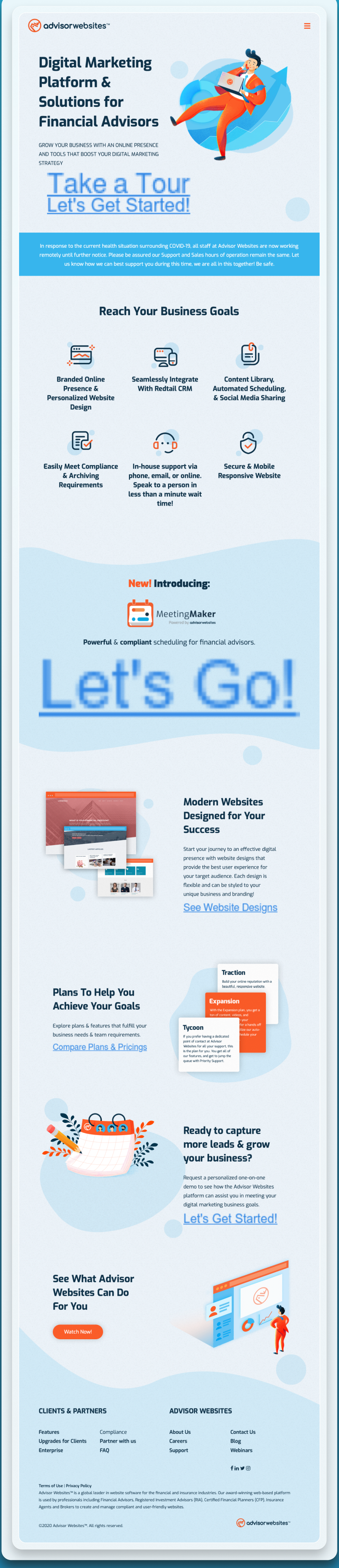
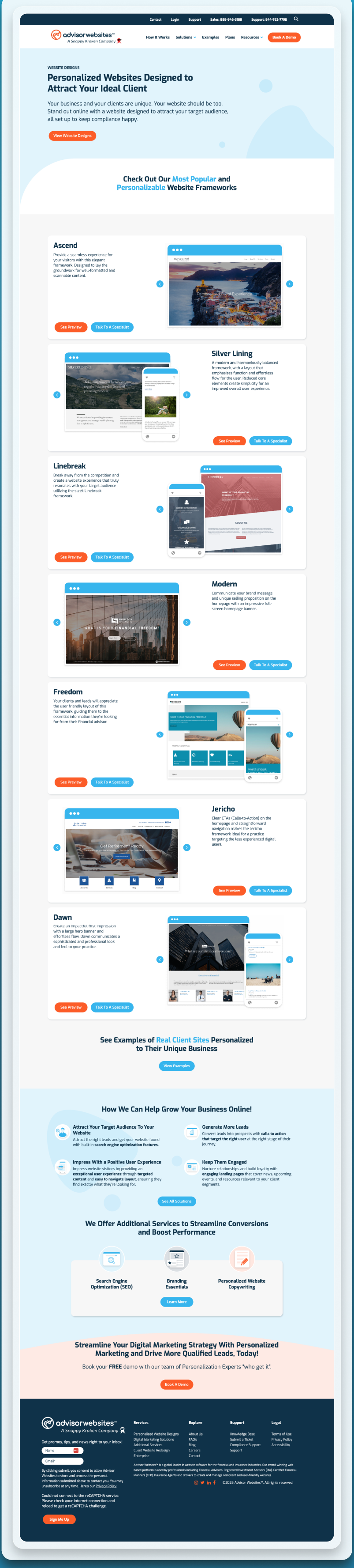
Every figure below is a real capture of the live page. Each frame caps its height and scrolls inside itself, so a full-page capture can be read end to end without leaving the figure. Both frames are reachable by keyboard. Nothing here is a mockup or a drawn schematic.
1. What does a SaaS homepage owe an advisor who arrived from a webinar?
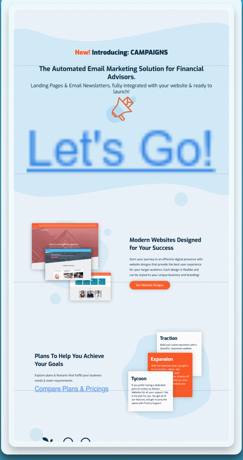
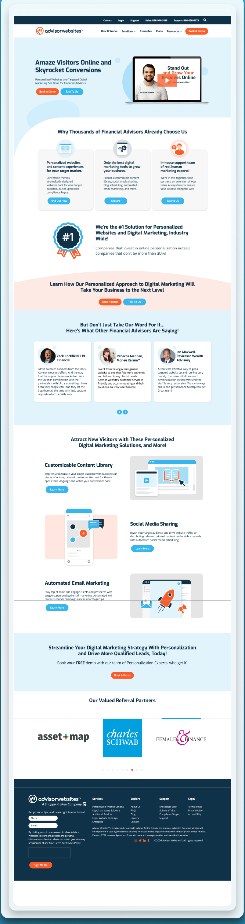
UX and UI analysis, before against after
Before: what the design cost the visitor
- Several competing actions. Multiple calls to action of equal weight split the visitor’s attention. The choice research shows that more options lower the rate at which anyone chooses. Source: Columbia University and Stanford University, Iyengar and Lepper, Journal of Personality and Social Psychology, 2000.
- No route back to the session. An advisor who arrived from a webinar had no way to return to it. The scent that brought them was cut, which the foraging research identifies as the point at which people abandon a task. Source: Xerox PARC, Pirolli and Card, Psychological Review, 1999.
- Attention spent above the fold was wasted. The first screen carried no clear next step for the largest arriving audience, and that is where more than half of all viewing time is spent. Source: Nielsen Norman Group, 2018.
After: what changed and why it works
- One primary action. A single next step replaces a set of competing ones, which is the direct fix the choice research prescribes. Source: Columbia University and Stanford University, Iyengar and Lepper, Journal of Personality and Social Psychology, 2000.
- A visible route into the replay library. The advisor who came from a session can follow the same scent straight to the recordings. That continuity is what information scent means in practice. Source: Nielsen Norman Group, 2003.
- The first fold does one job. The screen that receives most attention now names the audience and offers one path, in line with the headline research on making the reader feel addressed. Source: Nielsen Norman Group, 2015.
Sources cited in this section
- Columbia University and Stanford University, Iyengar and Lepper, Journal of Personality and Social Psychology (2000), When Choice is Demotivating: more options reduced purchase rate roughly tenfold.
- Xerox PARC, Pirolli and Card, Psychological Review (1999), Information Foraging: people follow the strongest scent toward the answer and leave when it weakens.
- Nielsen Norman Group (2018), Scrolling and Attention (57% of viewing time is above the fold, 74% within the first two screens).
- Nielsen Norman Group (2003), Information Scent: how users decide where to click.
- Nielsen Norman Group (2015), Headings Are Pick-Up Lines: 5 Tips for Writing Headlines That Convert.
2. How should a webinar replay library be structured?
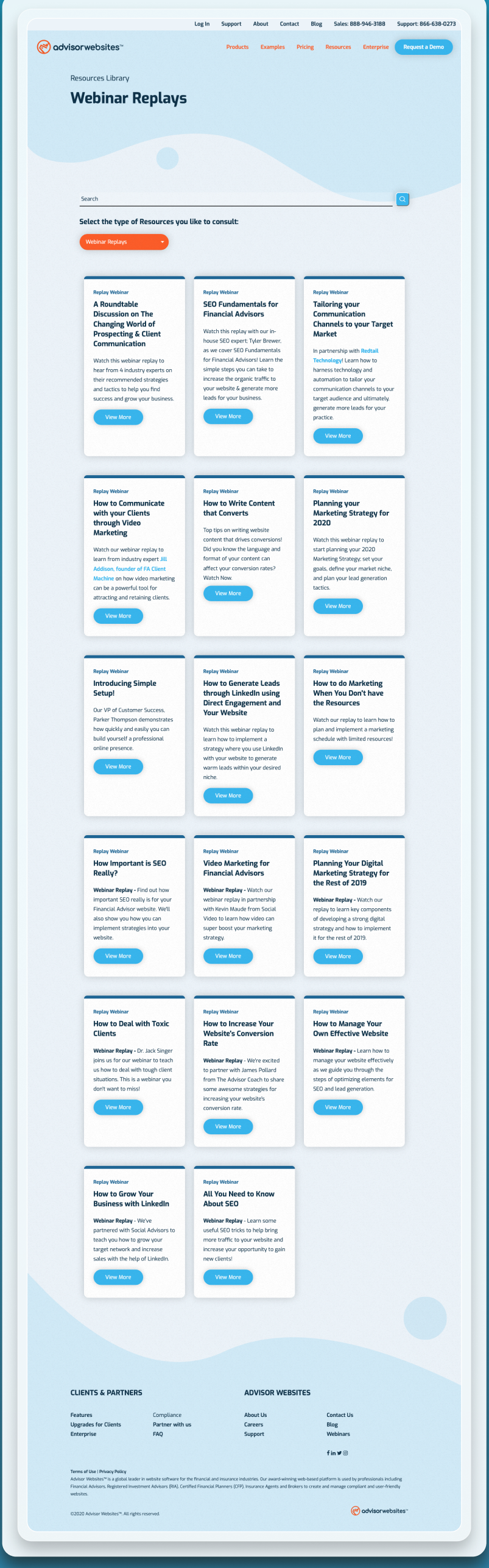
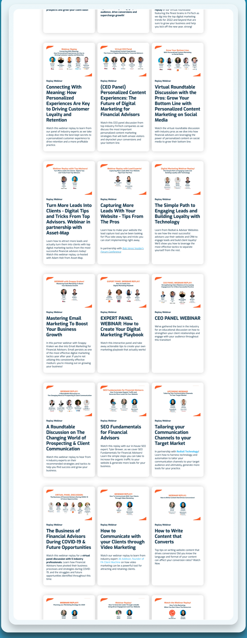
UX and UI analysis, before against after
Before: what the design cost the visitor
- No library existed. Recordings lived in email and expired with the invitation. Content that cannot be found after the event has no findability at all, which the usability heuristics treat as a failure of recognition over recall. Source: Nielsen Norman Group, 2024.
- Every replay depended on memory. A visitor had to remember which email held which session. Asking people to recall rather than recognise is one of the most reliable ways to lose them. Source: Nielsen Norman Group, 2013.
- Nothing for search engines to index. Recordings inside email are invisible to search, so the content produced no lasting traffic. Google’s guidance rewards pages that exist to answer a specific question. Source: Google Search Central, 2024.
After: what changed and why it works
- Each replay is a page of its own. One session per page is chunking at the site level: every recording is a discrete, findable unit rather than a line inside a message. Source: Nielsen Norman Group, 2016.
- Browsable after the session has aired. The library is available on demand, so recognition replaces recall and the visitor can scan titles rather than remember them. Source: Nielsen Norman Group, 2024.
- Indexable. Each replay page has a title, a summary and a stable address, which is what makes it citable by search and answer engines. Source: Google Search Central, 2024.
Sources cited in this section
- Nielsen Norman Group (2024), 10 Usability Heuristics for User Interface Design.
- Nielsen Norman Group (2013), Minimize Cognitive Load to Maximize Usability.
- Google Search Central (2024), Creating helpful, reliable, people-first content.
- Nielsen Norman Group (2016), How Chunking Helps Content Processing.
3. What belongs on a single webinar replay page?
UX and UI analysis, before against after
Before: what the design cost the visitor
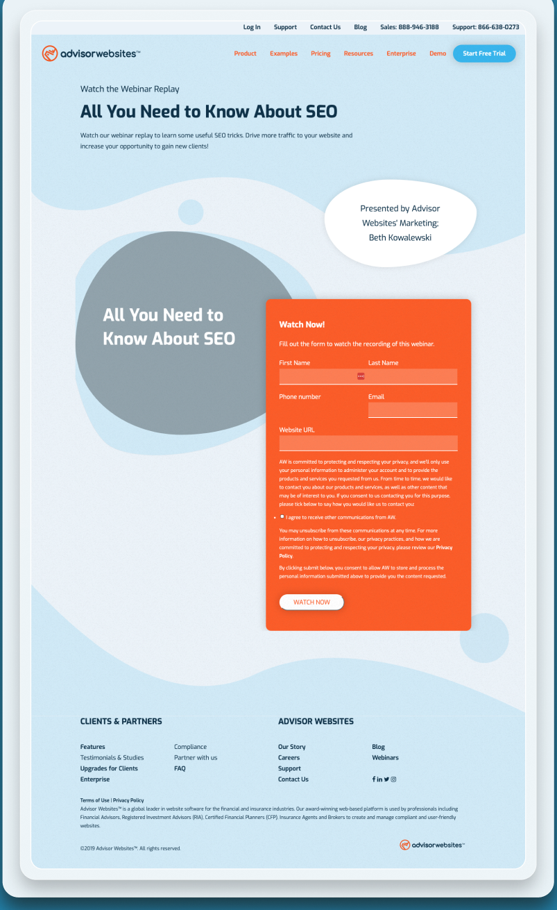
- A registration page for an event that had already happened. The page asked the visitor to sign up for something over. That mismatch between what the page says and what is true is a direct credibility failure. Source: Nielsen Norman Group, 2016.
- No summary, no recording, no next step. A visitor could not tell what the session covered without watching it, and had nowhere to go afterwards. Pages that make people work for the basic facts lose them. Source: Nielsen Norman Group, 2013.
- Not reusable. Each page was built by hand, so the marketing team could not publish the next one without a developer. The gap between events widened and the library never grew. Source: Nielsen Norman Group, 2024.
After: what changed and why it works
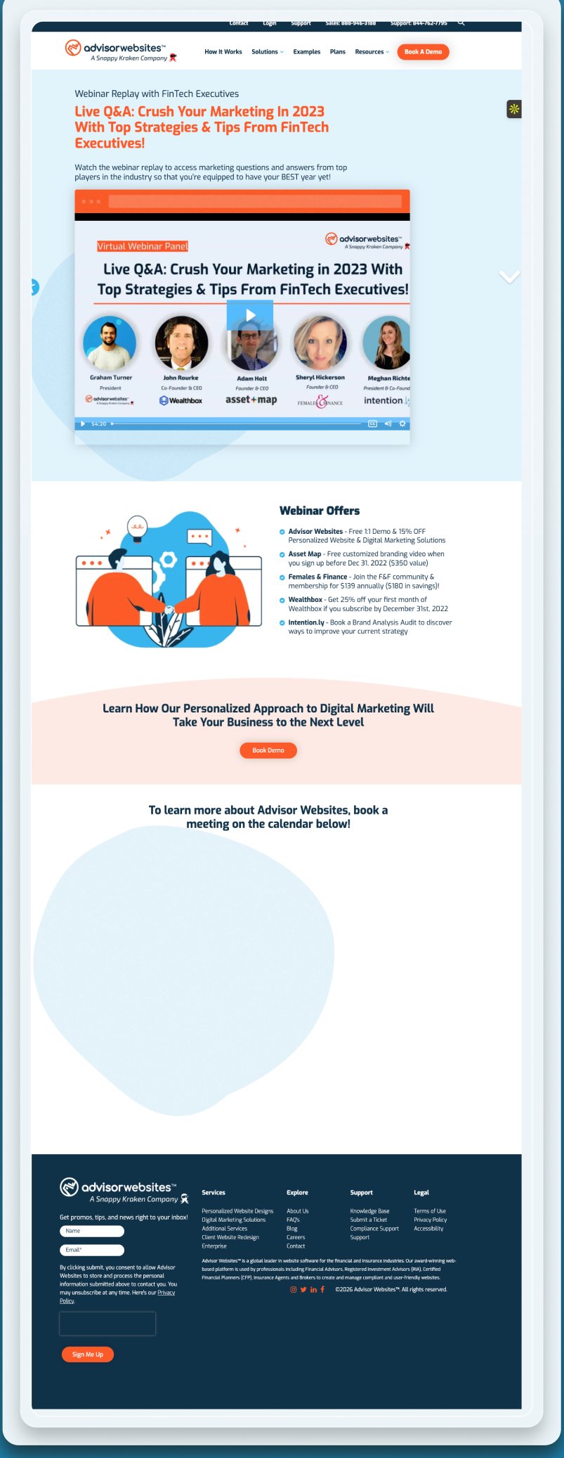
- The recording, the summary and one next action. Everything the visitor needs sits on one page in scan order: what it is, what it covers, what to do next. That is the structure the scanning research says people can actually use. Source: Nielsen Norman Group, 1997.
- Built as a template the marketing team can fill. Consistency across replay pages means a visitor who has used one can use all of them without learning anything new, which is the consistency heuristic applied. Source: Nielsen Norman Group, 2024.
- A summary that can be quoted. A plain-language summary at the top gives search and answer engines a passage to cite, and gives the scanning reader the point in one paragraph. Source: Nielsen Norman Group, 2017.
Sources cited in this section
- Nielsen Norman Group (2016), Trustworthiness in Web Design: 4 Credibility Factors.
- Nielsen Norman Group (2013), Minimize Cognitive Load to Maximize Usability.
- Nielsen Norman Group (2024), 10 Usability Heuristics for User Interface Design.
- Nielsen Norman Group (1997), How Users Read on the Web (79% of users scan rather than read).
- Nielsen Norman Group (2017), Plain Language Is for Everyone, Even Experts.
4. How much should a booking page ask for before it has given a reason?
UX and UI analysis, before against after
Before: what the design cost the visitor
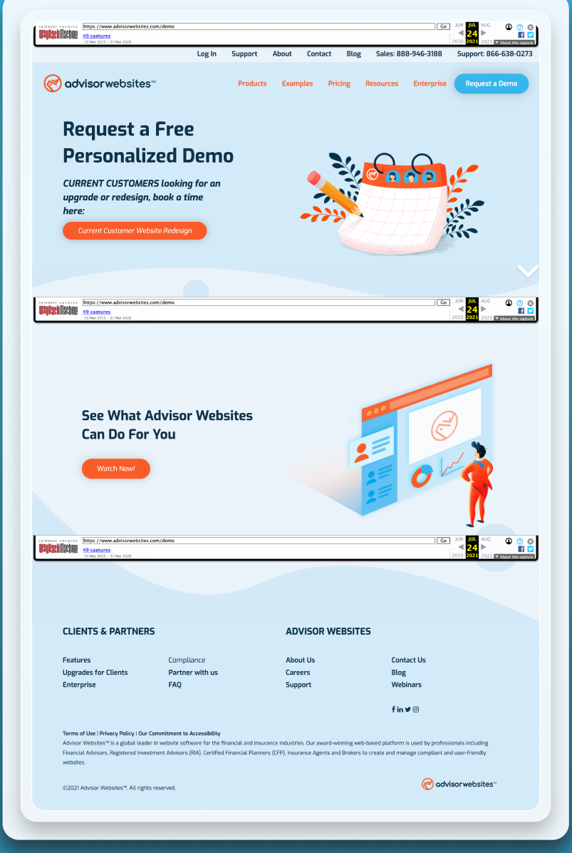
- The form came before the reason. A booking form presented before any statement of why to book asks for commitment ahead of value. Form research is consistent that people abandon forms whose purpose is unclear. Source: Nielsen Norman Group, 2018.
- No focal point. Without a single clear action the page had no answer to the question a visitor is asking, which is what should I do here. Source: Nielsen Norman Group, 2013.
- Trust was assumed rather than earned. Asking for a booking without evidence of what the call delivers ignores the finding that credibility is built from disclosure and demonstrated expertise before any ask. Source: Nielsen Norman Group, 2016.
After: what changed and why it works
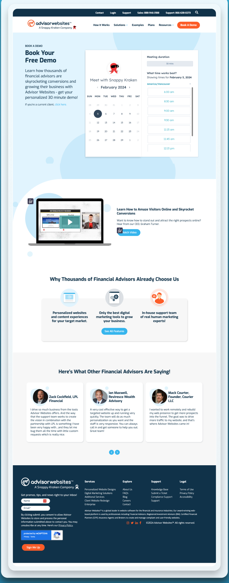
- The reason is stated first. The page explains what the call is for before it asks for anything. Purpose before the form is the first recommendation in the form usability guidance. Source: Nielsen Norman Group, 2018.
- One ask, one focal action. A single booking action gives the visitor one thing to do, in line with the cognitive load research on decision pages. Source: Nielsen Norman Group, 2013.
- Earned before asked. By stating the value and then asking once, the page follows the credibility sequence the Stanford guidelines set out. Source: Stanford Persuasive Technology Lab, Fogg et al., 2002.
Sources cited in this section
- Nielsen Norman Group (2018), Website Forms Usability: Top 10 Recommendations.
- Nielsen Norman Group (2013), Minimize Cognitive Load to Maximize Usability.
- Nielsen Norman Group (2016), Trustworthiness in Web Design: 4 Credibility Factors.
- Stanford Persuasive Technology Lab, Fogg et al. (2002), Stanford Web Credibility Research: 46.1% of credibility comments concerned the visual design of the site.
5. Should partner traffic land on the same page as everyone else?
UX and UI analysis, before against after
Before: what the design cost the visitor
- One page for everyone. Partner traffic and general traffic landed on the same generic page. A visitor sent by a partner arrived with a specific expectation the page did not acknowledge, and the scent broke. Source: Xerox PARC, Pirolli and Card, Psychological Review, 1999.
- No sign the visitor was in the right place. The headline research is explicit that a page which does not name its reader makes that reader doubt they belong. Source: Nielsen Norman Group, 2015.
- Attribution was impossible. With one page for all sources, nobody could say which partner produced which lead. Source: Nielsen Norman Group, 2024.
After: what changed and why it works
- A page that names the partner audience. The visitor is told, in the first line, that this page was built for them. That single sentence carries the scent from the referral through to the action. Source: Nielsen Norman Group, 2003.
- Recognition, not recall. The partner’s name on the page confirms the visitor is where they expected to be, which removes the doubt the heuristics call out. Source: Nielsen Norman Group, 2024.
- A page per source. Separate landing pages make it possible to see which partner sends leads, which turns a design choice into a measurement. Source: Google Search Central, 2024.
Sources cited in this section
- Xerox PARC, Pirolli and Card, Psychological Review (1999), Information Foraging: people follow the strongest scent toward the answer and leave when it weakens.
- Nielsen Norman Group (2015), Headings Are Pick-Up Lines: 5 Tips for Writing Headlines That Convert.
- Nielsen Norman Group (2024), 10 Usability Heuristics for User Interface Design.
- Nielsen Norman Group (2003), Information Scent: how users decide where to click.
- Google Search Central (2024), Creating helpful, reliable, people-first content.
Before against after, with the measured column
| What | Before | After | Measured |
|---|---|---|---|
| Recordings | Expired in email | A replay library with 1 page per session | Not measured |
| Replay page | Did not exist | A template the marketing team fills | Not measured |
| Booking page | Form before reason | Reason, then 1 ask | Not measured |
| Partner traffic | Generic landing page | Personalized pages per segment | Not measured |
What was built?
- A webinar replay library where each recording is a page that can be found after the session has aired.
- A replay template the marketing team can fill without a designer.
- The booking page rebuilt to state the reason before it asks, with 1 focal action.
- Personalized landing pages for partner segments, separate from general traffic.
What changed, and what is not claimed?
5 page types were rebuilt: homepage, webinar library, replay template, booking page and personalized pages. Each answers 1 question, and the replay library keeps every session in circulation instead of letting it expire in an inbox. No performance number is claimed for this engagement.
What this case cannot tell you
- Whether replay page visits turned into demonstration requests.
- Whether the rebuilt booking page raised completed bookings.
- Whether personalized pages outperformed the generic page for partner traffic.
- Whether the library changed the cost of acquiring an advisor.
The honest limitation
No performance data for this engagement has been verified, so no number appears on this page. The captures show the design states and the reasoning stands on architecture, not on outcomes.
This engagement runs as Website Design.
Pick a time. We measure your starting numbers on the call.
Mobile conversion rate, AI-referred traffic and lead count, measured before any work starts. You leave with the window and the number, whether or not you hire me.
If the calendar does not load here, the host is blocking the frame. Open it in a new tab with the link above.
