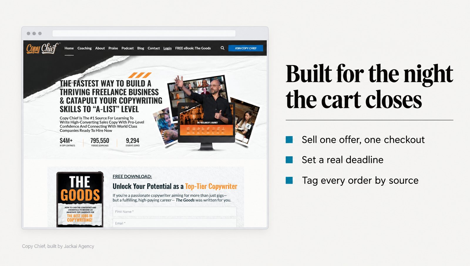
A product launch landing page gets one real test, and it usually happens on a phone, late in the evening, a few hours before the cart closes. A working copywriter has the page open and her card on the desk. She scrolls back up once to check what she gets and what it costs. If both answers are on the screen, she buys. If they aren’t, the cart closes without her.
I built launch pages and funnels for Copy Chief, a copywriting education business in St. Petersburg, Florida, from October 2021 to December 2025. On the Email Copy Academy product launch, $1,101.17 of ad spend came back as 26.39x return on ad spend (ROAS), across 65 purchases. The World of Financial Copy promo funnel went from build to launch in one week: 56 orders, 4% conversion rate.
None of that came from a clever page. It came from launches where the page, the deadline, the emails and the checkout agreed with each other.
In this guide
What is a product launch landing page, and how is it different from a normal landing page?
A product launch landing page sells one product during a fixed window: a course, a training program, a live event, or a paid membership opening to new members. Visitors arrive from launch emails, social posts and paid ads. On my launches, most of them have heard of the business before they land. The page has one job: getting a reader who has nearly decided to pay before the window shuts.
Three things set it apart from an evergreen page. It has a calendar: waitlist, cart open, last day, cart closed. It has a real deadline, which changes how people decide. And it sits inside a launch funnel, so it is only as good as the email that sent the reader and the checkout that receives them.
This is not the same job as a B2B lead page, where the goal is a form and a sales call. A launch page asks for money on the page itself, so the reader needs to see the price, payment terms, refund policy, start date and contents before paying.
One honest limit from the Copy Chief work: launch numbers don’t carry over to evergreen traffic. Plan the page for the launch, and plan a separate version for afterwards.
Which pieces does a launch funnel need besides the page?
When a launch disappoints, the client usually blames the product launch landing page. In my experience the leak is just as often elsewhere in the launch funnel: a waitlist page that set no expectations, an email promising a bonus the page forgot, or a checkout asking for a phone number nobody needed. So I map every piece before I design any of them.
This is the minimum set I build for a paid product launch:
- Waitlist page. One field, one promise, the launch date. It builds the list and tells you before launch how many people care.
- The sales page. The product launch landing page itself, with its open, last-day and closed states designed in advance.
- Checkout. Branded to match the sales page, with only the fields that payment and delivery need.
- Confirmation page and first email. What happens next, when access arrives, and who to contact if it doesn’t.
- Launch emails. Announcement, cart open, a mid-launch email answering real questions, and the closing sequence.
- Tracking. A UTM tag on every email link and every ad, so each order shows where it came from.
On Copy Chief, the World of Financial Copy promo funnel ran on ClickFunnels for the pages, ThriveCart for checkout and Keap for email. The stack matters less than the handoffs: each tool has to pass the buyer to the next without a dead end, and someone has to test every handoff before the first email goes out. My funnel development work covers that whole chain.
How long does it take to build a launch funnel?
Less time than most teams expect, if the inputs are ready. On Copy Chief, the World of Financial Copy promo funnel was built and launched in one week, and the Crossroads Summit event funnel launched in 14 days. A product launch landing page can be built that fast only when the offer, price and copy are settled before design starts.
The table shows how I scope a launch build. Times cover the pages and funnel wiring, not making the product.
| Launch type | What to build | Time to plan for | Copy Chief example |
|---|---|---|---|
| Promo to an existing email list | Sales page, checkout, launch emails | About one week | World of Financial Copy promo funnel: 56 orders at a 4% conversion rate |
| Live event or summit | Registration page, ticket checkout, reminder emails | About two weeks | Crossroads Summit event funnel: launched in 14 days, 10x event ticket sales |
| Product launch with paid traffic | Landing page matched to the ads, sales page, checkout, confirmation, tracking | 1 to 2 weeks for the page, plus ad setup | Email Copy Academy launch: 26.39x ROAS on $1,101.17 ad spend, 65 purchases |
| New product, no list yet | Waitlist page first, sales page later | Weeks of list building before the sales page matters | None: build the audience before the launch |
The last row is the one people skip. A launch with no list is a cold ad campaign with a deadline attached, and in my experience cold traffic rarely buys a course on first sight. Spend the first month on the waitlist page instead.
For budgeting: my Landing Page Design scope takes 1 to 2 weeks and starts at $2,750 USD (CA$3,795). Every other service, from tracking to full site builds, is on the Jackai Agency pricing page.
What goes on the sales page for a launch?
A product launch landing page carries more than an evergreen sales page, because the reader is about to pay, not book a call. I build it top to bottom in this order and cut anything that doesn’t help the reader decide.
- The promise, in the reader’s words. The first screen repeats what the launch email or ad said. I run audience research before writing it; on Copy Chief that meant pain mining with Perplexity and a custom Python Reddit scraper.
- What they get. Modules, live sessions, templates, how long access lasts, the start date. Concrete nouns, not benefits dressed up as features.
- Who it is for, and who it is not for. Naming who should not buy turns away the buyers most likely to ask for their money back. That is my experience, not a study.
- Proof from people like the reader. Past buyers in the same situation, quoted with specifics.
- Price, payment terms and the deadline. All three in one block, with the reason the deadline exists.
- Questions from real buyers. Refunds, hours per week, what happens if they fall behind.
- One action, same words, on every screen. The button text never changes as the reader scrolls.
On proof, the research favors buyers like the reader, quoted with specifics. Hotel guests reused towels more often when a sign said most guests in their own room had done so, compared with a general environmental appeal (Goldstein, Cialdini and Griskevicius, 2008). Book buyers appear to read review text, not only the star average (Chevalier and Mayzlin, 2006). On a launch page, that means a quote from a past buyer whose situation matches the reader’s, with a detail only a real buyer would know.
Keep the offer to one product, with one price and at most one payment plan. In the original jam study, shoppers who saw 6 flavors were more likely to buy than shoppers who saw 24 (Iyengar and Lepper, 2000). A later review of 50 experiments found the average effect of too much choice was close to zero, with wide swings between studies (Scheibehenne, Greifeneder and Todd, 2010). So I treat extra tiers as a test to run later, and I launch with one.
Design still matters when the page asks for money. In a study of 2,684 people judging site credibility, the design look was the most mentioned factor, in 46.1% of comments (Fogg and colleagues, 2003). I designed the Email Copy Academy landing page to read the same on desktop, tablet and phone, because a broken layout on a phone makes a purchase feel risky.
How should the deadline work on a product launch landing page?
A product launch landing page without a real deadline is a page with a sale banner. The deadline turns “later” into a decision, and the research supports it. In field studies, people given a short deadline to redeem a gift certificate used it more often than people given a long one, and visitors with an open-ended window kept putting off trips to local landmarks (Shu and Gneezy, 2010).
Real is the important word. Scarcity caused by demand changes how people value a thing: in a classic experiment, cookies that ran short because other people wanted them were rated higher than cookies that ran short by accident (Worchel, Lee and Adewole, 1975). So if your cohort is capped at 40 seats because you run live calls, say so and say why. If it isn’t capped, don’t invent a cap.
This is how I set the deadline up on the page:
- Write out the date, time and time zone in the price block (“Friday at 11:59 p.m. Eastern”), not only as a ticking timer.
- Give the reason in one sentence: the cohort starts Monday, the live sessions need a fixed group, or the launch price ends.
- Design the closed state before launch. When the cart closes, the page switches to a waitlist form for the next round. It never shows a dead cart and never quietly stays open.
- Run the closing emails on the same clock as the page, so no email links to a cart that has already closed.
If you use a countdown timer, make it count down to the real deadline and stop there. Researchers who crawled about 11,000 shopping sites found 157 deceptive countdown timers on 140 sites: timers that reset, or offers that stayed live after the clock ran out (Mathur and colleagues, 2019). A launch audience is mostly your own email list, and they will notice when the “final hours” come back next month.
How do you set up checkout so buyers finish?
Checkout is where a product launch landing page turns a decided buyer into a sale or a lost one. In my experience it is also the step launch teams test least. The fix is rarely clever: remove anything that makes the buyer stop and think again.
- Match the sales page. Same product name, same price, same image, same logo. A page that looks like a different company makes people hesitate.
- Ask only for what payment and delivery need. Name, email address and card. Add a phone field only if someone will actually call.
- Show payment plans on the sales page first. A plan that appears for the first time at checkout surprises people at the worst moment.
- Keep add-ons small and related. One optional add-on that fits the main product, not a stack of them.
- Write the confirmation page. What they bought, when access arrives, where to log in, who to email.
Form design has measurable effects. In an eye-tracking study, applying 20 form design guidelines to real company forms led to faster completion, fewer failed submissions and higher satisfaction (Seckler and colleagues, 2014). A checkout is a form with a card field. In practice I keep labels outside the fields, put error messages next to the field that caused them, and add no field the buyer didn’t expect.
On Copy Chief, I did conversion work on checkout flows and member dashboards with Google Analytics and Hotjar. Recordings show where buyers drop out. Opinions don’t.
Before the first email goes out, I run a real purchase through the live checkout on a phone, confirm the receipt and access email arrive, then refund it. A sandbox test proves the plugin works. A real purchase proves the launch does.
How do you measure a launch funnel honestly?
Every launch should make the next one cheaper, and that only happens if each order arrives with its source. I tag every email link and ad with UTM parameters, carry the tags through the forms into the CRM, and keep AI assistant referrals separate from direct traffic. The method is on my lead attribution page.
Then read the numbers in order. On the Email Copy Academy launch, the ads ran at a 1.05% click-through rate and a $1.33 cost per click, with 26.39x ROAS on $1,101.17 of ad spend across 65 purchases. Clicks tell you whether the ads worked. Purchases tell you whether the product launch landing page did. Strong clicks with few purchases point at the page, not the ads.
Be careful what you call that number. ROAS is revenue divided by ad spend, and nothing else. It leaves out product costs, design and build fees, platform fees and refunds. So the Email Copy Academy’s 26.39x is a fair number for judging the ads and the wrong one for judging profit.
A launch number also belongs to its window. On the Copy Chief Membership Funnel Redesign, the 31x ROAS and 215 paid subscriptions belong to the August to October 2023 campaign, not to that funnel forever.
If you want tracking in place before the next launch instead of rebuilt after it, Lead Source Reporting is a two-week job at $1,875 USD (CA$2,600).
What would I not do on a product launch landing page?
Some of these rest on the research above. Others are my own judgment, marked as such.
- No fake urgency. No timer that resets, no “3 spots left” that never changes. Your list will remember it.
- No paid traffic sent to a members’ page. On the Copy Chief Membership Funnel Redesign, paid traffic had been landing on a page written for existing members, so I built a separate funnel for paid traffic only. Experience.
- No three-tier pricing by reflex. Launch with one offer and test a second tier only when buyers ask for it. The choice research is mixed, so this is caution, not law.
- No launch without a closed-cart page. The cart will close at midnight whether the page is ready or not.
- No price change mid-launch without telling the list. Early buyers compare notes with late ones. Experience again.
What should you check before the cart opens?
This is the list I run the day before a launch. Each item breaks quietly and shows up later as a support email.
- Load the product launch landing page on a phone over mobile data. In one study, about 2 seconds was the wait people would tolerate before giving up on a page, and visible progress feedback stretched that (Nah, 2004). Compress images, and host long video on a video platform instead of inside the page builder.
- Make one real purchase on a phone and refund it.
- Click every link in every launch email. Each one should land on the right page state with its UTM tag intact.
- Switch a staging copy to the closed state and submit the waitlist form.
- Read the price block out loud. Price, payment plan, deadline with time zone, refund terms. Add whatever is missing.
- Name one person to watch the launch. For the first hour after the cart-open email, they own the page, the checkout and the inbox, with access to fix things.
Planning a product launch landing page? Book a call
The Email Copy Academy launch ran on $1,101.17 of ad spend. One product, one deadline, and a checkout that matched the page. The budget didn’t need to be bigger. The pieces needed to agree.
If you have a launch date and a product, I can design and build the product launch landing page that sits at the center of it. Landing Page Design takes 1 to 2 weeks and starts at $2,750 USD (CA$3,795), on a fixed quote. Book a 30-minute call and bring your launch date. You can read the Copy Chief case study before we talk.
Sources
Peer-reviewed research
- Chevalier, J. A., and Mayzlin, D. (2006). The effect of word of mouth on sales: Online book reviews. Journal of Marketing Research, 43(3), 345-354. https://doi.org/10.1509/jmkr.43.3.345
- Fogg, B. J., Soohoo, C., Danielson, D. R., Marable, L., Stanford, J., and Tauber, E. R. (2003). How do users evaluate the credibility of Web sites? Proceedings of the 2003 Conference on Designing for User Experiences, 1-15. https://doi.org/10.1145/997078.997097
- Goldstein, N. J., Cialdini, R. B., and Griskevicius, V. (2008). A room with a viewpoint: Using social norms to motivate environmental conservation in hotels. Journal of Consumer Research, 35(3), 472-482. https://doi.org/10.1086/586910
- Iyengar, S. S., and Lepper, M. R. (2000). When choice is demotivating: Can one desire too much of a good thing? Journal of Personality and Social Psychology, 79(6), 995-1006. https://doi.org/10.1037/0022-3514.79.6.995
- Mathur, A., Acar, G., Friedman, M. J., Lucherini, E., Mayer, J., Chetty, M., and Narayanan, A. (2019). Dark patterns at scale: Findings from a crawl of 11K shopping websites. Proceedings of the ACM on Human-Computer Interaction, 3(CSCW), 1-32. https://doi.org/10.1145/3359183
- Nah, F. F.-H. (2004). A study on tolerable waiting time: How long are Web users willing to wait? Behaviour and Information Technology, 23(3), 153-163. https://doi.org/10.1080/01449290410001669914
- Scheibehenne, B., Greifeneder, R., and Todd, P. M. (2010). Can there ever be too many options? A meta-analytic review of choice overload. Journal of Consumer Research, 37(3), 409-425. https://doi.org/10.1086/651235
- Seckler, M., Heinz, S., Bargas-Avila, J. A., Opwis, K., and Tuch, A. N. (2014). Designing usable web forms: Empirical evaluation of web form improvement guidelines. Proceedings of the SIGCHI Conference on Human Factors in Computing Systems, 1275-1284. https://doi.org/10.1145/2556288.2557265
- Shu, S. B., and Gneezy, A. (2010). Procrastination of enjoyable experiences. Journal of Marketing Research, 47(5), 933-944. https://doi.org/10.1509/jmkr.47.5.933
- Worchel, S., Lee, J., and Adewole, A. (1975). Effects of supply and demand on ratings of object value. Journal of Personality and Social Psychology, 32(5), 906-914. https://doi.org/10.1037/0022-3514.32.5.906