A woman on a bus is scrolling Instagram with one thumb. An ad names the exact problem she has been stuck on for a month, so she taps it. What opens next is the Meta ads landing page, and it has about one bus stop to earn her next tap. Hers opens on a company homepage: a menu, a slider, a headline about values. She swipes back to her feed.
Nothing was wrong with the ad. Nothing was wrong with the offer. The click landed on a page built for someone else.
This post is the build: how I put together the page Meta ad traffic lands on, mobile-first, with one promise, one action and a fast load. The examples come from Copy Chief, a membership platform for working copywriters, where I made the ad creative, bought the media and built the funnel pages.
In this guide
What is a Meta ads landing page, and what is it not?
A Meta ads landing page is a single page built for the people one set of Facebook or Instagram ads sends you. It is not your homepage. It is not a services page with the menu still attached. It has one job: take a person who tapped an ad about one problem and get them to take one next step.
The difference comes from who arrives: someone who searched Google went looking, while someone who tapped a Meta ad was watching a friend’s video a minute ago. The page has to pay off the ad’s promise before they remember what they were doing.
Researchers call the trail a visitor follows “information scent”: people keep going while the cues match what they want and leave when the cues weaken (Pirolli and Card, 1999). My post on post-click mismatch diagnoses that gap; this one is the build.
Here is what a Meta ads landing page carries, top to bottom, on a phone:
- The ad’s promise as the first line, in the ad’s own words.
- One line of proof the visitor can check.
- One button that says what happens when you tap it.
- The reasons to believe, in the order the doubts show up.
- The same button again, in the same words, every screen or two.
Why build a Meta ads landing page mobile-first?
The short answer is that the visitor is holding a phone. On my Meta campaigns the phone is the default screen, and the tap opens the page inside Facebook’s or Instagram’s own browser, not Safari or Chrome. That in-app browser has its own toolbar, so the visitor sees less of your page than the phone’s size suggests.
Phones make every bit of effort cost more. Ghose, Goldfarb and Han (2013) compared people using the same service on phones and computers and found links at the top of the screen were especially likely to be clicked on phones, because browsing costs more on a small screen. So the first screen does most of the selling, and anything pushed below it pays a toll.
Mobile-first is not shrinking a desktop design until it fits. I design at about 390 pixels wide first, decide what the first phone screen holds, and only then widen the layout for laptops. That changes four things:
- One column. Side-by-side blocks stack into a confusing pile on a phone.
- Body text at 18 pixels or larger, with a headline that fits in three lines.
- Buttons sized for a thumb. Parhi, Karlson and Bederson (2006) found targets of about 9.2 mm worked for one-handed thumb taps without extra errors, so the main button is full width and at least that tall.
- A first screen checked inside the app, from the ad preview on a real phone, not a resized desktop window.
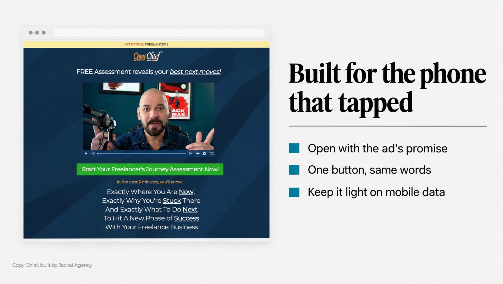
On Copy Chief’s Escape Velocity campaign, the funnel behind the Meta ads was mobile-first. If the phone version of a Meta ads landing page is an afterthought, the phone visitor can tell.
What goes on the first phone screen?
It holds the promise, one line of proof and the button, with nothing competing against them. If a visitor reads only the first screen of your Meta ads landing page, they should know what this is, why to believe it and what tapping does. On a mobile-first page I plan that screen at roughly 600 pixels tall, what survives the in-app toolbar.
Write the promise in the ad’s words
Take the hook from the ad creative, the line that earned the tap, and make it the headline, without paraphrasing it or writing a cleverer second version. If an ad says “Stop rewriting the same sales email five times,” the headline says that, or a line any reader would see as the same sentence.
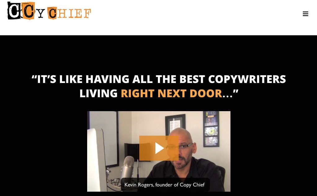
On Copy Chief’s Membership Funnel Redesign, the old page never repeated the ad’s promise. It was the shared membership page, written for people who already belonged. The rebuilt page opened with the ad’s promise word for word. It is a five-minute copy change, and the one I see skipped most.
The look carries the promise too: Lindgaard and colleagues (2006) found people rate a web page’s visual appeal within 50 milliseconds. So the first screen should look like the ad: the same main image, the same color, the same face if the ad had one.
Add one line of proof
Under the headline goes one line the visitor can check: a result with its time frame, a named client, a credential or a member count. Fogg and colleagues (2003) had 2,684 people judge real websites, and design look came up in 46.1% of their comments, more than any other factor. People judge trust from surface cues first, and in my experience one specific number does more there than three adjectives.
Put the button in view
The button sits on the first screen and says what happens next: “Get the checklist,” “See the schedule,” “Join the membership.” Labels like “Submit” and “Learn more” say nothing about the result, while a label that names it lets a nervous visitor tap without wondering what they just agreed to.
Why one action, and where does the button go?
A homepage offers a dozen choices because its visitors arrive with a dozen reasons. Ad traffic arrives with one reason: the ad. So a Meta ads landing page asks for one thing. No menu, no blog links, no second offer.
The research on choice is more mixed than the “fewer options always win” story. Chernev, Böckenholt and Goodman (2015) pooled 99 results and found more options hurt choice when the decision is hard, the options are complex, people are unsure what they want and they want to spend little effort. That describes a cold visitor from a social feed almost exactly. So one action is my default for cold traffic, not a law.
On Copy Chief’s Membership Funnel Redesign, the old sign-up button appeared once, below the fold. The new page was a dedicated ClickFunnels funnel for paid traffic only, separate from the member site, with one ask in identical wording on every screen. From August to October 2023, the Membership Funnel Redesign campaign returned 31x on ad spend across 215 paid subscriptions.
Two caveats sit next to that number. First, the Membership Funnel Redesign campaign ran to a deadline, and evergreen traffic does not convert at launch rates, so 31x belongs to that campaign from August to October 2023, not to the funnel forever. Second, the new first line was never measured on its own. The membership was the same membership. The page it was sold from changed.
How often to repeat the button
On a long page I repeat the same button, in the same words, every screen or two, because new wording makes people wonder whether the second button does something different. A sticky bar at the bottom can help on long pages, but it eats a small screen, so I only add one past five or six screens.
If the action is a form
Ask only for what the next step needs. Seckler and colleagues (2014) applied 20 form guidelines to forms from real company websites, and the improved forms were finished faster, with fewer failed submissions and higher satisfaction. On a phone, I check labels above the fields, the right keyboard for each field, no placeholder-only labels and errors shown beside the field that caused them.
How fast does a Meta ads landing page need to load?
It needs to load faster than feels reasonable. Nah (2004) measured how long people would wait for a web page before giving up and put the tolerable wait at about 2 seconds, longer when the page showed signs of progress.
Galletta, Henry, McCoy and Polak (2004) tested delays from 0 to 12 seconds. Task performance and people’s intentions toward the site fell as delays grew, and most of the drop came before about 4 seconds. I read that as: by 4 seconds, the visitor’s opinion is mostly set.
A Meta ads landing page also loads in worse conditions than your office Wi-Fi suggests: inside the in-app browser, often on mobile data, with nothing cached. So a mobile-first build gets a weight budget before design starts:
- One hero image, roughly 100 to 150 KB in WebP or AVIF, with width and height set so the layout does not jump.
- One font family, two weights at most, with a system font as the fallback.
- No slider, no autoplay video and no chat widget near the first screen.
- Tracking that waits its turn. The Meta Pixel loads because the campaign needs it to count conversions; heat maps and extras load after the page is visible.
- A real phone test on cellular data, from the ad preview, before any money is spent.
What goes below the first screen, and what stays off the page?
Below the first screen, the page answers doubts in the order they arrive. For most offers I have sold through Meta ads, that order is:
- Is this for me? Name the reader and their situation, in their words.
- Does it work? Results with dates, named clients and screenshots of the real thing.
- How does it work? Three or four plain steps, or a list of what you get.
- What does it cost, and what if it does not work out? Price, terms and any refund policy.
- What do I do now? The same button, in the same words.
“In their words” means research, not a brainstorm. For Copy Chief, that was Perplexity searches for buyer pain, a custom Python Reddit scraper feeding comments to a language model to pull out pains and desires, coach interviews and email outreach to members. On Copy Chief, the ad creative was built around the pain points that research surfaced. Feed the same notes into the page headings and the ad and the page speak the same language.
And here is what I leave off a Meta ads landing page:
- The site menu. Every menu link is an exit to a page not written for this visitor.
- A second offer. Two offers turn one decision into a comparison.
- Pop-ups on load. On a mobile-first layout they cover the promise the visitor tapped to see.
- Generic stock photos. A smiling team at a laptop says nothing about this offer.
- A testimonial carousel. One specific quote with a real name beats five that slide past unread.
How does the page change your cost per acquisition?
Cost per acquisition is ad spend divided by the number of people who took the action you paid for. Two numbers sit inside it: what each click costs, and the share of clickers who act. The ad creative mostly sets the first, and the Meta ads landing page mostly sets the second.
With made-up numbers: if clicks cost $1.50 and 2% of visitors buy, each buyer costs $75. Keep the ads exactly as they are, get the page to 4%, and each buyer costs $37.50. Same ads. Same audience. Half the cost per acquisition.
Click cost follows the ad creative: on Meta, cost per click equals the cost per thousand impressions divided by the clicks those impressions earn, so a higher click-through rate makes each click cheaper. On Copy Chief’s Escape Velocity campaign, click-through rose from 0.9% to 3.0%. If impression prices had held flat, that alone would have cut each Escape Velocity click to 30% of its old cost.
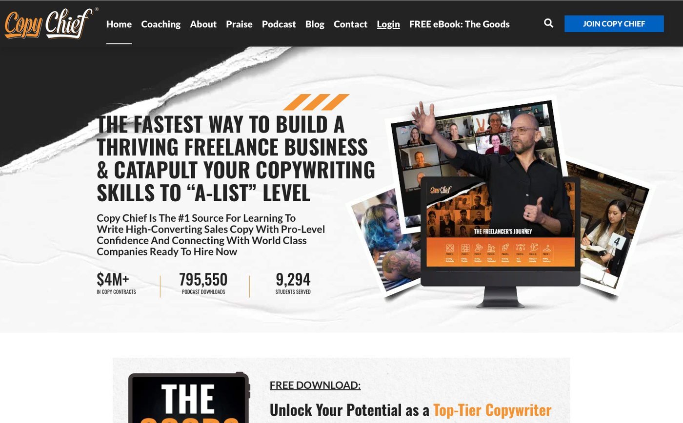
On the page side of Copy Chief’s Escape Velocity campaign, the mobile-first landing page converted 10.1% of its visitors, and average cost per acquisition fell from $42 to $22. Across the Escape Velocity campaign, average return on ad spend was 55.03x, or about $55 back for each $1 spent on ads.
The honest limit: on Escape Velocity, the ad creative, the media buying and the page were all part of the same campaign. The creative was split into top-of-funnel and bottom-of-funnel ads built around the buyer’s pain points, and those ads sent people to the mobile-first funnel. I cannot hand the Escape Velocity page all the credit for $42 becoming $22, and I would not trust anyone who claims to split it cleanly.
One more lesson from the Membership Funnel Redesign. Before the rebuild, ads were judged on engagement rate, so the ads that looked best in the dashboard were the least likely to sell. After it, the ad creative was bought against paid subscriptions. Measure the page on purchases and the ads on likes, and they pull your cost per acquisition in opposite directions.
Should every ad creative get its own landing page?
Not always, because a Meta ads landing page per ad creative gives the tightest match but is also the most work to build, track and keep current. I decide per campaign with one question: does this ad make a promise the shared page does not open with? If yes, it gets its own page, or at least its own first screen. Separate pages also show which promise brings the lower cost per acquisition.
| Situation | One shared page | Separate pages |
|---|---|---|
| Ads test different images or formats, same promise | Yes | No need |
| Ads test different promises, such as pain-led against benefit-led hooks | No | Yes, one per promise |
| Different audiences, such as owners and marketing leads | Only if one headline fits both | Yes, when the proof differs |
| Retargeting people who already visited | Sometimes, with the intro cut | Often, a shorter page that starts at the offer |
| Small test budget, first campaign | Yes, start with one | Later, once one promise wins |
One edge case matters for B2B services with a high price. In my experience, a cold visitor from a social feed rarely books a sales call on the first tap for a five-figure service. For that traffic I make the one action smaller, such as a checklist, then retarget the people who took it with a second page whose one action is the call. Each page still asks for one action; the action changes with the audience.
How do you brief, test and budget the build?
Most of the work on a good Meta ads landing page happens before design starts. This is the brief I ask for:
- The ads themselves, or the drafts: every hook, image and audience the page has to answer.
- The one action, and what counts as a conversion in Meta Ads Manager.
- The proof you can publish: dated results, client names you may use, screenshots.
- The words buyers use: sales call notes, reviews, support emails, survey answers.
- Price and terms, exactly as they will appear at checkout.
Before launch, every ad link carries UTM tags (short tracking codes on the end of the link), the form passes those tags into your CRM, and the conversion event fires once per action, not on every page load. It is the method on my lead attribution method page, and the setup I sell on its own as Lead Source Reporting.
After launch, I change one thing at a time. Change the headline, image and button in one go and you learn nothing about which one moved your cost per acquisition.
At Jackai Agency, Landing Page Design starts from $2,750 USD (CA$3,795) and takes 1 to 2 weeks, on a fixed quote with two revision rounds per phase. You own the page, the domain and the hosting. My Meta ad creative and media buying pairs with the page, multi-step builds sit under funnel development, and every price is on the Jackai Agency pricing page.
Running Meta ads next quarter? Start with the page
The ad can be right. The offer can be right. If the Meta ads landing page under the tap was built for someone else, you pay for the click and lose the person.
If a Meta campaign is coming up, book a 30-minute call and bring the ads or the drafts. I will go through what your first phone screen has to say, and you get a fixed quote for a mobile-first page before any work starts. The Copy Chief membership funnel case study shows the before and after.
Sources
Peer-reviewed research
- Chernev, A., Böckenholt, U., and Goodman, J. (2015). Choice overload: A conceptual review and meta-analysis. Journal of Consumer Psychology, 25(2).
- Fogg, B. J., Soohoo, C., Danielson, D. R., Marable, L., Stanford, J., and Tauber, E. R. (2003). How do users evaluate the credibility of Web sites? A study with over 2,500 participants. Proceedings of the 2003 Conference on Designing for User Experiences.
- Galletta, D., Henry, R., McCoy, S., and Polak, P. (2004). Web site delays: How tolerant are users? Journal of the Association for Information Systems, 5(1).
- Ghose, A., Goldfarb, A., and Han, S. P. (2013). How is the mobile Internet different? Search costs and local activities. Information Systems Research, 24(3).
- Lindgaard, G., Fernandes, G., Dudek, C., and Brown, J. (2006). Attention web designers: You have 50 milliseconds to make a good first impression! Behaviour and Information Technology, 25(2).
- Nah, F. F.-H. (2004). A study on tolerable waiting time: How long are Web users willing to wait? Behaviour and Information Technology, 23(3).
- Parhi, P., Karlson, A. K., and Bederson, B. B. (2006). Target size study for one-handed thumb use on small touchscreen devices. Proceedings of the 8th Conference on Human-Computer Interaction with Mobile Devices and Services.
- Pirolli, P., and Card, S. (1999). Information foraging. Psychological Review, 106(4).
- Seckler, M., Heinz, S., Bargas-Avila, J. A., Opwis, K., and Tuch, A. N. (2014). Designing usable web forms: Empirical evaluation of web form improvement guidelines. Proceedings of the SIGCHI Conference on Human Factors in Computing Systems.