
- Constraint
- No performance data verified, so no number appears
- Client
- Rufous & Co., a design studio with a services practice and a store
- Scope
- Strategy, design and development with the founders
- Stack
- Web, storefront
A studio site and storefront designed and built with the founders
Full-scope website design and development for a design studio with an online store. Client: Rufous & Co., A design studio running a services practice and a store.
A visitor arrives wanting to buy 1 print. Another arrives wanting to commission 6 months of design work. They land on the same page and read the same sentence, which is trying to be true for both of them and is therefore specific to neither. The buyer cannot find the price. The client cannot find the process. Both of them do the same thing, which is to scroll to the bottom, find a single contact form, and decide to deal with it later. The studio had 2 businesses and 1 door, and the door was labelled for nobody.
2 revenue lines cannot share 1 route. Somebody always loses the coin toss.
What was actually happening?
Services and product competed on every page. The portfolio was arranged for the studio rather than for a person deciding whether to hire it, so the proof took work to reach. The contact page opened with pleasantries instead of asking for the brief, which is the only thing the studio actually needed in order to reply.
Every figure below is a real capture of the live page. Each frame caps its height and scrolls inside itself, so a full-page capture can be read end to end without leaving the figure. Both frames are reachable by keyboard. Nothing here is a mockup or a drawn schematic.
1. How should a studio homepage handle 2 different buyers?
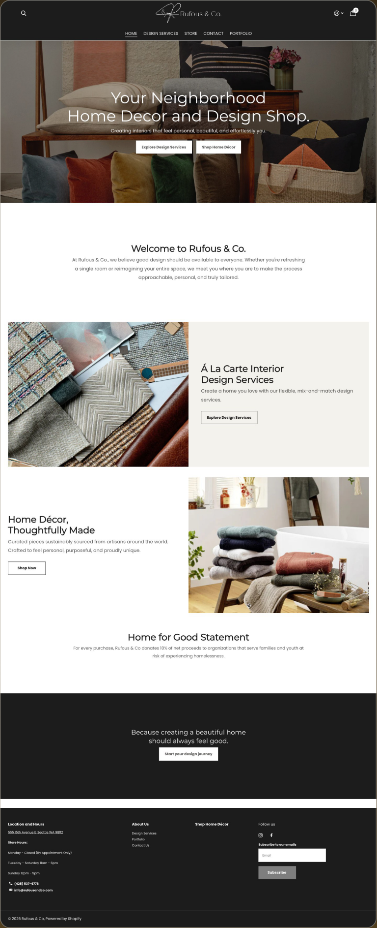

UX and UI analysis, before against after
Before: what the design cost the visitor
- Two buyers, one blended message. A person hiring the studio and a person buying from the store want different things. One homepage serving both with a single message gave neither a clear scent to follow. Source: Nielsen Norman Group, 2003.
- Choice without structure. When the routes are not separated, the visitor has to work out which parts of the page apply to them. That is cognitive load spent on navigation rather than on deciding. Source: Nielsen Norman Group, 2013.
- Neither audience was named. A headline that does not say who the page is for fails the basic test the headline research sets. Source: Nielsen Norman Group, 2015.
After: what changed and why it works
- Two clearly separated routes. One path for hiring the studio, one for buying from it. Each visitor sees their route named and follows it, which is information scent by design. Source: Nielsen Norman Group, 2003.
- A decision reduced to one choice. Instead of parsing a mixed page, the visitor makes one binary choice and proceeds. Fewer decisions at the top of the page is what the choice research recommends. Source: Columbia University and Stanford University, Iyengar and Lepper, Journal of Personality and Social Psychology, 2000.
- Both audiences addressed by name. Each route opens with the reader it serves, so both feel the page was written for them. Source: Nielsen Norman Group, 2015.
Sources cited in this section
- Nielsen Norman Group (2003), Information Scent: how users decide where to click.
- Nielsen Norman Group (2013), Minimize Cognitive Load to Maximize Usability.
- Nielsen Norman Group (2015), Headings Are Pick-Up Lines: 5 Tips for Writing Headlines That Convert.
- Columbia University and Stanford University, Iyengar and Lepper, Journal of Personality and Social Psychology (2000), When Choice is Demotivating: more options reduced purchase rate roughly tenfold.
2. What does a services page need to say before it asks for the brief?
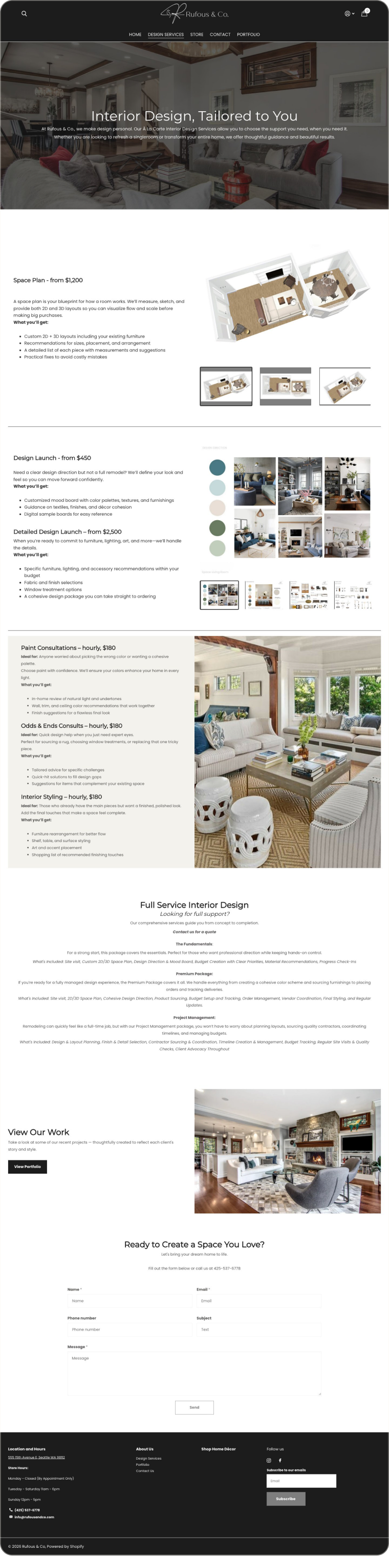

UX and UI analysis, before against after
Before: what the design cost the visitor
- A list of services with no process or scope. A buyer cannot judge a service from a label. Without the shape of an engagement, the page asked for a brief before it had given any reason to write one. Source: Nielsen Norman Group, 2016.
- No sense of what happens next. The usability heuristics require visibility of system status; for a service page that means telling the buyer what the engagement looks like from first call to delivery. Source: Nielsen Norman Group, 2024.
- The ask arrived early. A form on a page that has not yet stated what the work involves is the form usability failure of purpose left unclear. Source: Nielsen Norman Group, 2018.
After: what changed and why it works
- Scope stated, process stated, then one ask. The page tells the buyer what is included and how the engagement runs, and only then asks for the brief. Value before the form is the sequence the form research prescribes. Source: Nielsen Norman Group, 2018.
- Disclosure as a trust signal. Explaining the process up front is the up-front disclosure the credibility research identifies as one of the four factors that make a site trustworthy. Source: Nielsen Norman Group, 2016.
- One ask, not several. A single request for the brief replaces scattered prompts, which lowers the decision load on a buyer who is comparing studios. Source: Nielsen Norman Group, 2013.
Sources cited in this section
- Nielsen Norman Group (2016), Trustworthiness in Web Design: 4 Credibility Factors.
- Nielsen Norman Group (2024), 10 Usability Heuristics for User Interface Design.
- Nielsen Norman Group (2018), Website Forms Usability: Top 10 Recommendations.
- Nielsen Norman Group (2013), Minimize Cognitive Load to Maximize Usability.
3. How should a design portfolio be arranged for a buyer?
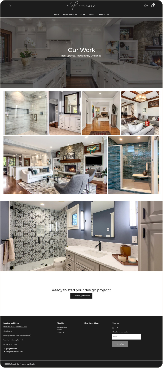

UX and UI analysis, before against after
Before: what the design cost the visitor
- Arranged for the studio, not the buyer. The proof took several clicks to reach. Every extra step before the work is visible is a point where the foraging research says people give up. Source: Xerox PARC, Pirolli and Card, Psychological Review, 1999.
- The work was not legible from the list. A buyer scanning a portfolio needs to see the work before deciding to open anything. Thumbnails that hide the piece defeat the scan. Source: Nielsen Norman Group, 1997.
- Decorative before informative. The eyetracking research shows people ignore decorative images and study informative ones. A portfolio layout that led with styling rather than the work itself lost the attention it was built to hold. Source: Nielsen Norman Group, 2010.
After: what changed and why it works
- Skimmable in one scroll. The portfolio is laid out so a buyer can take in the range of work in a single pass, which matches how the scanning research says people evaluate a page. Source: Nielsen Norman Group, 1997.
- Legible before any click. Each piece is readable from the list, so the decision to open a project is informed rather than a gamble. Source: Nielsen Norman Group, 2010.
- Recognised in milliseconds. The brain identifies an image in about 13 milliseconds. Putting the work itself in view lets that recognition do the selling before a word is read. Source: MIT, Potter et al., Attention, Perception and Psychophysics, 2014.
Sources cited in this section
- Xerox PARC, Pirolli and Card, Psychological Review (1999), Information Foraging: people follow the strongest scent toward the answer and leave when it weakens.
- Nielsen Norman Group (1997), How Users Read on the Web (79% of users scan rather than read).
- Nielsen Norman Group (2010), Photos as Web Content (eyetracking: decorative stock photos are ignored, informative photos are studied).
- MIT, Potter et al., Attention, Perception and Psychophysics (2014), Detecting meaning in RSVP at 13 ms per picture: the brain identifies an image in 13 milliseconds.
4. Can a store share a design system with the studio site?
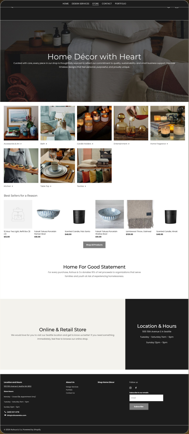
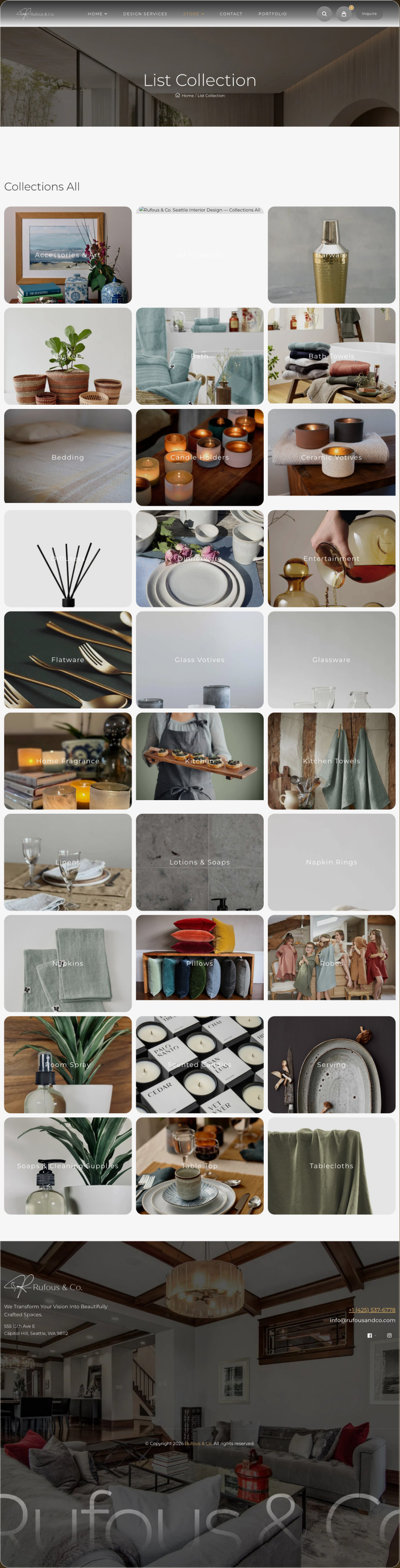
UX and UI analysis, before against after
Before: what the design cost the visitor
- A storefront that looked like a different company. The store was visually detached from the studio site. A visitor moving from one to the other had to re-establish trust, because the visual continuity that signals one organisation was missing. Source: Nielsen Norman Group, 2016.
- Two sets of conventions to learn. Different navigation, type and controls between the studio and the store meant two interfaces to learn instead of one, which is the consistency failure the heuristics warn against. Source: Nielsen Norman Group, 2024.
- Design quality signalled differently on each. Since visual design is the most cited credibility factor, a store that looked less finished than the studio site undermined the studio’s own claim to design skill. Source: Stanford Persuasive Technology Lab, Fogg et al., 2002.
After: what changed and why it works
- One design system across studio and store. The same type, spacing, colour and controls run through both, so the visitor carries their trust and their learned habits from one to the other. Source: Nielsen Norman Group, 2024.
- Continuity as credibility. A store that looks like the studio that built it is itself evidence of the studio’s competence, which is the visual design credibility signal in action. Source: Stanford Persuasive Technology Lab, Fogg et al., 2002.
- Familiar controls. Because the store follows the conventions the rest of the site already taught, nothing has to be relearned at the moment of purchase. Source: Nielsen Norman Group, 2017.
Sources cited in this section
- Nielsen Norman Group (2016), Trustworthiness in Web Design: 4 Credibility Factors.
- Nielsen Norman Group (2024), 10 Usability Heuristics for User Interface Design.
- Stanford Persuasive Technology Lab, Fogg et al. (2002), Stanford Web Credibility Research: 46.1% of credibility comments concerned the visual design of the site.
- Nielsen Norman Group (2017), Jakob's Law: users spend most of their time on other sites, so they expect yours to work the same way.
5. What should a contact page ask for first?
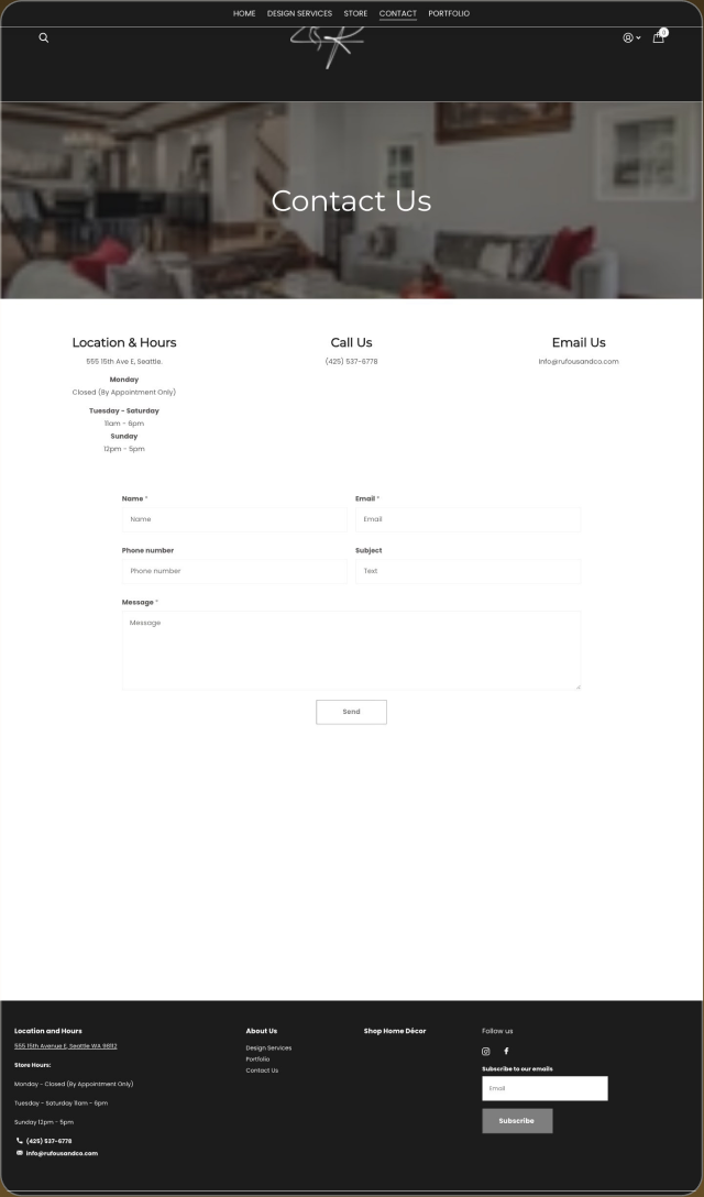
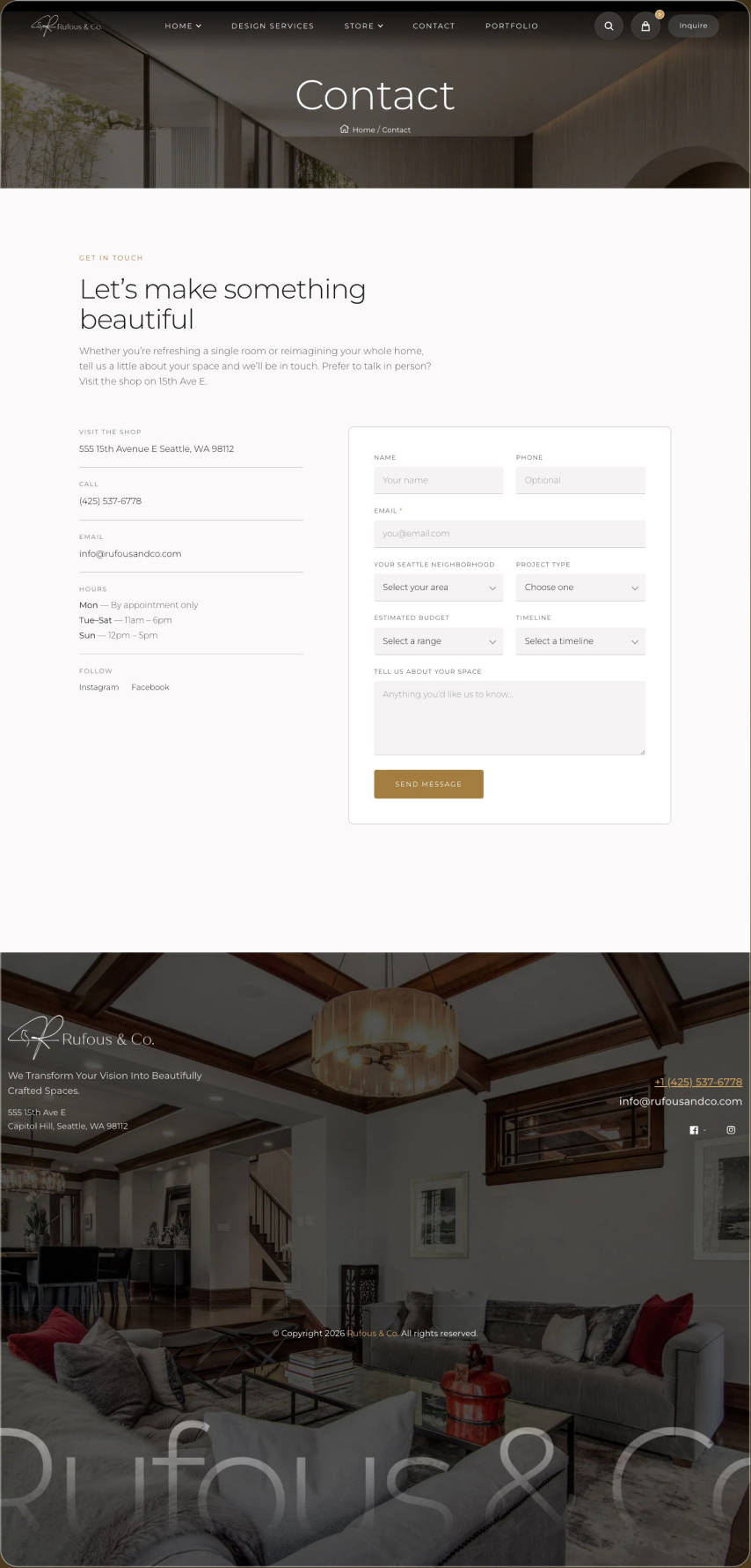
UX and UI analysis, before against after
Before: what the design cost the visitor
- Pleasantries first, then a bare form. A contact page that opens with small talk and an unlabelled form asks the visitor to work out what to write. Unclear purpose is the leading cause of form abandonment in the usability guidance. Source: Nielsen Norman Group, 2018.
- The important question came last, or not at all. The brief is what the studio needs and what the buyer has ready. Burying or omitting it wastes the one moment the visitor has decided to act. Source: Nielsen Norman Group, 2013.
- No signal of what happens after sending. Visibility of what comes next is a core heuristic, and a bare form gives none. Source: Nielsen Norman Group, 2024.
After: what changed and why it works
- The brief is the first field. The page asks for the thing that matters immediately, so the visitor who arrived ready to describe a project can do exactly that. Source: Nielsen Norman Group, 2018.
- Fewer, clearer fields. A short form with a clear first question reduces effort at the point of commitment, which the form research links directly to completion. Source: Nielsen Norman Group, 2018.
- A plain statement of what happens next. Telling the visitor what to expect after sending closes the loop the heuristics ask for. Source: Nielsen Norman Group, 2024.
Sources cited in this section
- Nielsen Norman Group (2018), Website Forms Usability: Top 10 Recommendations.
- Nielsen Norman Group (2013), Minimize Cognitive Load to Maximize Usability.
- Nielsen Norman Group (2024), 10 Usability Heuristics for User Interface Design.
Before against after, with the measured column
| What | Before | After | Measured |
|---|---|---|---|
| Routing | 1 blended route | 2 routes, services and store | Not measured |
| Portfolio | Arranged for the studio | Skimmable in 1 scroll | Not measured |
| Contact | Pleasantries, then a form | The brief asked first | Not measured |
| Storefront | Visually detached | Same design system as the site | Not measured |
What was built?
- 2 separated routes 1 for services and 1 for the store, each with a single action.
- A portfolio built to be skimmed in 1 scroll, with the work legible before any click.
- A contact page that asks for the brief in the first field rather than the last.
- A storefront on the same design system as the site, so both revenue lines look like 1 company.
What changed, and what is not claimed?
This was a founder-led full-scope engagement covering strategy, design and development with the founders. 5 page types shipped, and each revenue line carries its own route and its own single action. No performance number is claimed for this engagement.
What this case cannot tell you
- Whether separating the 2 routes raised enquiries or orders.
- Whether the portfolio change affected time on page or enquiry quality.
- Whether asking for the brief first improved reply rates.
- Whether the storefront conversion rate moved.
The honest limitation
No analytics for this build have been verified, so no performance claim appears here. What is known is the scope: strategy, design and development, run with the founders.
This engagement runs as Website Design.
Pick a time. We measure your starting numbers on the call.
Mobile conversion rate, AI-referred traffic and lead count, measured before any work starts. You leave with the window and the number, whether or not you hire me.
If the calendar does not load here, the host is blocking the frame. Open it in a new tab with the link above.
