8 Executive Website Design Moves: Full 2026 Guide
Eight executive website design moves for a founder-led site, checked against peer-reviewed research and the W Communications rebuild, with a CAD price table by page count.
 Joshua Jackai
20 min read
Published 7 October 2026 · Last updated and fact-checked November 2026
Short answer: Executive website design works when the site names the four people who arrive at one leader’s name, and gives each one a page. Put the credential first. Visitors form a judgment of a face in 100 milliseconds and of a page in 50. Launch a founder-led practice on 5 to 8 pages.
A producer needs a communications expert on air in 90 minutes. She has one name, one browser tab and no time to ask for a media kit. Executive website design decides what that tab shows her: the credential, the topics, a photo she is allowed to use, and a person who answers. Instead, the site opens with a paragraph about the practice, and she books the next name on her list.
This isn’t a post about looking impressive. It’s about one reputation that four different people arrive at, each deciding something different. I’m Joshua Jackai, and at Jackai Agency, my Vancouver web design practice, I build WordPress sites for B2B and professional-service firms, including founder-led ones. The W Communications rebuild is my worked example, because that site had exactly this problem. It is a Seattle practice, so the research and the rules here apply to a Canadian founder as much as an American one.
Key takeaways
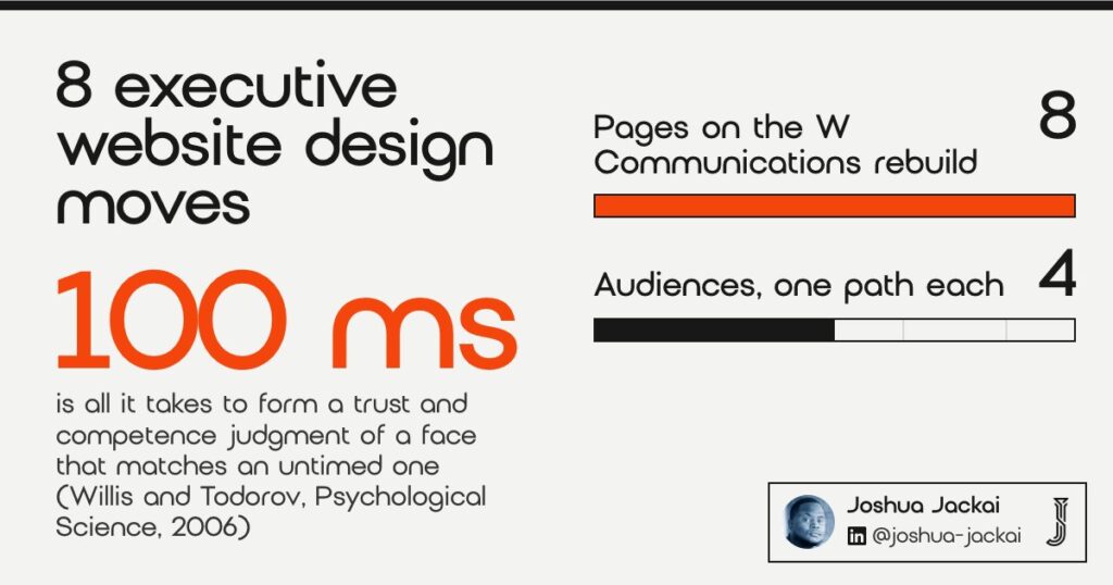
- Four audiences arrive at a founder’s name: media, clients, event bookers and readers. On W Communications each got its own path across 8 pages.
- People formed trust and competence judgments of a face after 100 milliseconds that matched judgments made with no time limit (Willis and Todorov, 2006).
- Design look was the most common credibility comment among 2,684 people judging live websites, at 46.1% (Fogg et al., 2003).
- Journalists in a 155-person survey rated visuals and news archives as the most important parts of an online pressroom (Atabek and Alikilic, 2020).
- A founder-led site costs from CA$4,950 for 5 pages on Framer, from CA$8,950 for a custom WordPress build, and from CA$10,495 for 8 to 15 pages.
| # | Move | Audience it serves | Best for |
|---|---|---|---|
| 1 | Map the four audiences | All four | Deciding which pages exist |
| 2 | Lead the bio with the credential | Media, clients | The first five seconds on the founder page |
| 3 | Rank the credibility signals | All four | Choosing what goes on the first screen |
| 4 | Answer on the speaking page | Event bookers | Turning a shortlist into an enquiry |
| 5 | Build the media page for a deadline | Producers | Getting booked on air |
| 6 | Write expertise AI can quote | Media, clients | Being named in AI answers |
| 7 | Leave four things off | All four | Protecting the leader and the proof |
| 8 | Scope by page count | The buyer of the site | Getting a fixed quote you can compare |
In this guide
1. Map the four audiences: best for deciding which pages exist
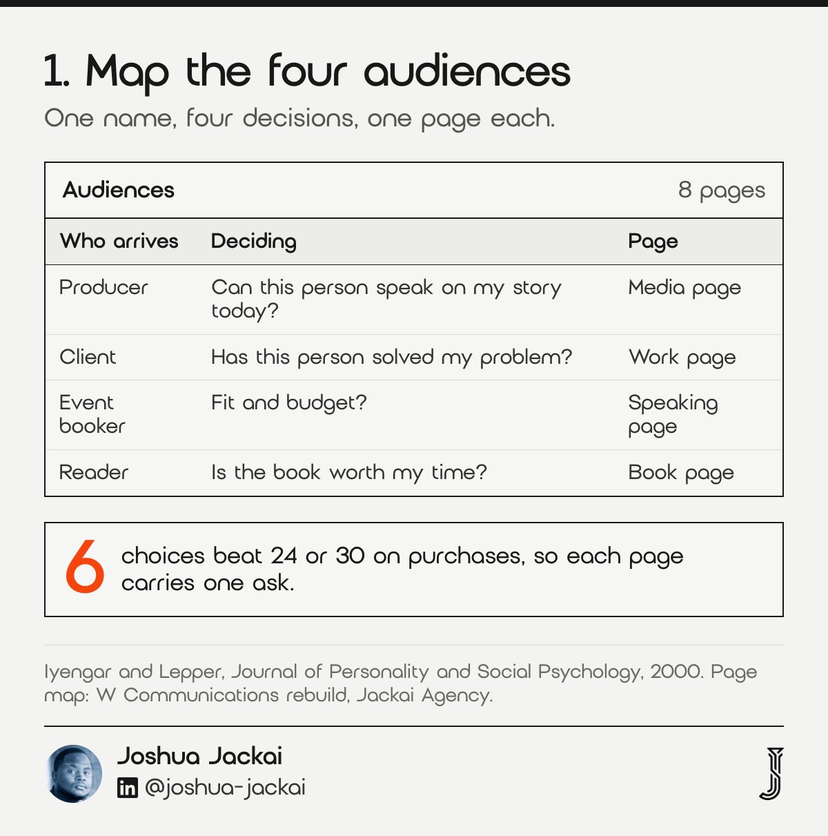
Executive website design is building a site around one named leader rather than a product list. Start by writing down who arrives and what each person is deciding. For a founder-led practice there are usually four: a producer, a prospective client, an event booker and a reader. Each page then serves one of them.
- Audiences: media, clients, event bookers, readers
- Output: one list of decisions, one page per audience
- W Communications result: 8 pages, one path per audience
- Evidence: field and lab experiments on choice overload
- Time: one hour with the leader
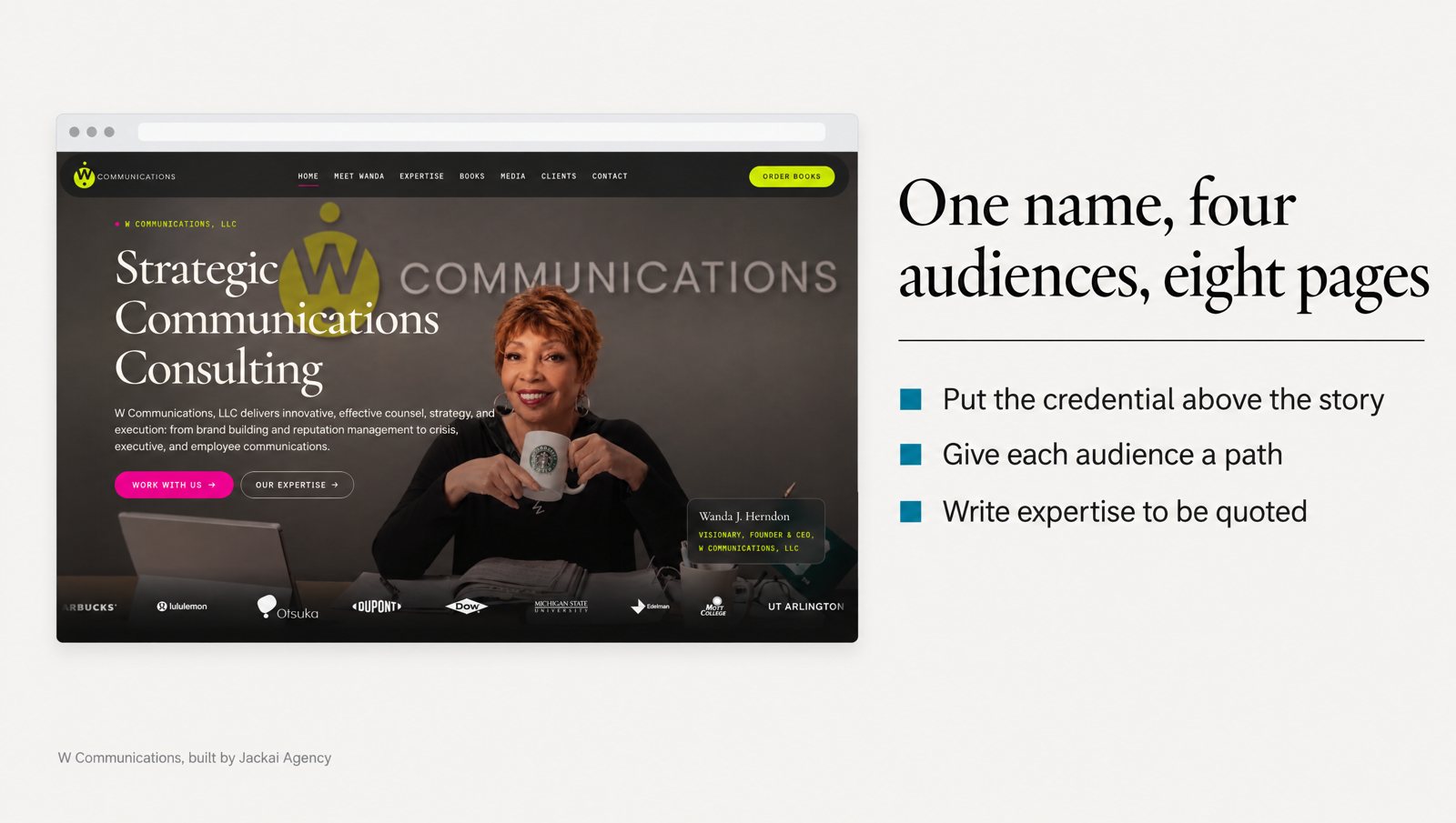
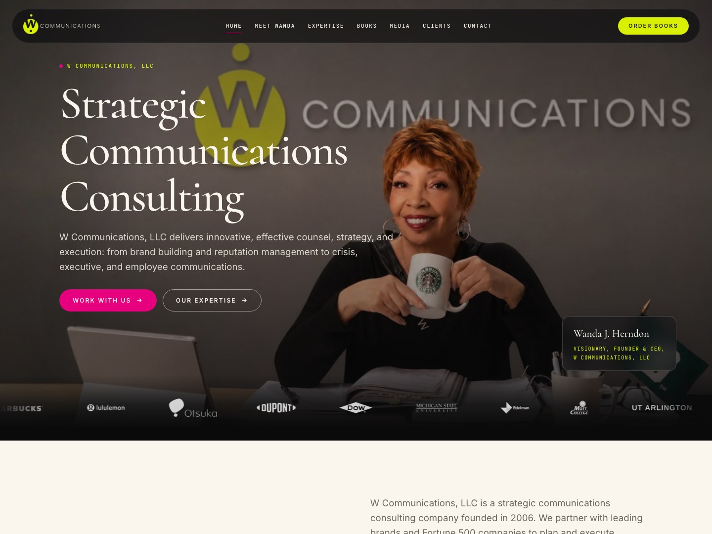
W Communications is a Seattle strategic communications and speaking practice. Before the rebuild, media, clients, event bookers and readers all arrived at one homepage and got the same opening paragraph. The proof existed, but low on the page. The rebuild gave each audience its own path across 8 pages, and the homepage did one job: name each audience and send it to the page built for it.
The executive website design brief starts before any layout. A producer is deciding whether this person can speak on her story today, so she needs the credential, the topics, a usable photo and a contact who replies. A client is deciding whether the leader has solved a problem like theirs. A booker is deciding fit and budget. A reader is deciding whether the book is worth the time. The homepage persuades none of them directly. It routes.
Fewer options at the point of decision has research behind it. In field and lab experiments, people were more likely to buy jams or chocolates when offered 6 choices than 24 or 30, and they were happier with what they picked (Iyengar and Lepper, 2000). I apply the same rule to every page after the homepage: one ask per page, written for the audience that page serves.
“I apply the same rule to every page after the homepage: one ask per page, written for the audience that page serves,” stated Joshua Jackai, Vancouver web designer.
2. Lead the founder bio with the credential: best for the first five seconds
At the top. It is the rule of executive website design I would defend first. On the W Communications biography page, the founder’s credential, former Starbucks senior vice president, sat after several paragraphs of narrative. In the rebuild it moved ahead of the story. Every later sentence then has a source the reader has already checked.
- Position: the first sentence of the bio and of the homepage
- Length: one sentence, one senior role, one recognizable organization
- Two versions: 50 words for producers and programs, long form for the page
- Evidence: first-impression studies and source credibility research
- Check: read only the first sentence; does it carry the credential?
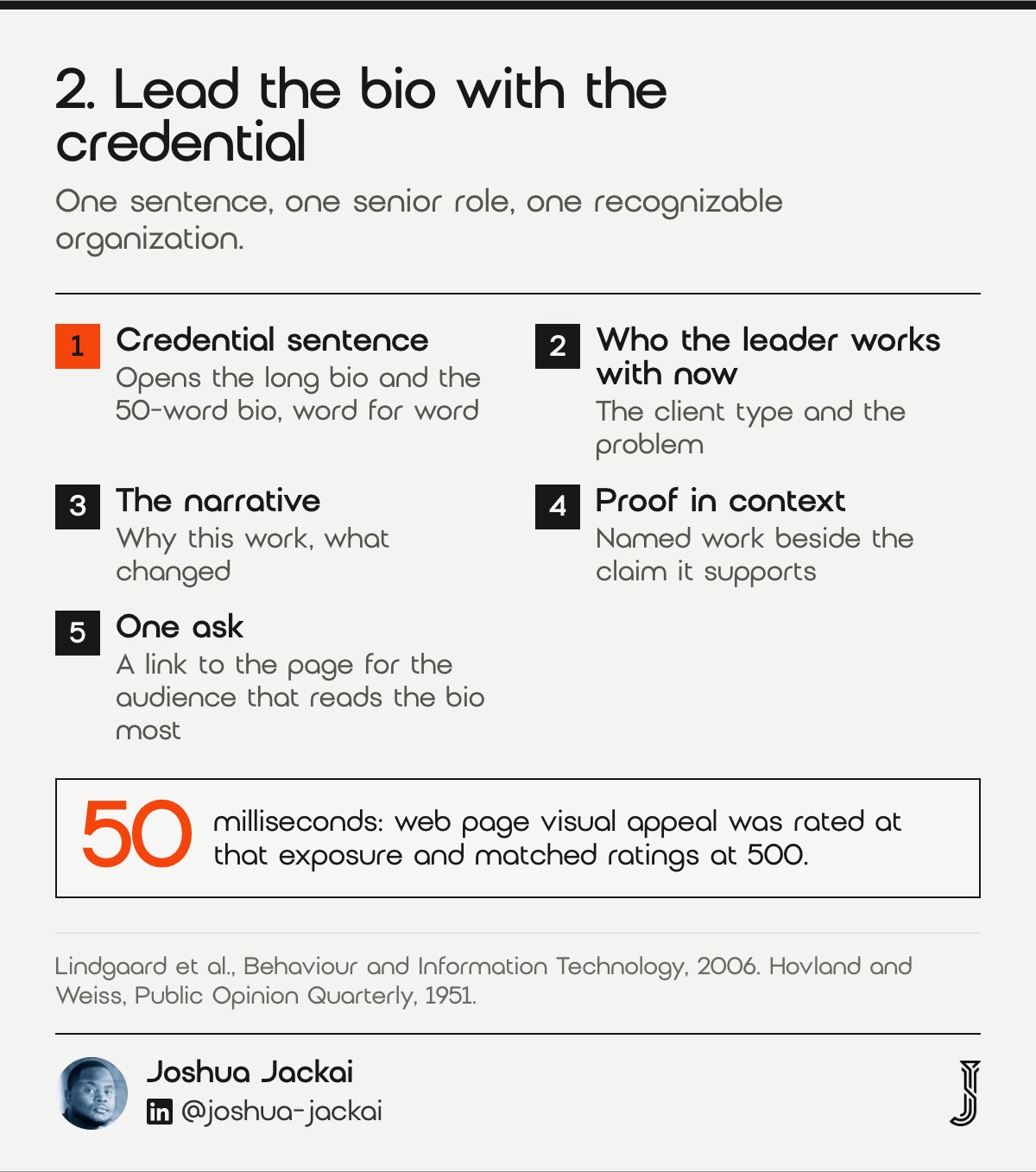
The order matters because visitors judge fast. In one study, people rated the visual appeal of web pages shown for 50 milliseconds, and those ratings closely matched ratings made at 500 milliseconds (Lindgaard et al., 2006). A founder bio that saves its strongest fact for paragraph four has already been judged on paragraph one.
The credential also changes how the rest is read. Classic persuasion research found people discounted material at the time they read it when they believed its source was untrustworthy (Hovland and Weiss, 1951). Here is the structure I write a founder bio to: one credential sentence; one sentence on who the leader works with now; the narrative of why this work; proof in context, with named clients and talks beside the claim they support; and one ask, a link to the page for whichever audience reads the bio most.
I write two versions, a 50-word founder bio for producers and event programs and the long founder bio for the page. Both open with the same credential sentence, word for word.
“A founder bio that saves its strongest fact for paragraph four has already been judged on paragraph one,” stated Joshua Jackai, Vancouver web designer.
3. Rank the credibility signals: best for choosing the first screen
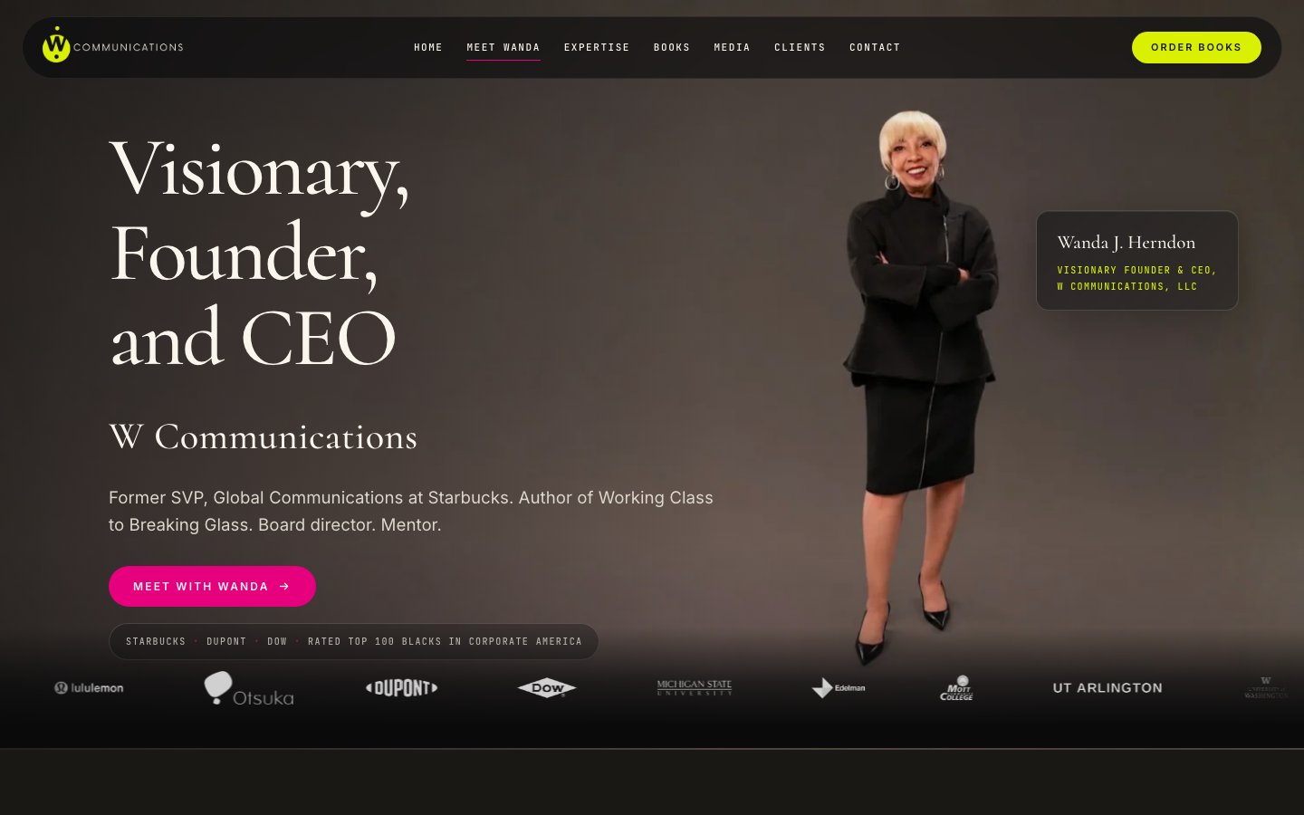
Not every signal weighs the same. Rank them, and put the top three on the first screen. In a study of 2,684 people, the design look of a site was the most common credibility comment, and a face is judged in 100 milliseconds.
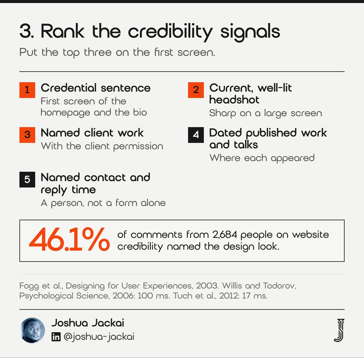
- Rank 1: the credential sentence on the first screen
- Rank 2: a current, well-lit headshot, sharp on a large screen
- Rank 3: named client work, with permission
- Rank 4: dated published work and talks
- Rank 5: a contact route that names a person and a reply time
When 2,684 people evaluated the credibility of live websites, the design look came up most often, in 46.1% of their comments. Information structure and information focus came next (Fogg et al., 2003). For executive website design, that means the layout is one of the credibility signals. Visitors read it before they read the words.
The photo is the clearest case. In five experiments, judgments made after seeing a face for 100 milliseconds correlated highly with judgments made with no time limit. Willis and Todorov of Princeton University ran the experiments (Willis and Todorov, 2006). A dim, cropped or ten-year-old headshot is judged before the credential under it is read.
“Judgments made after a 100-ms exposure correlated highly with judgments made in the absence of time constraints,” wrote Janine Willis and Alexander Todorov of Princeton University (Psychological Science, 2006).
Unusual design isn’t the answer either. Visual complexity and prototypicality, meaning how closely a page matches what people expect a site of its kind to look like, both shaped aesthetic judgments within 17 milliseconds (Tuch et al., 2012). What I leave out is as deliberate as what I put in: logos nobody can verify, “award-winning” with no award named, and praise the site never received. In my experience, weak signals don’t sit there neutrally. They make a careful reader doubt the strong ones beside them. For placing proof beside the ask on every page, see how to build trust on a website.
“In my experience, weak signals don’t sit there neutrally. They make a careful reader doubt the strong ones beside them,” stated Joshua Jackai, Vancouver web designer.
4. Answer on the speaking page: best for turning a shortlist into an enquiry
An event booker usually has a date, a theme, an audience and a budget before they open your site. A speaking page that hides the answers behind “get in touch” turns a yes-or-no decision into an email thread. A booker with three other names on the shortlist won’t start one, so the page answers first.
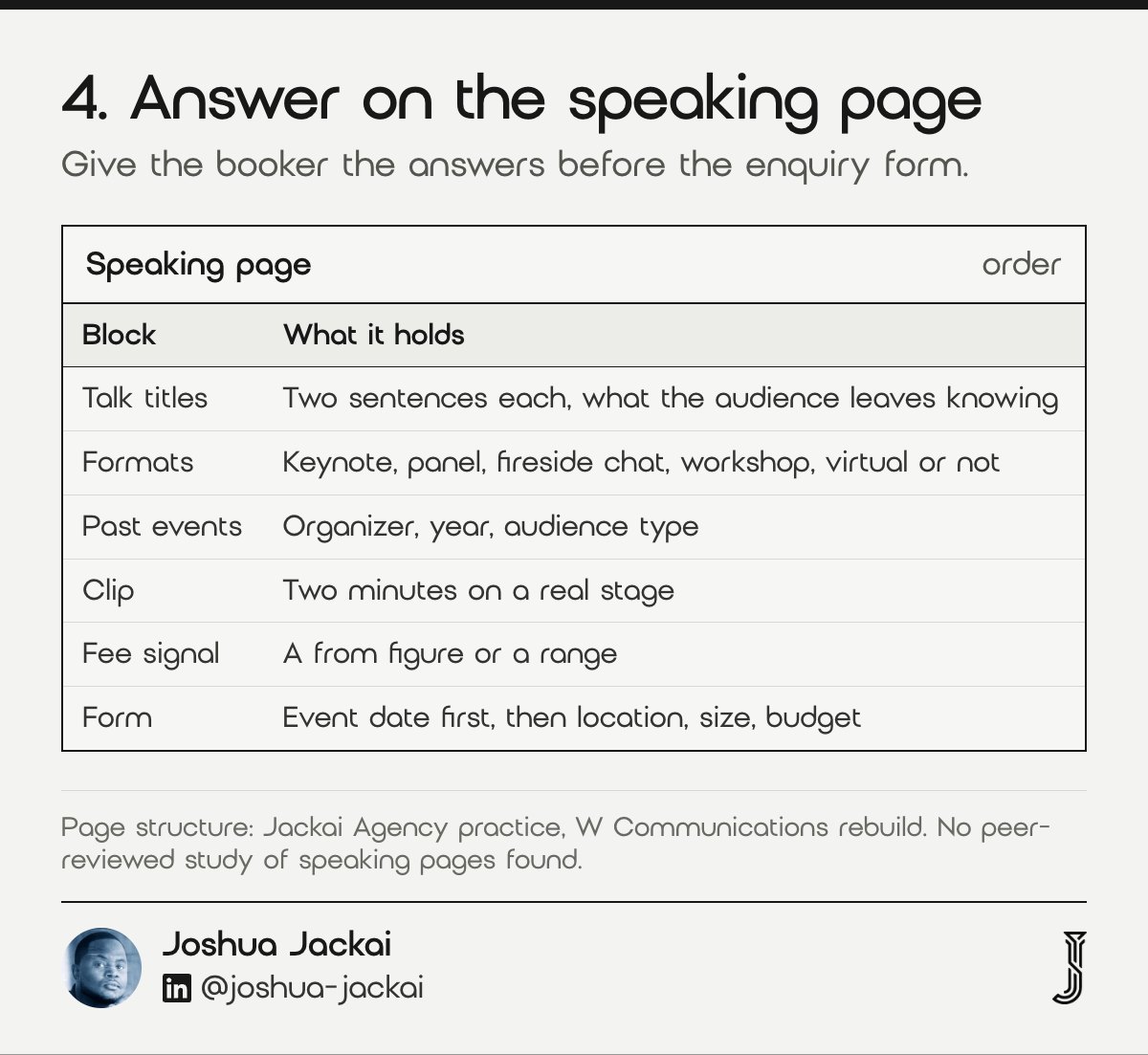
- Talks: a title and two sentences each, what the audience leaves knowing
- Formats: keynote, panel, fireside chat or workshop, virtual or not
- Past events: organizer, year, audience type
- Fee signal: a “from” figure or a range
- Form: the event date first, then location, audience size and budget
The W Communications rebuild gave event bookers their own path, separate from the client pages, because the two ask different questions. In my executive website design work, the speaking page is the one I most often find left as a paragraph and a form. Before the enquiry form I put talk titles with two sentences each, the formats offered, named past events, a two-minute clip from a real stage, a fee signal, and where the speaker is based and whether travel is included.
Leaders resist the fee signal most. But a speaking page without one gets enquiries from events that cannot afford the speaker, and someone spends the week saying no. A range filters them before they arrive. If the leader will not publish a figure, say which event types are a fit. The form should ask for the event date first, because date, location, audience size and budget decide availability.
Choice research applies here too. People offered 6 options bought more often than people offered 24 or 30 (Iyengar and Lepper, 2000), so a booker comparing speakers decides faster when each page offers the same few facts in the same order. That is why I template the speaking page the way I template the bio.
“A speaking page without one gets enquiries from events that cannot afford the speaker,” stated Joshua Jackai, Vancouver web designer.
5. Build the media page for a deadline: best for getting booked on air
A producer is not browsing. She is checking whether this person can carry a segment and whether anyone will answer before her deadline. A survey of 155 journalists found they rated visuals and news archives as the most important contents of an online pressroom, and trusted an organization more when an authorized contact answered fast.
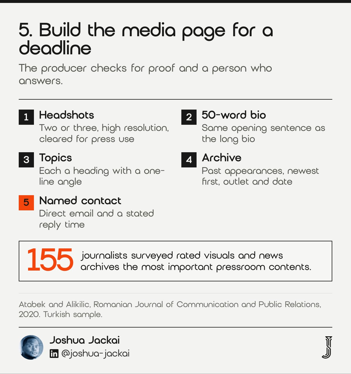
- Headshots: two or three, high resolution, marked cleared for press use
- Bio: the 50-word founder bio, same opening sentence as the long one
- Topics: each a heading with a one-line angle
- Archive: past appearances, newest first, outlet and date
- Contact: a named person, a direct email, a stated reply time
The survey followed a focus group of 11 journalists and then a questionnaire sent to 155 Turkish journalists, so it describes one country’s press, not all of them (Atabek and Alikilic, 2020). I use it as evidence for what a pressroom should contain, not for how fast any producer replies. The pattern matches what I see on rebuilds: the missing piece is rarely the proof. It is the proof being findable in one visit.
The producer from the top of this post is the scenario that opens my W Communications case study. In that scenario, the credential is further down the page, the topics sit inside a document and the photograph is 400 pixels wide. She doesn’t wait for a media kit. She books the second name on her list.
“The missing piece is rarely the proof. It is the proof being findable in one visit,” stated Joshua Jackai, Vancouver web designer.
So the media page carries cleared headshots, the 50-word bio, topics as headings, a dated archive and a named contact. Each takes under an hour to write once the leader has approved the facts. The page then answers the questions a producer would otherwise have to email.
6. Write expertise AI can quote: best for being named in AI answers
Producers aren’t the only ones lifting facts off the page now. When someone asks ChatGPT, Claude or Google’s AI answers for a speaker or an advisor, the answer is put together from several sources. The job for executive website design is stating each fact plainly enough for a machine to lift it.
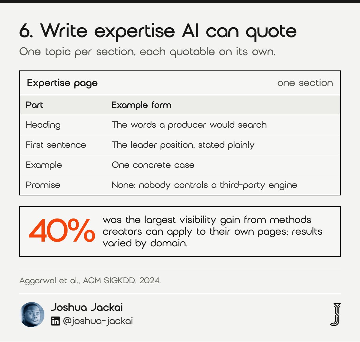
- Heading: the words a producer would search
- First sentence: the leader’s position
- Then: one concrete example
- Unit: one topic per section, quotable on its own
- Promise: none; no one controls a third-party engine
On the W Communications rebuild, expertise moved from flowing prose, with the topics implied rather than named, to an expertise page with one topic per section. Before, nobody looking for one topic could find it, because it was never named. Now each section stands alone.
The research is early. A 2024 study of generative engines found that methods content creators can apply to their own pages raised visibility in AI answers by up to 40%. The results varied by domain (Aggarwal et al., 2024). Nobody controls what a third-party engine returns, so I don’t promise citations. I do write so a fact can be lifted.
“Nobody controls what a third-party engine returns, so I don’t promise citations,” stated Joshua Jackai, Vancouver web designer.
Each topic gets a heading in the words a producer would search, a first sentence stating the leader’s position, and one concrete example. To see what AI tools say about you today, my free AI Visibility Report checks ChatGPT, Claude and Google’s AI answers within 24 hours.
7. Leave four things off: best for protecting the leader and the proof
A site under a named person is a lasting public record about a private individual, so executive website design includes deciding what stays off it. These four rules are my position, not research, and a leader can overrule any of them. Each protects either the person or the credibility of the claims that remain.
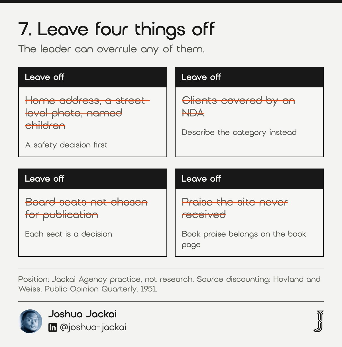
- Location: a city is fine; a home address or named children are not
- Clients: none covered by a non-disclosure agreement
- Board seats: only the ones the leader chose to publish
- Praise: only what the work actually received
- Authority: the leader can overrule any of the four
Street-level location and family details come first. A home address, a photo that identifies the street, or named children is a safety decision before it is a design decision. Clients covered by an NDA are next: if the engagement is confidential, the logo does not go on the page, and I describe the category of work instead.
Board seats the leader has not chosen to publish stay off too. Listing every seat is a default, not a decision. And praise the site did not receive stays off: endorsements of a book belong on the book page, credited to the book. Presenting them as praise for the advisory work is a stretch a careful buyer notices.
A source people distrust gets discounted at the time of reading (Hovland and Weiss, 1951), which is why a borrowed endorsement costs more than it earns.
“Presenting them as praise for the advisory work is a stretch a careful buyer notices,” stated Joshua Jackai, Vancouver web designer.
The same goes for numbers. The W Communications case study has no result figure, because no analytics survived the rebuild. No number beats an invented one, and I give leaders the same advice about the signals on their own site.
“No number beats an invented one,” stated Joshua Jackai, Vancouver web designer.
8. Scope by page count: best for getting a fixed quote you can compare
Page count is the first driver of executive website design cost. A founder with one offer and a short bio can launch on 5 pages. A practice serving media, clients, event bookers and readers usually needs more. The W Communications rebuild came to 8 pages, which sits in the Marketing Site tier.
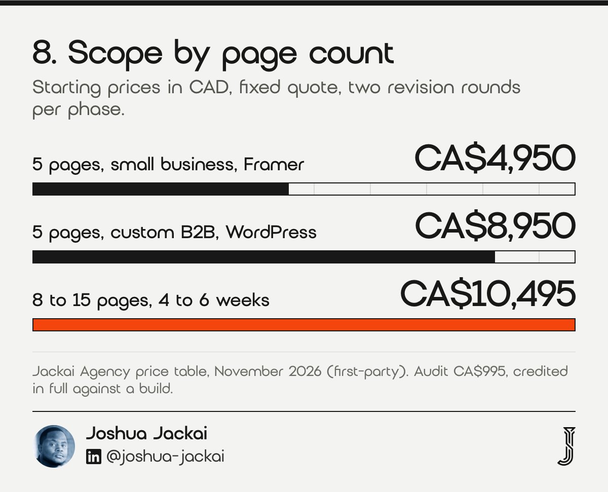
- 5 pages, small business: from CA$4,950 on Framer, CA$5,950 on WordPress
- 5 pages, custom B2B: from CA$7,450 on Framer, CA$8,950 on WordPress
- 8 to 15 pages: from CA$10,495, 4 to 6 weeks
- Website audit: CA$995, credited in full against a build
- Terms: fixed quote, two revision rounds per phase, you own the site, domain and hosting
These are my fixed prices on the Jackai Agency pricing page, as of November 2026. I start from the current site. The redesigns I led on client accounts at In Communications, a B2B digital marketing agency, began with a conversion audit of the existing analytics.
After page count, four things move the scope. How many service areas need writing, since finished copy and copy I write from interviews are different jobs. Whether a book page, a speaking page or a fixed-date event page is in scope. Whether the design system is built new or adapted. And who edits the site after launch, which decides the platform more than any design preference does.
W Communications runs on WordPress, which suits a library that keeps growing after launch: published work, media appearances, a speaking page that gains events every season. If the site is already on WordPress and the structure is the problem, a WordPress website redesign usually costs less than a platform move. When the launch date belongs to someone else, such as a book launch, I split the work into two phases: ship the one page the date requires, then build the full site behind it.
“Page count is the first driver of executive website design cost,” stated Joshua Jackai, Vancouver web designer.
Which executive website move fits which audience?
Match the move to the person arriving before you brief a designer. Media needs moves 2, 3 and 5, clients need 2, 3 and 6, bookers need move 4, and readers need the book page that move 1 creates. Filter the matrix by audience to see the moves, the evidence and the check for each.
| Move | Audience | Evidence | Check |
|---|---|---|---|
| 1. Map the four audiences | Readers | 6 options beat 24 or 30 on purchases (Iyengar and Lepper, 2000) | One ask per page |
| 2. Credential first in the bio | Clients | Distrusted sources are discounted (Hovland and Weiss, 1951) | First sentence carries the credential |
| 3. Rank the credibility signals | Clients | Design look led 46.1% of comments, n = 2,684 (Fogg et al., 2003) | Top three on the first screen |
| 4. Answer on the speaking page | Event bookers | My practice; no peer-reviewed study of speaking pages | Form asks for the date first |
| 5. Media page for a deadline | Media | 155 journalists rated visuals and archives most important (Atabek and Alikilic, 2020) | Named contact with a reply time |
| 6. Expertise AI can quote | Media | Visibility in AI answers rose by up to 40% (Aggarwal et al., 2024) | Each heading stands alone |
| 7. Leave four things off | Clients | My position, not research | No NDA logos, no home address |
| 8. Scope by page count | Readers | Jackai Agency price table, November 2026 | Fixed quote, two revision rounds |
How many pages does your executive website need?
Count the audiences you serve, then add the pages that serve them. The estimate here uses my November 2026 CAD price table and two inputs you set. Treat the defaults as placeholders; a real quote depends on copy, design system and who edits the site afterwards.
A pre-launch checklist for executive website design
I run eight checks before any executive site goes live. Each is a check a visitor would otherwise run for you, and leave when it fails. Run them in this order, on a phone first, and fix every failure before the site is announced to anyone.
- Open the homepage on a phone. Can a stranger tell who the leader is, and which link is theirs, without scrolling?
- Read only the first sentence of the founder bio. Does it carry the credential?
- Click every buy, book and download link. Each should open the exact edition, calendar or file it names, not a close cousin.
- Tap every button with one thumb. A study of one-handed thumb use recommends targets of about 9.2 mm for single taps (Parhi, Karlson and Bederson, 2006). Check the speaking page booking button first.
- Download the press headshot. Is it high resolution, and does the page say it is cleared for press use?
- Send a test enquiry from each form. Does it reach a named person who replies on time?
- Read each expertise heading on its own. Would a producer know the topic from the heading alone?
- Check that each enquiry arrives with its source. I tag every link so a lead carries the channel that sent it, as in my lead attribution case study.
Questions about executive website design, answered
Five questions come up on nearly every founder-site project, from what the term means to whether a speaker should publish a fee. Each answer here is the short version, written to stand alone, and the eight numbered moves carry the detail and the sources.
What is executive website design?
Executive website design is building a site around one named leader rather than a company's product list. The leader might run a consultancy, speak for a fee, publish books or advise executives. The site exists because people search that person's name before they hire, book or quote them.
How many pages does an executive website need?
Five pages is enough for a founder with one offer and a short bio. A practice serving media, clients, event bookers and readers usually needs 8 or more. The W Communications rebuild came to 8 pages, one path per audience, with the homepage routing rather than persuading.
Where should the credential go on a founder bio?
In the first sentence of the bio and on the first screen of the homepage. Visitors rate a page within 50 milliseconds, so a credential saved for paragraph four is judged after the impression has formed. Write the same credential sentence at the start of the 50-word version.
Should a speaker publish a fee?
Publish a "from" figure or a range, or name the event types that fit. A page with no fee signal draws enquiries from events that cannot afford the speaker, and someone spends the week declining them. It is my practice rather than a research finding, and the leader decides.
Is an executive site better than a LinkedIn profile?
They do different jobs. A platform owns a profile page and decides its layout. An owned domain is the one page under that name where the leader decides the order of things. That is my position, not a research finding, and most leaders need both.
Want a second opinion on your founder site?
Same leader. Same credential. Same body of work. What changes is the order a visitor meets it in, and whether each of the four people arriving finds their page, and the credibility signals on it, before they give up and book the next name.
If you run a founder-led practice and your site hands every visitor the same paragraph, book a 30-minute call with me. Bring the list of who arrives at your site and what each of them is deciding. We will work out the executive website design from there, page by page.
Sources
Peer-reviewed research
- Aggarwal, P., Murahari, V., Rajpurohit, T., Kalyan, A., Narasimhan, K., and Deshpande, A. (2024). GEO: Generative Engine Optimization. Proceedings of the 30th ACM SIGKDD Conference on Knowledge Discovery and Data Mining, 5-16. https://doi.org/10.1145/3637528.3671900
- Atabek, U., and Alikilic, O. A. (2020). Online Pressrooms: Journalists' Expectations from Public Relations Practitioners Concerning Online Media Relations. Romanian Journal of Communication and Public Relations, 22(3), 65-83. https://doi.org/10.21018/rjcpr.2020.3.309
- Fogg, B. J., Soohoo, C., Danielson, D. R., Marable, L., Stanford, J., and Tauber, E. R. (2003). How do users evaluate the credibility of Web sites? Proceedings of the 2003 Conference on Designing for User Experiences, 1-15. https://doi.org/10.1145/997078.997097
- Hovland, C. I., and Weiss, W. (1951). The Influence of Source Credibility on Communication Effectiveness. Public Opinion Quarterly, 15(4), 635-650. https://doi.org/10.1086/266350
- Iyengar, S. S., and Lepper, M. R. (2000). When choice is demotivating: Can one desire too much of a good thing? Journal of Personality and Social Psychology, 79(6), 995-1006. https://doi.org/10.1037/0022-3514.79.6.995
- Lindgaard, G., Fernandes, G., Dudek, C., and Brown, J. (2006). Attention web designers: You have 50 milliseconds to make a good first impression! Behaviour and Information Technology, 25(2), 115-126. https://doi.org/10.1080/01449290500330448
- Parhi, P., Karlson, A. K., and Bederson, B. B. (2006). Target size study for one-handed thumb use on small touchscreen devices. Proceedings of the 8th Conference on Human-Computer Interaction with Mobile Devices and Services, 203-210. https://doi.org/10.1145/1152215.1152260
- Tuch, A. N., Presslaber, E. E., Stöcklin, M., Opwis, K., and Bargas-Avila, J. A. (2012). The role of visual complexity and prototypicality regarding first impression of websites: Working towards understanding aesthetic judgments. International Journal of Human-Computer Studies, 70(11), 794-811. https://doi.org/10.1016/j.ijhcs.2012.06.003
- Willis, J., and Todorov, A. (2006). First Impressions: Making Up Your Mind After a 100-Ms Exposure to a Face. Psychological Science, 17(7), 592-598. https://doi.org/10.1111/j.1467-9280.2006.01750.x
Industry and vendor data (not peer reviewed)
- Jackai Agency price table, November 2026 (first-party). Pricing.
- Jackai Agency, W Communications rebuild, 8 pages (first-party). W Communications case study.