Most social media ad creative for B2B and education offers does not fail because it looks cheap. It fails because someone judged it on the wrong number. On the Membership Funnel Redesign for Copy Chief, a membership platform for working copywriters, the ads with the best engagement were the ones least likely to sell a subscription. Engagement picked the winners, and engagement was the wrong judge.
Picture the buyer. A copywriter is deciding whether to spend rent money on herself. She sees an ad that names the exact thing she is stuck on, and she stops, because for once the words match her situation. That ad did its job. An ad that makes her smile and keeps her thumb moving did not, whatever the dashboard says.
This guide covers six ad concepts I still use, what the research says about each one, how I brief them, and how I run creative testing when the budget cannot pay for a long experiment.
In this guide
What is social media ad creative, and what makes it work?
Social media ad creative is everything a person sees in the feed before they click: the image or video, the words on it, the text above it and the headline under it. The concept is the single idea all of those parts carry. Production is how well they are made. In creative testing on my projects, a sharp concept made quickly beats a weak concept made beautifully more often than not.
The research backs the idea, with a condition attached. A 2020 meta-analysis in the Journal of Marketing pooled 878 effect sizes from 67 papers and found that advertising creativity has positive effects, and that originality and appropriateness both count (Rosengren et al., 2020). The effects were stronger for high-involvement products. A course that costs real money, or a B2B service with a long contract, is exactly that kind of product.
An earlier study in Marketing Science found the same shape from another angle. People rated an ad as creative when it was different from what they expected and relevant to them at the same time (Smith et al., 2007). Different without relevant is noise. Relevant without different is wallpaper. All six ad concepts below get checked against both tests.
Which ad concepts still hold up when you check them?
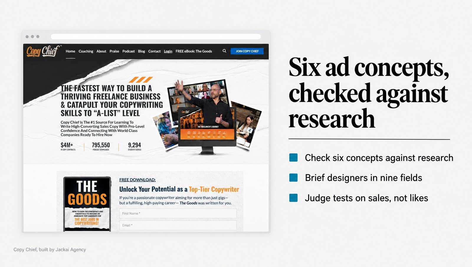
An old draft of this post listed five ad concepts from my own feed work: the warning ad, the “this is not” ad, us versus them, the news-style ad and the sticky note. Its brain science leaned on citations I could not verify. So I checked each one against peer-reviewed work and added a sixth, the pain-point static, because it sits behind the Copy Chief campaigns I can measure.
1. The pain-point static
One line, in the buyer’s own words, naming a problem she has today. No product shot needed. For Copy Chief, I built static and animated Meta ads around the pain points of the ideal customer, split into top-of-funnel and bottom-of-funnel sets.
Why it holds: a major review of psychology research found that bad information is processed more thoroughly than good information (Baumeister et al., 2001). A named problem gets read. The condition is that the problem has to be hers, quoted from research, not guessed in a meeting. A pain line written by the marketing team reads like it was written by the marketing team.
2. The warning ad
A plain screen and a word like “Warning”, followed by something the reader did not expect: “Warning: your proposal template is losing you the second meeting.” It works as a pattern break. The feed predicts another ad and gets a notice instead. The Smith study above explains when it fails. The surprise must point at a real problem the reader has.
What I would not do: fake system alerts, fake notification dots or anything that copies the platform’s own screens. In my experience, a tricked click arrives annoyed, and the landing page rarely wins it back.
3. The “this is not” ad
I dropped the old draft’s comparisons with prescription drugs, because health claims have no place in these ads. The structure itself still works for services: “This is not another agency retainer. It is one landing page, built in two weeks, judged on booked calls.” It borrows a category the reader already knows, then moves the offer out of it. I have no peer-reviewed study for this format, so treat it as my experience: I use it when a B2B offer keeps getting confused with a cheaper service.
4. Us versus them
Your way against the old way, side by side. A meta-analysis of comparative advertising found that comparative ads beat non-comparative ads on attention, message processing, brand attitude and purchase intention. They scored lower on source believability and on liking of the ad itself (Grewal et al., 1997). New brands comparing themselves with established ones gained the most.
That trade explains how I use it. I compare against a habit, such as “a 40-page capabilities deck”, not against a named competitor. The reader gets the contrast, and I skip the argument about whose numbers are right.
5. The news-style ad
A headline and a short finding laid out like an article, often with a date. It works because it looks like information rather than a pitch. That is also its risk. In two experiments on native advertising, people who recognized sponsored content as advertising generally rated the brand and the publisher more negatively (Wojdynski and Evans, 2016).
So I borrow the format and keep it honest: a real finding, a real date and the brand name in view. No fake mastheads and no invented quotes. If the ad only works while the reader is fooled, it stops working the moment she lands on the page.
6. The sticky-note ad
A handwritten note on a plain surface with one line on it. The old draft credited it to the Zeigarnik effect, the idea that people remember unfinished tasks better. That support is gone. A 2025 meta-analysis found no memory advantage for unfinished tasks, only a general tendency to go back and finish them (Ghibellini and Meier, 2025).
The format has a better explanation. Eye-tracking on 1,363 print ads found that text captures attention in proportion to its size, and only bigger text raised attention to the ad as a whole (Pieters and Wedel, 2004). A later study found that dense visual detail hurt attention to the brand (Pieters, Wedel and Batra, 2010). A sticky note is one large line with almost no clutter around it. That is the likelier reason it works.
How should social media ad creative change across the funnel?
The same ad concepts do not belong in front of everyone. On Copy Chief’s Meta ads I split the creative into top-of-funnel sets for people new to the offer and bottom-of-funnel sets for people who had already engaged, both built around the buyer’s pain points. The table below is the rule I work from now.
A field experiment with an online travel firm points the same way. Ads showing the exact product a person had viewed did worse, on average, than plain brand ads. They only caught up once the person’s browsing showed narrower preferences, such as visiting review sites. The authors’ advice was to vary ad content by stage of the decision (Lambrecht and Tucker, 2013).
| Stage | Who sees it | Ad concepts that fit | Judge it on |
|---|---|---|---|
| Cold | People who match the buyer but have never heard of you | Pain-point static, warning ad, sticky note | Cost per lead or opt-in, not cost per click |
| Warm | Video viewers, page visitors, your email list | Us versus them, news-style finding, “this is not” | Booked calls or purchases |
| Hot | People who started a form or checkout and stopped | The objection answered, proof from a named client | Completed purchases or calls |
The last column matters most. Social media ad creative that wins cheap clicks and no leads is not a winner. It is a slow way to spend the budget on the wrong people.
What did Copy Chief’s Meta ads teach me about judging creative?
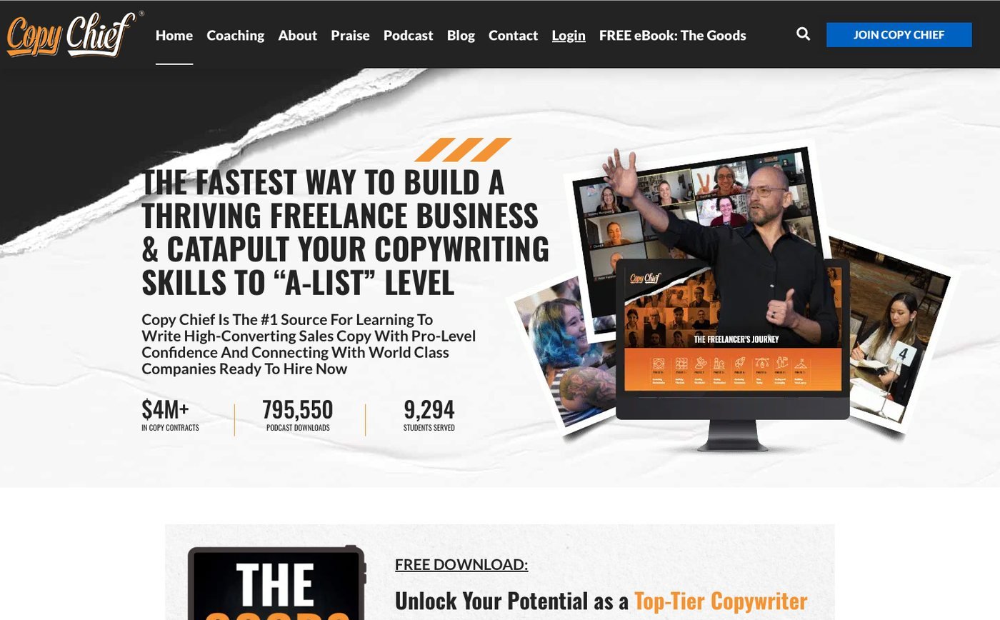
Two campaigns for Copy Chief, a copywriting education business in St. Petersburg, Florida, shaped how I judge social media ad creative now. Each number below belongs to its campaign only.
Escape Velocity ran on Meta ads with a mobile-first funnel. Average return on ad spend was 55.03x, about $55 back for every $1 of media. The landing page converted at 10.1%. Click-through rate went from 0.9% to 3.0%, and each customer cost $22 instead of $42. The creative testing and the mobile-first page ran together, so I cannot tell you how much of that belongs to the ads alone.
Membership Funnel Redesign ran from August to October 2023 on ClickFunnels with traffic from Meta ads. It returned 31x on ad spend across 215 paid subscriptions. Before the rebuild, the social media ad creative was judged on engagement, and the ads that won on engagement were the least likely to sell. I moved creative testing to paid subscriptions instead, and the budget followed that number.
Nothing about the offer was wrong. The page and the number the creative answered to were. One caveat travels with the 31x: that campaign ran to a deadline. Evergreen traffic does not convert at launch rates, so the figure belongs to August to October 2023, not to the funnel forever.
The new funnel also opened with the ad’s promise as its first line, so the cue that earned the click carried onto the page, what information foraging research calls information scent (Pirolli and Card, 1999). The full before and after is in the Copy Chief membership funnel case study.
How do I brief ad concepts so a designer can build them?
A brief for social media ad creative that says “make it pop” gets you production with no concept. Mine fits on one page, has nine fields and feeds straight into creative testing. If a field is empty, the ad is not ready to design.
- Buyer: one person in one moment, such as “an operations director comparing two IT providers before a renewal”.
- Her words: a phrase she actually used, from an interview, a review, a sales call or a forum thread.
- Funnel stage: cold, warm or hot, from the table above.
- Concept: one of the six ad concepts, named.
- The line: the one sentence on the creative, short enough to read in two seconds.
- Proof: the one fact that makes the line believable, with its source.
- Format: static, animated or both, and where it will run.
- Judged on: the conversion event, such as a booked call, a purchase or a form fill. Never likes.
- Kill rule: the spend or date at which it stops if it has not produced that event.
The second field does most of the work. For Copy Chief, the buyer research came from four places. I ran Perplexity searches for pain points and built a custom Python scraper that fed Reddit comments to a language model to sort pains from desires. I also interviewed the coaches and emailed members. The lines in the social media ad creative came out of that pile, not out of a brainstorm.
Here is a worked example for a made-up client, so you can see the fields filled in. A 40-person managed IT firm wants more calls in renewal season. The buyer is an operations director whose contract ends in 90 days. Her words, from a sales call: “I never know what I’m actually paying for.”
Stage: cold. Concept: sticky note. Line: “What does your IT contract actually cover?” Proof: a one-page coverage checklist. Format: static first. Judged on: checklist downloads that turn into calls. Kill rule: paused after a spend set in advance if no calls come in.
How do you run creative testing on a small B2B budget?
Most advice on creative testing assumes a budget that most firms with 10 to 200 staff do not have. The research is blunt about this. Twenty-five large field experiments with US retailers and brokerages found the median confidence interval on return on investment was over 100 percentage points wide (Lewis and Rao, 2015). An informative test could need more than 10 million person-weeks of data.
Shortcuts do not rescue it. Large field experiments at Facebook showed that observational methods, the kind that compare people who saw an ad with people who did not, often failed to match the results of randomized tests (Gordon et al., 2019).
So on a small budget I change what I test, not how hard I stare at the numbers:
- Test ad concepts, not buttons. A pain-point static against a news-style ad is a difference big enough to show up. Blue against green is not.
- Use the platform’s split-test tool, such as the A/B test in Meta ads, so each person sees one version. Two ad sets running side by side are not a test.
- Judge on the event closest to money. Booked calls or purchases first, leads if sales take months, clicks only to spot a broken ad.
- Set the stop rule before launch. Write down the spend or the date, then keep to it.
- Treat a narrow win as a tie. Keep both, then test a new concept against the pair.
None of this makes a small test precise. It makes creative testing less likely to fool you, which is the part that saves money.
When does social media ad creative wear out?
Creative fatigue is real, but people blame it too early. A meta-analysis of repetition studies found that, in experiments, attitudes kept improving up to about ten exposures, while recall kept climbing. Spaced exposures helped attitude toward the brand, and the effects faded over time (Schmidt and Eisend, 2015).
In practice I read two signals together in Meta ads reporting, with the audience held the same, before I call an ad tired: frequency climbing, and cost per result rising for two weeks or more. If only one moves, it is more likely the auction or the season. When both move, I keep the concept and change the execution: a new line, a new image, the same idea.
The concept took research to find. The execution is the cheap part to replace. Throwing out social media ad creative that still has a sound concept means paying for the research twice.
Static or animated: which format should carry the concept?
Copy Chief’s social media ad creative ran as both static and animated Meta ads. Statics are faster to make and easier to test, because there is one frame to read. Animation earns its place when the concept needs a before and after.
For animated ads, brand placement matters. Eye-tracking on TV commercials found that a brand held in the center of the screen pushed people to skip, while short brand appearances spread across the ad, with the same total exposure, reduced skipping (Teixeira, Wedel and Pieters, 2010). A feed is not a TV, so take that as direction, not a rule. I show the brand early and briefly, then let the problem carry the middle.
What does social media ad creative cost with Jackai Agency?
Social media ad creative and media buying are quoted as a fixed price before work starts, because the number of concepts and channels changes the job. Two pieces around them have set prices. A landing page for paid traffic starts at CA$3,795 and takes one to two weeks. If your leads arrive without their source, Lead Source Reporting is CA$2,600 over two weeks, so each enquiry records the campaign and ad that sent it.
Without that tracking, creative testing on booked calls is guesswork, because nobody can say which ad booked the call. Standard terms apply to all of it: a fixed quote, two revision rounds per phase, and replies within one business day. The Meta ads service covers the paid side, and the pricing page and calculator lists everything else.
Want a second opinion on your ad concepts before you spend more?
The offer was never the problem at Copy Chief. The number the ads answered to was. If your social media ad creative collects likes while your calendar stays empty, bring three of your current ads to a 30-minute call. We will look at which concept each one uses and what creative testing should judge it on.
Sources
Peer-reviewed research
- Baumeister, R. F., Bratslavsky, E., Finkenauer, C., and Vohs, K. D. (2001). Bad is stronger than good. Review of General Psychology, 5(4), 323-370.
- Ghibellini, R., and Meier, B. (2025). Interruption, recall and resumption: A meta-analysis of the Zeigarnik and Ovsiankina effects. Humanities and Social Sciences Communications, 12.
- Gordon, B. R., Zettelmeyer, F., Bhargava, N., and Chapsky, D. (2019). A comparison of approaches to advertising measurement: Evidence from big field experiments at Facebook. Marketing Science, 38(2), 193-225.
- Grewal, D., Kavanoor, S., Fern, E. F., Costley, C., and Barnes, J. (1997). Comparative versus noncomparative advertising: A meta-analysis. Journal of Marketing, 61(4), 1-15.
- Lambrecht, A., and Tucker, C. (2013). When does retargeting work? Information specificity in online advertising. Journal of Marketing Research, 50(5), 561-576.
- Lewis, R. A., and Rao, J. M. (2015). The unfavorable economics of measuring the returns to advertising. Quarterly Journal of Economics, 130(4), 1941-1973.
- Pieters, R., and Wedel, M. (2004). Attention capture and transfer in advertising: Brand, pictorial, and text-size effects. Journal of Marketing, 68(2), 36-50.
- Pieters, R., Wedel, M., and Batra, R. (2010). The stopping power of advertising: Measures and effects of visual complexity. Journal of Marketing, 74(5), 48-60.
- Pirolli, P., and Card, S. (1999). Information foraging. Psychological Review, 106(4), 643-675.
- Rosengren, S., Eisend, M., Koslow, S., and Dahlen, M. (2020). A meta-analysis of when and how advertising creativity works. Journal of Marketing, 84(6), 39-56.
- Schmidt, S., and Eisend, M. (2015). Advertising repetition: A meta-analysis on effective frequency in advertising. Journal of Advertising, 44(4), 415-428.
- Smith, R. E., MacKenzie, S. B., Yang, X., Buchholz, L. M., and Darley, W. K. (2007). Modeling the determinants and effects of creativity in advertising. Marketing Science, 26(6), 819-833.
- Teixeira, T. S., Wedel, M., and Pieters, R. (2010). Moment-to-moment optimal branding in TV commercials: Preventing avoidance by pulsing. Marketing Science, 29(5), 783-804.
- Wojdynski, B. W., and Evans, N. J. (2016). Going native: Effects of disclosure position and language on the recognition and evaluation of online native advertising. Journal of Advertising, 45(2), 157-168.