An operations lead at a 12-person advisory firm has two tabs open. She sat through both product demos last week. Now she is on the pricing pages, and her managing partner wants a recommendation by Friday. This is the moment most B2B SaaS website design gets wrong. The homepage got the budget. The page where she has to defend a number got a table of ticks.
It isn’t a looks problem. A software site carries jobs a services site never has: a pricing page a committee can read without a salesperson, a demo request path that doesn’t stall, a home for webinar traffic, and pages marketing can publish alone. I’m Joshua Jackai, and I run Jackai Agency in Vancouver. I’ve built each of these, for Snappy Kraken on HubSpot CMS and for Advisor Websites, two SaaS companies that sell to financial advisors.
In this guide
What does B2B SaaS website design need that a services site does not?
A services site sells a team and a conversation. The visitor decides whether to talk to you, and the first conversion is a call. A SaaS site sells a product that someone has to evaluate, compare and then defend to the people who share the budget. Much of that work happens before anyone fills in a form.
The committee part is old news in B2B research. Johnston and Bonoma (1981) studied the group that makes a business purchase, which they called the buying center, across 31 firms. Its makeup differed reliably between equipment purchases and service purchases. On the SaaS sites I’ve built, each member of that group reads a different page. The user reads the product pages. The person who signs reads the pricing page.
So B2B SaaS website design starts from a different list of pages than a services site does. Here is how the two differ.
| Question | Services site | SaaS site |
|---|---|---|
| Where is the decision made? | On a call | On the pricing page, often before any call |
| What is the first conversion? | A booked consultation | A demo request, a free trial or a webinar sign-up |
| Where does traffic come from? | Referrals and search | Search, webinars, partners, events and paid campaigns |
| Who reads it? | The owner or one buyer | A user, a budget holder and often a compliance reviewer |
| Who edits it? | Changes a few times a year | Marketing needs new pages for launches, webinars and segments |
How should a SaaS pricing page be structured?
On the Snappy Kraken project, the pricing page carried the most traffic on the site and had the least design. Snappy Kraken is a B2B FinTech SaaS company that sells marketing systems to financial advisors. Its old pricing page was a three-column plan table with rows of feature names and ticks. Nothing on it explained what changed between tiers.
A tick table works for a buyer who already knows which feature matters. Most don’t. In Iyengar and Lepper’s (2000) field and lab studies, people were more likely to buy jams or chocolates from a set of 6 options than from a set of 24 or 30.
A later meta-analysis of 99 results by Chernev, Böckenholt and Goodman (2015) found the effect grows when the options are complex, the task is hard and the buyer is unsure what she wants. Three plans across nine rows of features is a complex set, and most buyers arrive unsure.
A second finding matters just as much for B2B SaaS website design. Simonson (1989) showed that a middle option gains share as a compromise, and that the effect gets stronger when people expect to justify their choice to others. That’s the B2B buyer. She is choosing something she can explain to a partner, so the middle tier earns its place only when its reason is written where she can copy it into an email.
Here is the structure I use. The first three items are what changed on the Snappy Kraken pricing page. The last two are what I add on other projects.
- One focal action per screen. Each tier gets its own space and one next step, so the buyer moves forward one decision at a time.
- Differences written as sentences. Beside each tier, say in plain words what changes from the tier below it and who it suits.
- The objection beside the number. If buyers hesitate over setup time or contract length, answer that next to the price, not in a FAQ three screens down.
- Labels that name the buyer. “Firms with 5 to 20 advisors” tells a reader where she fits faster than a tier name does.
- The full comparison table, lower down. Keep it for the reader who wants every row, just not as the first thing she sees.
Should you publish prices at all? For a product sold to small firms, I’d say yes. A buyer who can’t find a number has to book a call just to learn whether she can afford you, and plenty won’t. For enterprise contracts, a starting price plus what changes the quote still beats “contact us”. That is my experience from client projects, not a research finding.
What should happen after someone clicks the demo request button?
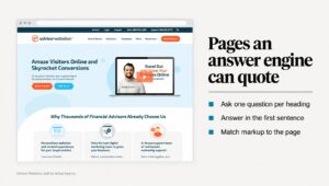
The demo request is the SaaS version of a contact form, and it’s the first step I check on any SaaS site. At Advisor Websites, a Vancouver SaaS platform that builds websites for financial advisors, the booking page asked for a decision before it had given a reason. The old version was a plain form. The rebuilt page offers real-time calendar booking, with a video from the CEO and named testimonials beside it.
In an eye-tracking experiment with 65 people, Seckler and colleagues (2014) applied 20 usability guidelines to forms taken from real company websites. The improved forms were finished faster, with fewer failed submissions, and people were more satisfied with them.
On every B2B SaaS website design project, I work through the same short list for the booking step:
- Ask only for what sales will use. Name, work email, company and one qualifying question.
- Say what happens next. How long the demo runs, who runs it, and whether the buyer can bring a colleague.
- Let people book a time. A calendar on the page removes the email back and forth that follows a plain form.
- Give each role a way in. At Advisor Websites, the advisor who owns the firm, the office manager and the compliance officer each needed a different entry point.
- Record the source. Every demo request should carry the page, campaign and channel that produced it into your CRM.
That last point matters more on a SaaS site than almost anywhere, because in my experience demo count is the number marketing gets judged on. My lead attribution method shows how the tags travel from link to form to CRM.
Should the main button be a demo request or a free trial? It depends on how fast a buyer can see value alone. A study of a subscription TV service by Foubert and Gijsbrechts (2016) found free trials cut both ways. A poor trial can lose a prospect for good, and timing and trial usage decide whether it pays off. At Advisor Websites, booking a demo is the main goal and a free trial is second, because several people at an advisory firm share the decision.

Where should webinar traffic land?
In my experience, webinars rarely make it into a brief for B2B SaaS website design, yet the traffic a webinar sends behaves like nothing else on the site. Picture an advisor who registered for a session, missed it, and finds the invitation two days later. She clicks the link. It opens a registration page for an event that already happened. There’s no recording, no summary and no next step.
That was the situation at Advisor Websites. The sessions were being recorded, but the recordings lived in email and expired with the invitation. So every webinar stopped earning the day after it aired. The fix was not more webinars. It was a page for each one.
The research term for what broke is information scent. Pirolli and Card (1999) describe how people judge the value of a path from the cues in front of them, and change what they do to get useful information at the best rate. In those terms, a webinar invite is a strong cue, and a dead registration page cuts the trail where the visitor was most interested.
Here is what I built for Advisor Websites:
- A replay library. Every session is a page of its own, browsable after it airs, with a title, a summary and a stable address that search engines can index.
- A replay template. Each page holds the recording, a short summary and one next action. Marketing fills it for each new session without a developer.
- A route from the homepage. The homepage went from several competing actions to one primary action, with a visible path into the library.
The results, from the replay library and opt-in templates: organic traffic up 58% and MQL conversion up 28%. MQL means marketing-qualified lead, a contact marketing has judged ready for sales. The recordings already existed before I started. What they lacked was a page that kept working after the session ended. The before and after is in the Advisor Websites webinar library case study.
What belongs on SaaS product pages?
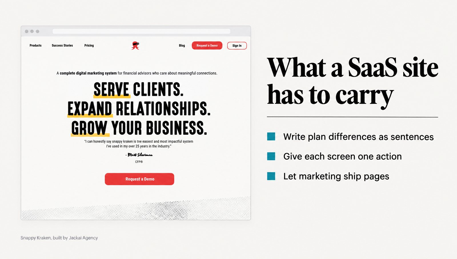
Before the redesign, the Snappy Kraken homepage led with features and never said who it was for. The main action appeared 4 times in 4 different phrasings, so it read like 4 different choices. After the rebuild, the advisor is named in the first screen, and one action repeats in the same words all the way down the page.
Product pages follow the same rule: write them for the buyer’s decision, not the feature list. At Advisor Websites, each acquisition page was built around what an advisor checks before buying: compliance, how far a site can be personalized, search performance, CRM integration and the template library. A feature list says what the product has. A page built on those checks says why it fits this buyer.
Looks still count in B2B SaaS website design, and they count fast. Lindgaard and colleagues (2006) found people rate a homepage’s visual appeal within 50 milliseconds, and those ratings closely matched the ones given at 500 milliseconds. In a study of 2,684 people judging live websites, Fogg and colleagues (2003) found the design look came up in 46.1% of comments about credibility.
From my own projects, these are the parts every SaaS product page needs:
- A named reader in the first screen. “For firms with 3 to 30 advisors” tells a visitor more than a capability headline.
- Real screenshots. The actual product with realistic data, not a drawn mockup.
- One proof point near the claim. A named customer and one number say more than a wall of logos.
- The compliance answer. Buyers in regulated fields look for it early, so put it on the page, not in a PDF behind a form.
Can your marketing team edit the site without a developer?
On my projects, services firms rarely needed this. SaaS companies almost always did. A software company ships features, runs webinars and changes plans, and each of those needs a page, often within days. If every page waits for a developer, the site falls behind the product, which is why I treat editing as part of B2B SaaS website design rather than a handover detail.
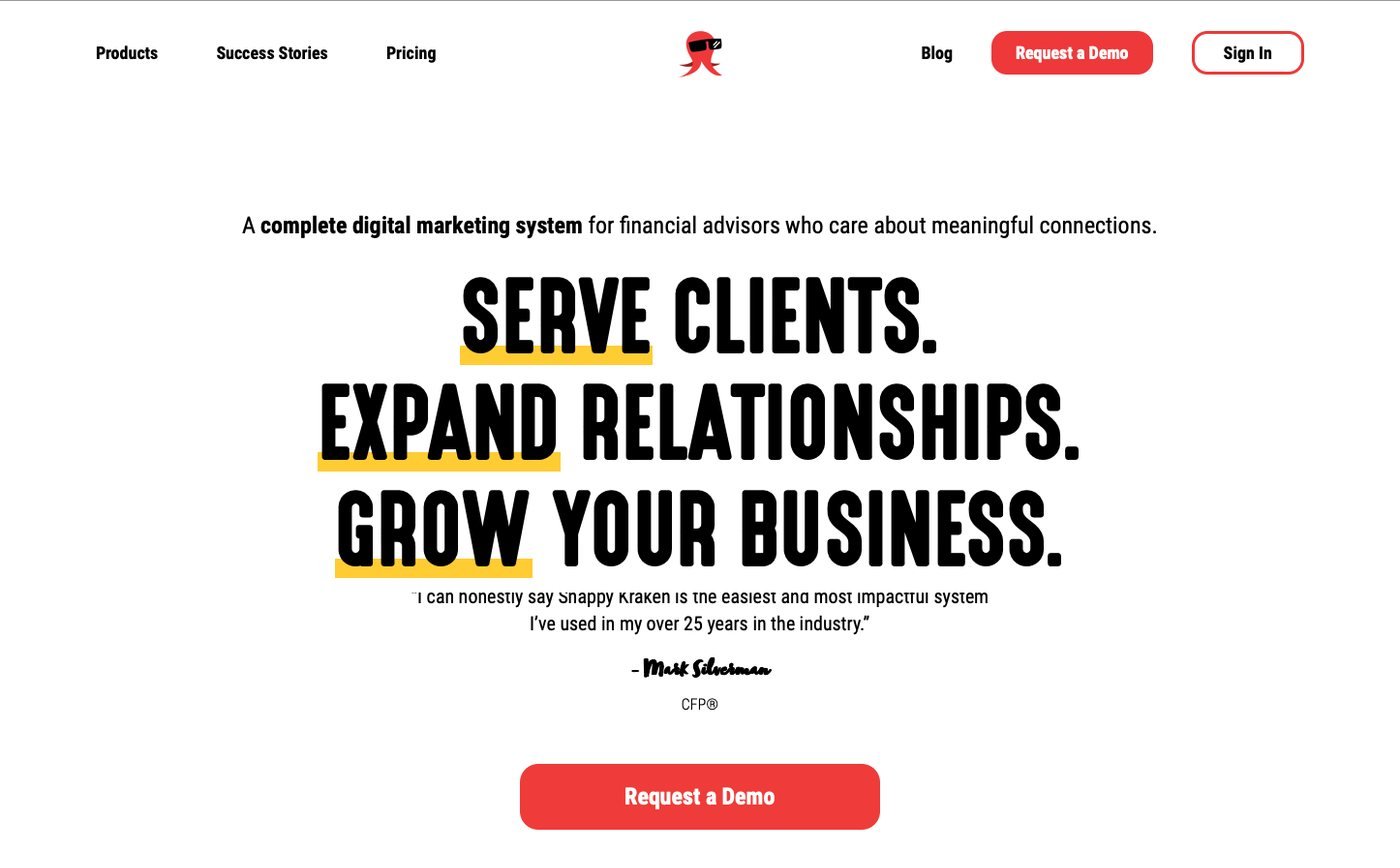
At Snappy Kraken, marketing owned a roadmap larger than the team could build. So anything I shipped had to be editable by the in-house team, with no designer in the loop. I took 6 responsive pages from Figma to production on HubSpot CMS in 3 weeks, using HubL templates and a bound design system. Afterwards, the marketing team edits and ships pages inside that system on its own.
On Snappy Kraken, the work influenced 7 figures of annual recurring revenue (ARR), a figure that is influenced, not attributed, because sales, pricing and product all moved in the same period. I can’t separate my pages from those changes, and I won’t pretend to. The Snappy Kraken HubSpot CMS case study shows the before and after screens.
A site marketing can run alone usually comes down to four things:
- Modules, not one-off pages. Hero, proof block, pricing table, replay embed and form, so new pages come from parts that already match the brand.
- Locked styles. Type, color and spacing live in the theme, so a new page can’t drift off-brand.
- Templates for repeat pages. Webinar replays, new product pages, customer stories and comparisons.
- A short handover guide. Which module does which job, written for the person who builds the next page.
HubSpot CMS and WordPress can both do this. If your CRM is already HubSpot, keeping the site there removes one integration to maintain. My HubSpot CMS redesign service covers that route.
How much does B2B SaaS website design cost, and how long does it take?
These are my own prices from my price table dated 3 October 2026, in USD with CAD alongside. Every quote is fixed, with two revision rounds per phase. You own the site, the domain and the hosting, and I reply within 1 business day.
| Scope | USD | CAD |
|---|---|---|
| Custom B2B website, up to 5 pages, on HubSpot CMS | $7,000 | CA$9,700 |
| Custom B2B website, up to 5 pages, on WordPress | $6,450 | CA$8,950 |
| Custom B2B website, up to 5 pages, on Framer | from $5,375 | from CA$7,450 |
| Marketing site, 8 to 15 pages, 4 to 6 weeks | from $7,575 | from CA$10,495 |
| Landing page design, 1 to 2 weeks | from $2,750 | from CA$3,795 |
| Lead source reporting, 2 weeks | $1,875 | CA$2,600 |
For B2B SaaS website design, the marketing site row is the usual fit, because a pricing page, a demo path, product pages and a replay library run past 5 pages. The full menu is on my pricing and calculator page.
On timing, Snappy Kraken went from Figma to production in 3 weeks. The clock started from designs already in Figma, not from a blank page. In my experience, what slows a SaaS site is rarely the build. It’s plan pricing that isn’t final, product screenshots nobody has captured, and compliance copy waiting on review.
If you can only fund one piece this quarter, this is how I’d choose:
| What you see now | Where I’d start |
|---|---|
| The pricing page gets traffic but few demo requests follow | Rebuild the pricing page and the booking step |
| You run webinars and the recordings sit in email | A replay library and a replay template |
| Marketing waits on a developer for every new page | A design system and page templates on your CMS |
| Nobody can say where last month’s demos came from | Lead source reporting, before any redesign |
| All four at once | A marketing site build, 8 to 15 pages |
What would I leave out of B2B SaaS website design?
Some defaults in B2B SaaS website design look professional and still cost demos. These are the ones I remove first.
- A “Most Popular” badge with no reason. If the middle plan suits most buyers, say who it suits and why. A badge gives the committee nothing to repeat.
- A booking form that interrogates. Budget, timeline, headcount and tech stack before a time slot appears. Ask those on the call.
- Registration links that outlive the event. Once a session airs, the link in every old invite should open the replay, not a sign-up form.
- Product pages named after internal modules. Buyers search for the job they need done, not your team’s feature names.
- A launch without source tracking. If the first month of demos arrives untagged, you lose the baseline that tells you whether the redesign worked.
Before you brief anyone, run this 20-minute check on your own site:
- Open your pricing page on a phone and time how long it takes to learn what changes between plans.
- Click your demo request button, count the fields, and read what the confirmation page says happens next.
- Open a webinar invite from three months ago and follow its link.
- Open two of your product pages and check whether the first screen names who each one is for.
- Pull last month’s demos from the CRM and count how many carry a source.
Want a second pair of eyes on your pricing page and demo path?
The recordings at Advisor Websites already existed. At Snappy Kraken, the product was never the problem. In both cases the gap sat on a handful of pages: the price, the demo request, and replays that expired in an inbox. That’s where I start most B2B SaaS website design projects, and it’s probably where I’d start on yours.
On a 30-minute call I measure your starting numbers first: mobile conversion rate, AI-referred traffic and lead count. You leave with those numbers whether or not you hire me. Book a call with Joshua and bring the page you’re least sure about.
Sources
Peer-reviewed research
- Chernev, A., Böckenholt, U., and Goodman, J. (2015). Choice overload: A conceptual review and meta-analysis. Journal of Consumer Psychology, 25(2), 333-358.
- Fogg, B. J., Soohoo, C., Danielson, D. R., Marable, L., Stanford, J., and Tauber, E. R. (2003). How do users evaluate the credibility of Web sites? Proceedings of the 2003 Conference on Designing for User Experiences (DUX ’03), 1-15.
- Foubert, B., and Gijsbrechts, E. (2016). Try it, you’ll like it, or will you? The perils of early free-trial promotions for high-tech service adoption. Marketing Science, 35(5), 810-826.
- Iyengar, S. S., and Lepper, M. R. (2000). When choice is demotivating: Can one desire too much of a good thing? Journal of Personality and Social Psychology, 79(6), 995-1006.
- Johnston, W. J., and Bonoma, T. V. (1981). The buying center: Structure and interaction patterns. Journal of Marketing, 45(3), 143-156.
- Lindgaard, G., Fernandes, G., Dudek, C., and Brown, J. (2006). Attention web designers: You have 50 milliseconds to make a good first impression! Behaviour and Information Technology, 25(2), 115-126.
- Pirolli, P., and Card, S. (1999). Information foraging. Psychological Review, 106(4), 643-675.
- Seckler, M., Heinz, S., Bargas-Avila, J. A., Opwis, K., and Tuch, A. N. (2014). Designing usable web forms: Empirical evaluation of web form improvement guidelines. Proceedings of the SIGCHI Conference on Human Factors in Computing Systems (CHI ’14), 1275-1284.
- Simonson, I. (1989). Choice based on reasons: The case of attraction and compromise effects. Journal of Consumer Research, 16(2), 158-174.