6 Best B2B Website Examples in Vancouver: 2026 Field Guide
Six Vancouver-area B2B homepages, Unbounce, Clio, Visier, Procurify, Absolute Security and Svante, scored on six first-screen checks, with a peer-reviewed study behind each lesson and a calculator for your own homepage.
 Joshua Jackai
18 min read
Published 22 October 2026 · Last updated and fact-checked 22 October 2026
Short answer: Unbounce and Clio scored highest, at 5 of 6, on my first-screen review of six Vancouver-area B2B sites. Visual appeal can be judged within 50 milliseconds (Lindgaard and colleagues, 2006), so what a homepage shows in its first 900 pixels sets most of the first impression. Score your own homepage with the same six checks.
On 22 October 2026 I searched “best b2b website examples” the way a Canadian marketing lead would. The results were global or American roundups, mostly of ecommerce stores and agency portfolios, and none was built around companies a Vancouver buyer could look up on a map. So I did the work another way. I picked six B2B companies whose own pages give a Vancouver or Burnaby address, opened each homepage in Chrome at 1440 by 900 pixels, and wrote down what a first-time visitor sees before scrolling. Then I scored all six on the same six yes or no checks and tied each lesson to a peer-reviewed study.
Disclosure: I sell web design, so I benefit if you decide your own homepage needs work. I have no access to the analytics of any of these companies, so this guide says nothing about how well their sites convert. It describes what is visible on one visit, and homepages change, so each screen is dated. Every company figure quoted here is the company’s own claim, labelled as that.
In this guide
Key takeaways
- Two sites scored 5 of 6 on my checks: Unbounce, which puts two review badges (4.5 from 256 reviews and 4.4 from 359 reviews) next to its main button, and Clio, whose Canadian page carries a CA country switch.
- Visier states its promise in one sentence and shows the product answering a real question, which earns it 4 of 6.
- Procurify and Absolute Security both scored 3 of 6, for different reasons: a photograph behind the headline on one, and a cookie panel plus a chat widget over the hero on the other.
- Svante scored 2 of 6, because its headline names a category and not a product, though its first screen has the fewest choices of the six.
- High visual complexity has a negative effect on intention to use a website, and the effect runs through the first impression (Crutzen and colleagues, 2012).
- Every site repeats the same primary action in the header and the hero, and I count that as a check, not a coincidence.
| Rank | Site (HQ per its own page) | Score | Best for | Skip |
|---|---|---|---|---|
| 1 | Unbounce (Vancouver) | 5 of 6 | One action with proof beside it | The feature icon row competes with the button |
| 2 | Clio, Canadian page (Vancouver) | 5 of 6 | Telling Canadian buyers they are in the right place | The cookie bar covering the lower first screen |
| 3 | Visier (Vancouver) | 4 of 6 | One clear promise, with the product in use | Proof that sits well below the first screen |
| 4 | Procurify (Vancouver) | 3 of 6 | Outcome numbers and a low-commitment second action | A promo bar above the header and a photo behind the headline |
| 5 | Absolute Security (Vancouver) | 3 of 6 | Sales phone and email in the header | Two overlays on the hero at load |
| 6 | Svante (Burnaby) | 2 of 6 | A first screen with very few choices | A headline that does not say what the product does |
How I scored the six sites: six checks on one screen
Every site got the same six yes or no checks on its first screen, which is the part a visitor sees before scrolling. The checks are my own rubric, not a published standard, so read the scores as a consistent way to compare six pages and never as a measure of revenue.
The six checks, in the order I ask them:
- Promise: does the headline say what the product does, in words a buyer would use?
- Action: is one primary action repeated in the header and the hero?
- Proof: is there evidence, such as a rating, a customer count or a result, before the first scroll?
- Product: does the screen show the product or an outcome, not a decorative image?
- Local: does it tell a Canadian buyer, in the first screen, that Canada was considered?
- Clear: is the hero free of overlays at load, so nothing covers the headline or the buttons?
I captured each page once, at 1440 by 900 pixels, on 22 October 2026. I dismissed no overlay on the Canadian Clio page or on the Absolute page, because a visitor sees those overlays too. A one-visit capture can miss a variant, and some pages show different banners by country or time. On the Clio United States page I saw a pop-up that offered to switch me to the Canadian site, so I scored the Canadian page, which is the one a Vancouver buyer lands on.
1. Unbounce: best for one action with proof beside it
Unbounce puts one blue button in the header and one in the hero, both reading “Start building for free”, with a note that no credit card is required. Two review badges sit above the headline. It scored 5 of 6, missing only the Canadian signal, and its first screen is the clearest model here for a self-serve B2B product.
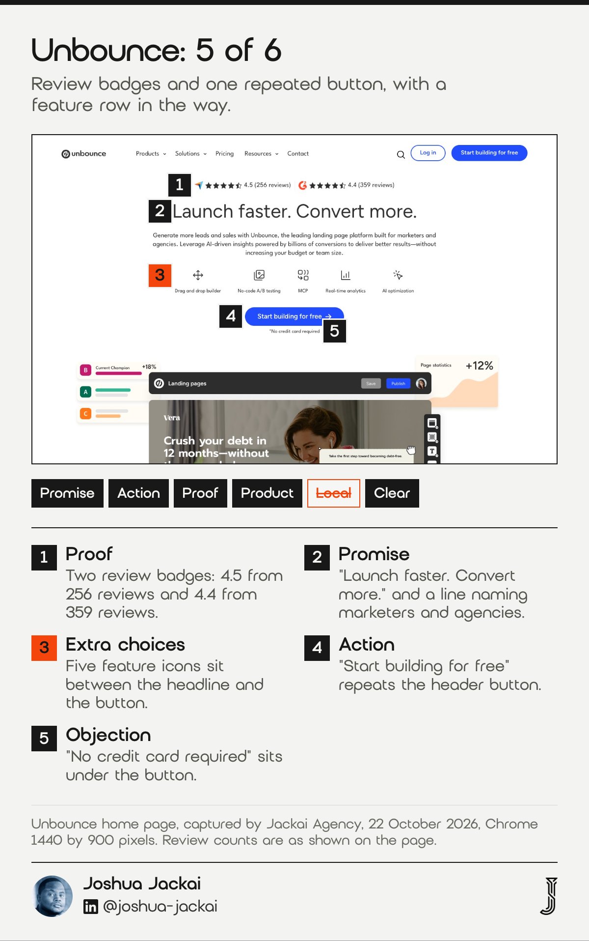
- HQ: Vancouver, from its contact page
- Headline: “Launch faster. Convert more.”
- Primary action: Start building for free, in the header and the hero
- Proof in the first screen: review badges, 4.5 from 256 reviews and 4.4 from 359 reviews
- Score: 5 of 6, missing the Canadian signal
The first thing the eye meets is the proof, then a two-word promise, then a paragraph that names the buyer: marketers and agencies. A row of five small icons follows (drag and drop builder, no-code A/B testing, MCP, real-time analytics, AI optimization), and then the button. That order matters for a B2B buyer who has never heard of the company. The reviews answer “is this real?” before the headline asks for anything. The note “No credit card required” removes the most common objection in the same glance. Further down the page the company says it learned from over 57 million landing page conversions and shows a customer result of a 104% increase in trial start rate, both of which are Unbounce’s own claims. The weakness is the icon row, which adds five small choices between the headline and the button. Trust research gives the reason the badges matter. In e-commerce, trust is what makes buyers comfortable sharing information and acting on a vendor’s advice, and the same logic applies to a demo request.
“The reviews answer “is this real?” before the headline asks for anything,” Joshua Jackai, Vancouver web designer, wrote.
“Trust makes consumers comfortable sharing personal information, making purchases, and acting on Web vendor advice,” McKnight, Choudhury and Kacmar wrote in Information Systems Research.
2. Clio: best for telling Canadian buyers they are in the right place
Clio runs a separate Canadian page, marked by a CA country switch in the header and a banner about legal accounting built for Canadian law firms. It scored 5 of 6, losing its point on the clear check because a cookie bar covered the lower screen when I captured it.
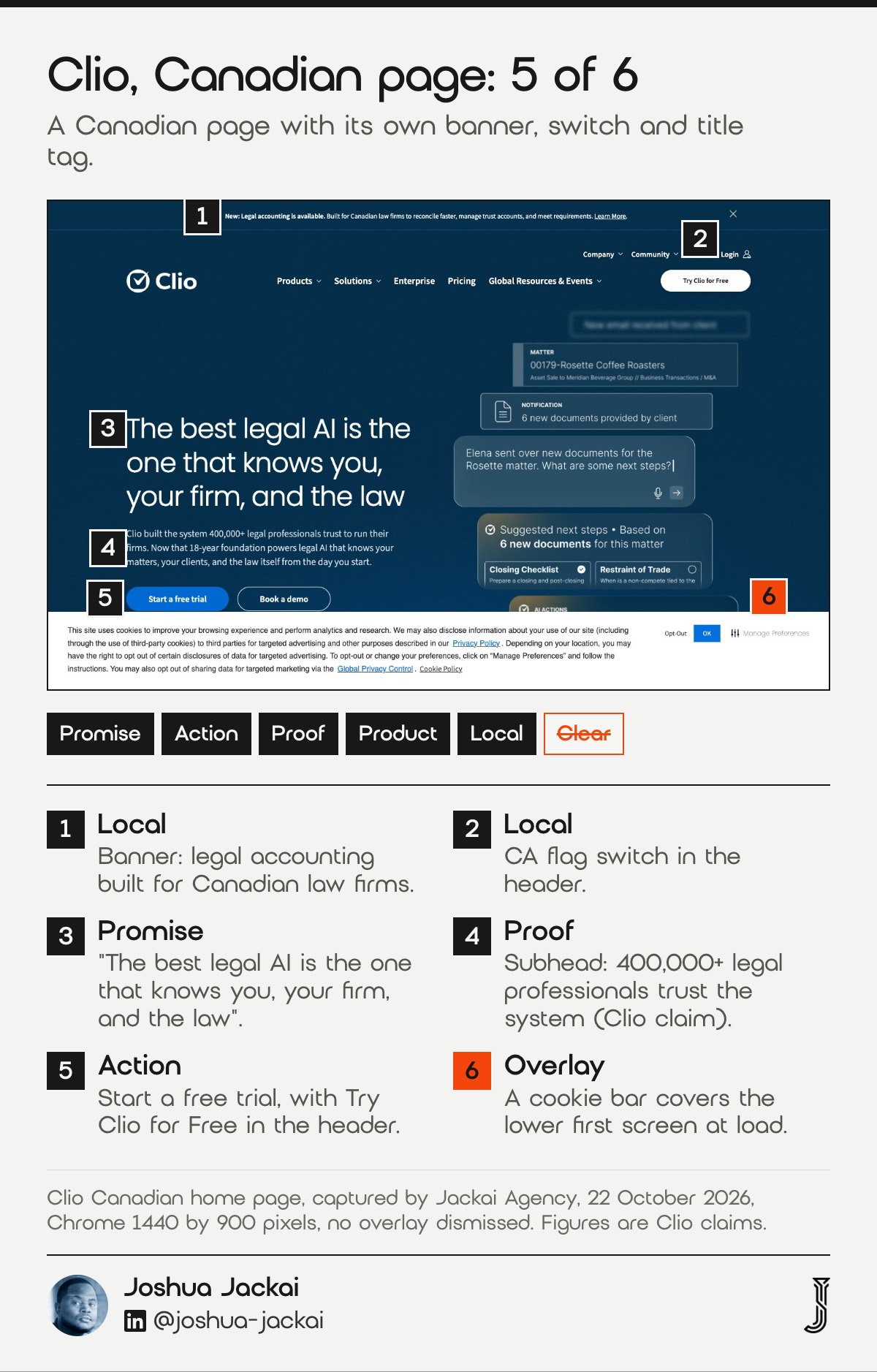
- HQ: Vancouver, from its about page
- Headline: “The best legal AI is the one that knows you, your firm, and the law”
- Primary action: Start a free trial, plus Try Clio for Free in the header
- Local signal: CA flag switch, “Canadian Legal AI Software” in the title tag
- Score: 5 of 6, missing the clear check
Most Canadian B2B sites are one global page with a Canadian phone number in the footer. Clio does the opposite. Its Canadian page has its own title tag, “Canadian Legal AI Software by a Legal Tech Leader”, and a meta description that calls it the Canadian legal AI platform. A banner above the header says the new accounting tool is built for Canadian law firms and mentions trust accounts. On its United States page, a pop-up told me it looked like I was in Canada and offered a switch, which is a polite way to send a buyer to the right version. The subhead gives a number: 400,000+ legal professionals trust the system, a claim from Clio. Further down the page it lists a 4.7 out of 5 rating from 12,000+ reviews and 100+ law society and bar approvals worldwide. What I would skip is the cookie bar, which on my capture covered the lower part of the first screen. Research on cultural adaptation is about other countries, so I use it only to show that local fit is a studied variable, not to claim a Canadian preference.
“In general, significant differences were found in the depiction of cultural values on the websites examined,” Karaçay-Aydin, Akben-Selçuk and Aydin-Altinoklar wrote in the International Business Research in 2009, about American and Turkish sites.
3. Visier: best for one clear promise, with the product in use
Visier opens with a sentence a buyer can repeat: give AI a complete understanding of your workforce, securely. Beside it, a panel shows the product answering a hiring question with three options, one marked Recommended. It scored 4 of 6, losing points for proof sitting below the first screen and for having no Canadian signal.
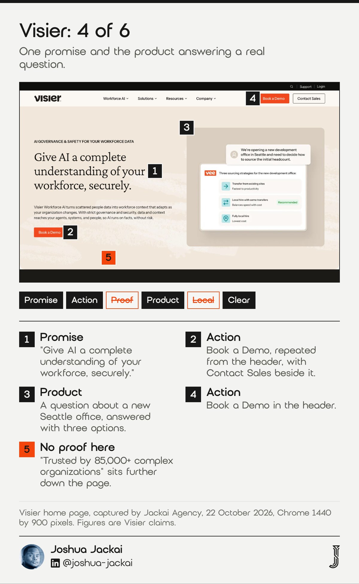
- HQ: Vancouver, from its contact page
- Headline: “Give AI a complete understanding of your workforce, securely.”
- Primary action: Book a Demo, in the header and the hero, plus Contact Sales
- Product in use: a question about opening a Seattle office, with three answers
- Score: 4 of 6, missing proof and the Canadian signal
The type is a calm serif on a warm cream ground, and the page is short on decoration. The eyebrow line reads AI governance and safety for your workforce data, which names the category in the buyer’s own words, and the paragraph under it says what the product does in plain language. The product panel is the best part of the screen: a user asks how to source the first headcount for a new office, and the answer lists three strategies with a short reason beside each. That shows a result, not a feature list. The second button, Contact Sales, serves buyers who are not ready for a demo, a small choice that costs little. Proof exists, but it sits lower on the page: “Trusted by 85,000+ complex organizations“, and a customer result of $75M in estimated savings, both claims from Visier. Moving one of those into the first screen is the cheapest fix I can see. The study behind this item is the 50 millisecond one, because a first screen this clear survives a glance.
“That shows a result, not a feature list,” Joshua Jackai, Vancouver web designer, wrote.
Lindgaard, Fernandes and Dudek wrote that “visual appeal can be assessed within 50 ms, suggesting that web designers have about 50 ms to make a good first impression,” in Behaviour and Information Technology.
4. Procurify: best for outcome numbers and a second, lighter action
Procurify pairs a Book a demo button with a Take a tour button, which gives a buyer who is not ready to talk to sales something to click. Further down it lists four customer outcomes in numbers. It scored 3 of 6: the proof is not in the first screen, and a photograph sits behind the headline.
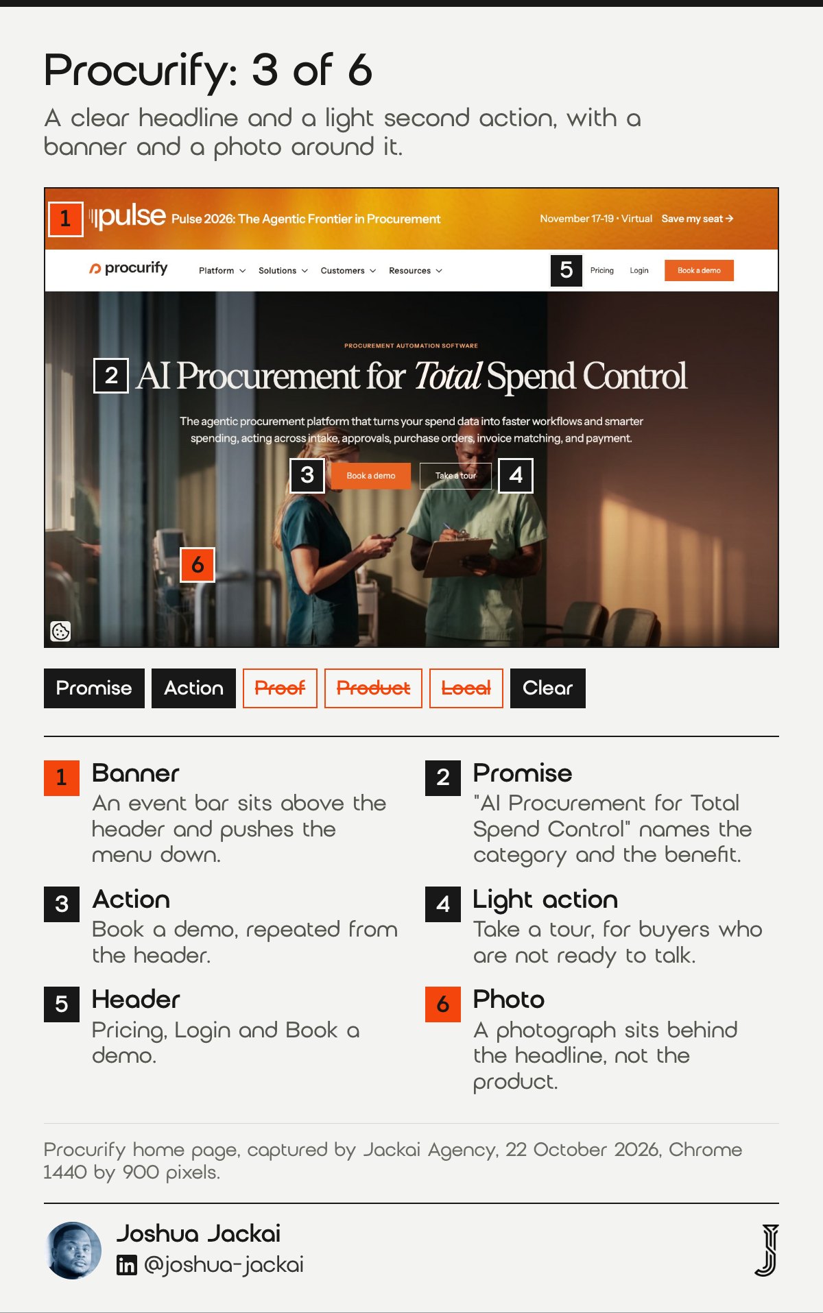
- HQ: Vancouver, from its contact page
- Headline: “AI Procurement for Total Spend Control”
- Primary action: Book a demo, in the header and the hero, plus Take a tour
- Outcome figures, lower on the page: 96% reduction in requisition time, $90K weekly savings
- Score: 3 of 6, missing proof, product and the clear check
The headline is good: it names the category and the benefit in six words, and the line under it lists the jobs the platform does, from intake to payment. The weaker parts are in the frame around it. A full-width banner for an event, Pulse 2026, November 17 to 19, sits above the header and pushes the navigation down the screen. The headline and the buttons are laid over a photograph of two healthcare workers, one holding a clipboard, so the first screen is a picture of people and not of the product. Four customer outcomes do appear on the page, 96% reduction in requisition time, $90K weekly savings, $6.6M tracked in one system and 10X faster purchasing, and all four are the company’s own figures. They would do more work in the first screen than a banner does. The research reason is visual complexity: a busy first screen costs intention to use the site.
“They would do more work in the first screen than a banner does,” Joshua Jackai, Vancouver web designer, wrote.
“The results indicate that high visual complexity has a negative effect on intention to use websites,” Crutzen, de Kruif and de Vries reported in Interaction Studies.
5. Absolute Security: best for putting a sales phone number in the header
Absolute is the only site of the six that prints a sales phone number and an email address in the header, which tells a buyer a person is reachable today. It scored 3 of 6, because two overlays, a cookie panel and an AI assistant widget, sat on top of the hero when the page loaded.
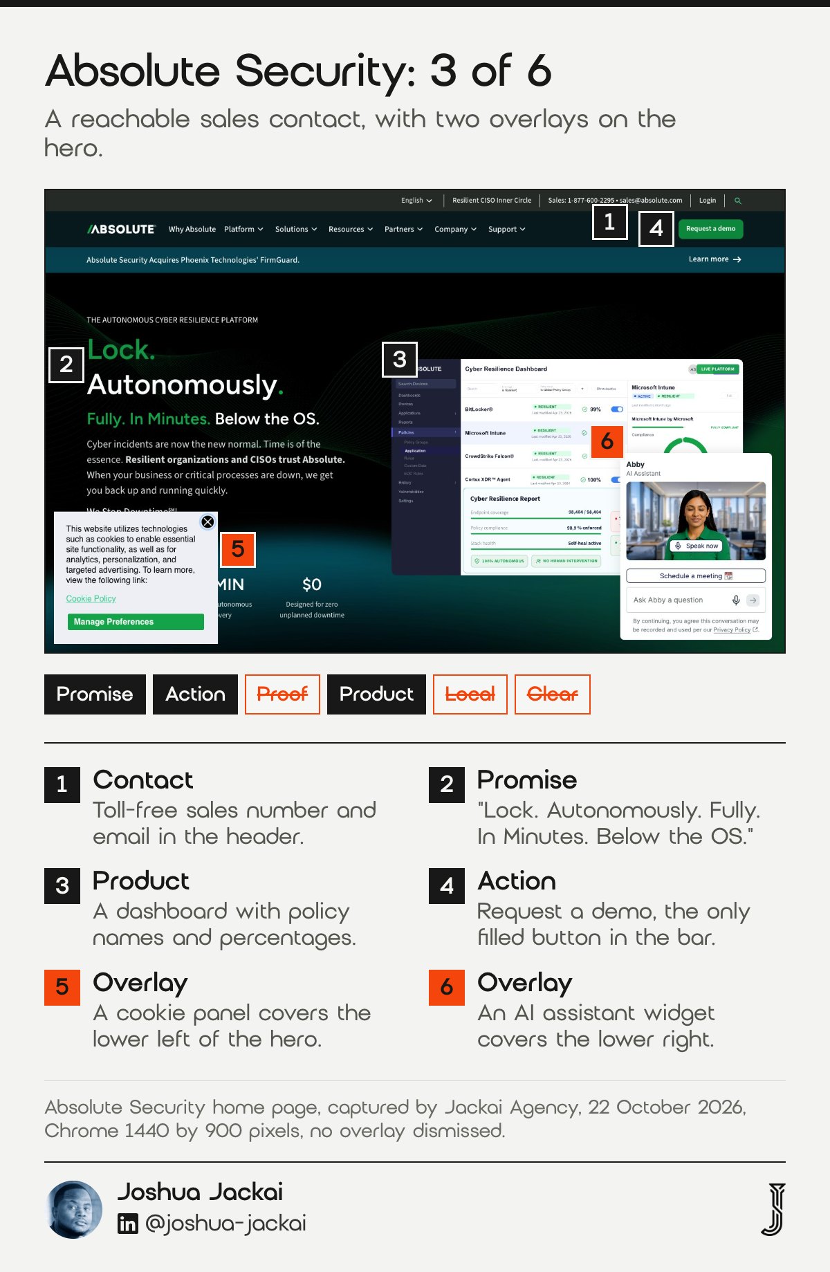
- HQ: Vancouver, from its contact page
- Headline: “Lock. Autonomously. Fully. In Minutes. Below the OS.”
- Primary action: Request a demo, a green button in the header
- Sales contact: a toll-free number and an email address in the header
- Score: 3 of 6, missing proof, the Canadian signal and the clear check
The product dashboard on the right is real interface, with percentages and policy names, so it shows what a buyer would use. The header holds seven menus, a language selector, a login link and the sales contact, which is a lot, and it works because the green button is the only filled shape in the bar. The page claims 600M+ devices firmware-embedded and 65% less downtime, both company statements that sit lower on the page. In my capture, a cookie panel covered the lower left of the hero and an assistant widget called Abby covered the lower right. Both are normal on a B2B site, and both competed with the headline for the same few hundred pixels. A visitor with less working memory or less patience feels that more than a designer does. One study varied the viewing time and found that first impression feedback is inconsistent across people, because of cognitive ability and visual complexity.
Kuric, Demcak and Krajcovic reported that “first impression feedback is rendered inconsistent by cognitive ability and visual complexity,” in Behaviour and Information Technology.
6. Svante: best for a first screen with very few choices
Svante shows a headline, two buttons and one decorative wave, and nothing else competes for attention. It scored 2 of 6, because the headline names a category, carbon management, without saying what the product does, and the first screen has no proof or product. It is the quietest page here.
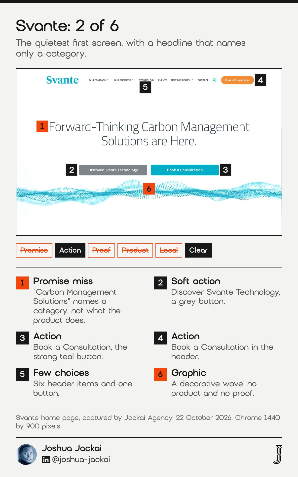
- HQ: Burnaby, from its about page
- Headline: “Forward-Thinking Carbon Management Solutions are Here.”
- Primary action: Book a Consultation, in the header and the hero
- Second action: Discover Svante Technology, a grey button
- Score: 2 of 6, missing promise, proof, product and the Canadian signal
I include Svante because its restraint is useful and its weakness is just as instructive. The header has six items and one orange button. The hero has two buttons in different colours, so the primary action is obvious: the teal Book a Consultation button is the strong one and the grey Discover button is the soft one. The page is also short, about 580 words, and its section headings, such as “Our Unique Approach to Carbon Capture” and “Trusted by Global Industry Leaders”, explain the product after the first scroll. The cost is that a buyer who lands from search sees a generic headline first. The words “carbon capture” appear in the page title and further down, not in the first sentence. Fewer options do help, in the research: shoppers offered 6 choices were more likely to buy than those offered 24 or 30. The lesson is to keep the quiet layout and to move the specific words up.
Iyengar and Lepper wrote that “people are more likely to purchase gourmet jams or chocolates” when offered 6 choices rather than 24 or 30, in the the Journal of Personality and Social Psychology.
What the six pass and miss together: proof and a Canadian signal are the gaps
Across the six homepages the same two checks fail most often. In my review, only 2 of 6 show proof in the first screen and only 1 of 6 tells a Canadian buyer that Canada was considered. Every site passes the button check, so the basics are widely copied and the evidence is not.
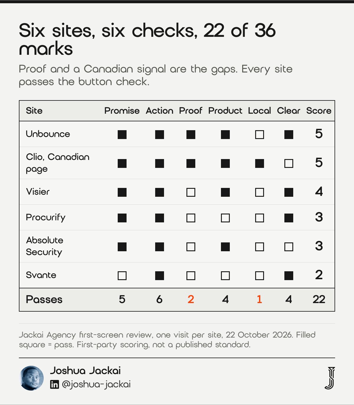
Here are the tallies from my review of 22 October 2026, out of 6 sites.
- Action: 6 of 6 repeat one primary action in the header and the hero.
- Promise: 5 of 6 state what the product does. Svante is the miss.
- Product: 4 of 6 show the product or an outcome. Procurify and Svante use a photograph or a graphic.
- Clear: 4 of 6 load without an overlay on the hero. Clio and Absolute are the misses.
- Proof: 2 of 6 show a rating, customer count or result in the first screen. Unbounce and Clio do.
- Local: 1 of 6 shows a Canadian signal in the first screen. Clio does.
The total is 22 of 36 possible marks, or 61%, which is my own count and not a benchmark. It tells you where a typical Vancouver B2B homepage leaves room. Four of the six sites hold their strongest proof lower on the page, such as Visier’s 85,000+ organizations and Procurify’s four customer outcomes, so the fix is often a move, not a rewrite. For a Canadian buyer comparing vendors from three countries, a Canadian signal in the first screen costs one line of copy and is rare enough to stand out.
Compare the six sites and filter by check
Use the filters to find which sites pass a check you care about, or to list only the highest scoring pages. Every row is one of the six homepages in this guide, and the marks come from my one-visit review on 22 October 2026. Rows are hidden, never deleted, so clear the filters to see all six.
| Site | Score | Passes | Misses |
|---|---|---|---|
| Unbounce | 5 of 6 | Promise, Action, Proof, Product, Clear | Local |
| Clio (Canadian page) | 5 of 6 | Promise, Action, Proof, Product, Local | Clear |
| Visier | 4 of 6 | Promise, Action, Product, Clear | Proof, Local |
| Procurify | 3 of 6 | Promise, Action, Clear | Proof, Product, Local |
| Absolute Security | 3 of 6 | Promise, Action, Product | Proof, Local, Clear |
| Svante | 2 of 6 | Action, Clear | Promise, Proof, Product, Local |
Score your own first screen against the six
Tick each check your own homepage passes on a first visit, before any scrolling and with no overlay dismissed. The calculator adds them up, compares the total with the six sites, and names the first check to fix. The default ticks are placeholders, so set them to match your own page before you read the result.
Frequently asked questions
These are the questions people ask Google most often about B2B website examples, answered in the same terms as the review. Each answer stands alone, so you can read only the one you need. Where a claim needs evidence I link it, and where I did not check something I say so instead of guessing.
What are some good examples of B2B websites?
Unbounce, Clio, Visier, Procurify, Absolute Security and Svante are six that a Vancouver buyer can check, each with a Vancouver or Burnaby address on its own pages. Unbounce and Clio scored highest on my six first-screen checks, at 5 of 6, and Svante scored lowest, at 2 of 6.
What makes a B2B website good?
A good B2B homepage tells a first-time visitor what the product does, repeats one primary action, shows proof, shows the product and stays clear of overlays. A 2015 study of 15,750 comments reported a weaker impact of webpage appearance, so credibility cues matter too.
Which platform is best for a B2B website?
I did not check which platform each of the six runs on, and the platform did not decide the first screen. Choose by who edits the site and how often. A WordPress build suits a team that publishes weekly, while a small brochure site can run on something lighter.
How do I build a B2B website?
Start with the first screen: one sentence that names the product and the buyer, one primary action, one proof point and a clear hero. Then plan pages for each buyer question. I build these for Canadian B2B companies on fixed quotes, described in the closing section.
Who sets this up for you
I am Joshua Jackai, founder of Jackai Agency in Vancouver. I design, build and migrate websites for Canadian B2B companies with fixed quotes. The CA$995 website audit scores your first screen on the six checks used in this guide, plus your form, tracking and lead source field, and it is credited in full if a project starts within 30 days.
Custom B2B sites start at CA$7,450. If you want to see how your homepage reads to answer engines before you change anything, start with the free AI visibility report, then read about my B2B web design in Vancouver service.
Sources
Peer reviewed
- Lindgaard, G., Fernandes, G. and Dudek, C. (2006). Attention web designers: you have 50 milliseconds to make a good first impression! Behaviour and Information Technology. doi.org/10.1080/01449290500330448
- McKnight, D. H., Choudhury, V. and Kacmar, C. (2002). Developing and validating trust measures for e-commerce: an integrative typology. Information Systems Research. doi.org/10.1287/isre.13.3.334.81
- Karaçay-Aydin, G., Akben-Selçuk, E. and Aydin-Altinoklar, A. E. (2009). Cultural variability in web content: a comparative analysis of American and Turkish websites. International Business Research. doi.org/10.5539/ibr.v3n1p97
- Crutzen, R., de Kruif, L. and de Vries, N. K. (2012). You never get a second chance to make a first impression. Interaction Studies. doi.org/10.1075/is.13.3.07cru
- Kuric, E., Demcak, P. and Krajcovic, M. (2023). Cognitive abilities and visual complexity impact first impressions in five-second testing. Behaviour and Information Technology. doi.org/10.1080/0144929x.2023.2272747
- Iyengar, S. S. and Lepper, M. R. (2000). When choice is demotivating: can one desire too much of a good thing? Journal of Personality and Social Psychology. doi.org/10.1037/0022-3514.79.6.995
- Kakal, M. and Nielek, R. (2015). What affects web credibility perception? An analysis of textual justifications. Computer Science. doi.org/10.7494/csci.2015.16.3.295
Industry, vendor and company pages (not peer reviewed)
- Unbounce. Home and contact pages, read 22 October 2026. unbounce.com
- Clio. Canadian home page and about page, read 22 October 2026. clio.com
- Visier. Home and contact pages, read 22 October 2026. visier.com
- Procurify. Home and contact pages, read 22 October 2026. procurify.com
- Absolute Security. Home and contact pages, read 22 October 2026. absolute.com
- Svante. Home and about pages, read 22 October 2026. svanteinc.com
- First-party review by Jackai Agency: six yes or no first-screen checks applied to one capture of each homepage in Chrome at 1440 by 900 pixels, 22 October 2026 (first-party scoring, not a published standard).
- Jackai Agency price table, October 2026 (first-party prices, CAD).