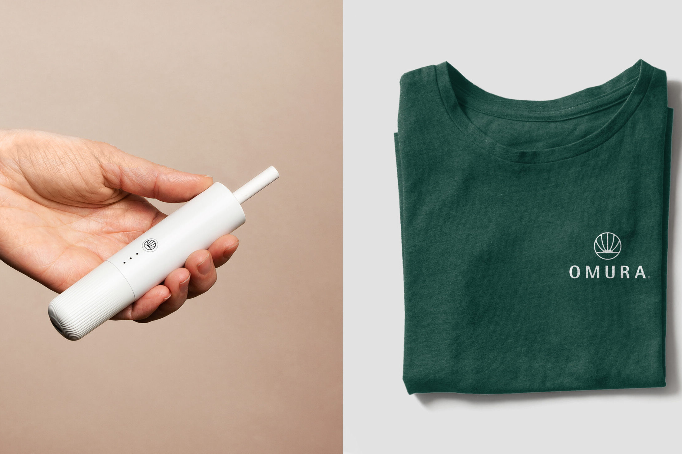
Omura Package Design
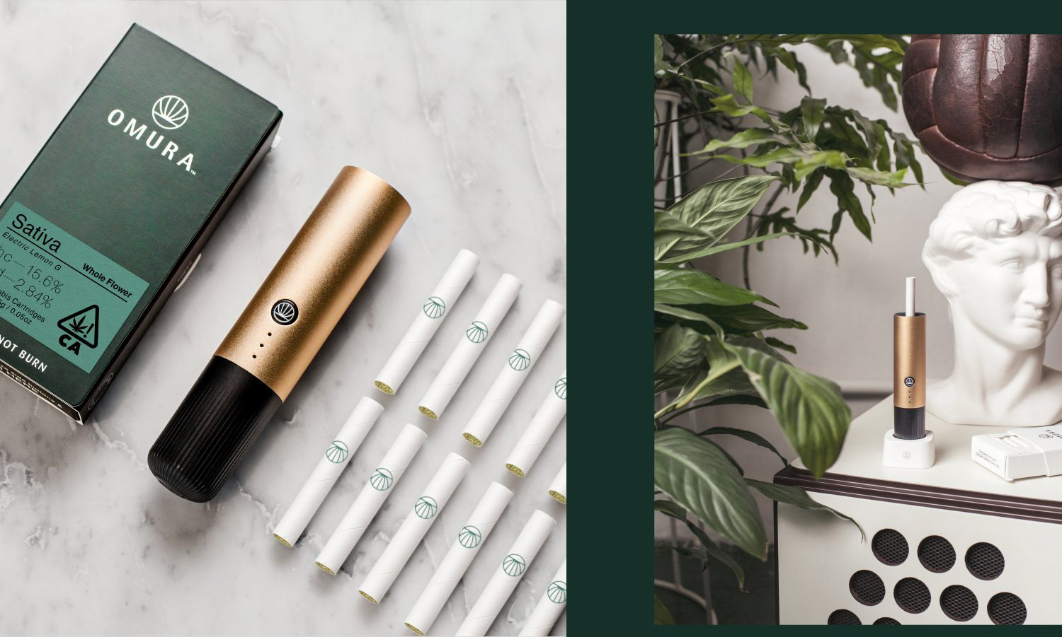
The omura package design project sits in one of the most tightly regulated consumer categories in Canada, where almost every instinct a designer brings from beauty, beverage, or wellness has to be checked at the door. Cannabis packaging here is governed by rules that limit colour, limit imagery, limit typography, and dictate the presence and size of mandatory elements. What is left after all of that is a very small room to work in. This page is about how we work in that room.
We treat omura package design as an engineering problem before it is a graphic one. Structure, substrate, and compliance geometry come first. The visual system is built into whatever space survives those decisions. That order matters, because a beautiful comp that cannot carry the standardized cannabis symbol at legal size is not a design, it is a proposal that will be rejected.
What omura package design has to solve before it solves anything else
Every cannabis pack in Canada carries a fixed set of obligations. The standardized cannabis symbol has a required minimum size and cannot be altered, recoloured, or crowded. The health warning message occupies a defined proportion of the principal display surface and comes from a rotating set of approved statements. The excise stamp is applied by the licence holder and its placement has to be planned, not improvised. These are not suggestions. They are the floor of the layout.
On an omura package design project we start by drawing the mandatory elements first, at true size, on the real dieline. Only then do we look at what is left. In our experience the remaining brandable area on a small pack is a fraction of what a designer used to unregulated categories would expect. Knowing that number on day one changes every decision after it.
The regulatory frame is the brief
Health Canada’s framework restricts appealing imagery, testimonials, lifestyle depictions, and anything that could reasonably be attractive to young people. One uniform colour is permitted on the exterior outside of the mandatory elements and a single brand element. That constraint reshapes the entire visual language available to omura package design and to every other brand in the category.
Designers who fight this usually lose time and money in revision cycles with the regulatory reviewer. Omura package design takes the opposite route and uses the constraint as the organizing idea. When you cannot use gradients, photography, or a palette, the things that carry brand meaning become proportion, structure, material, weight, and the precise cut of a letterform.
Reading the rules literally, then designing generously
We read the regulation as written rather than as summarized in industry blog posts, which drift and go stale. The primary reference for omura package design and for any cannabis packaging work is Health Canada’s own packaging and labelling guide for cannabis products, and we check the current text before every build rather than trusting a prior project’s assumptions.
That habit protects the client. Rules get amended. A pack that cleared review two years ago is not automatically a template for a pack going into review today. Treating each omura package design build as a fresh compliance read is slower at the start and much faster at the end.
Structure and dielines in the omura package design system
Structural work in omura package design is not decorative. Cannabis containers have to meet child-resistant requirements, which narrows the format options considerably. Push-and-turn closures, certified pouches, tins with locking rings, and slider boxes each carry different geometry, different tooling costs, and different consequences for the graphic layout wrapped around them.
Our approach starts with the format decision because it cascades. A tin gives you a flat lid and a curved wall. A pouch gives you a large flexible face and a header that vanishes when the pack slumps on a shelf. A folding carton gives you clean panels and an insert cavity. None of these are neutral. Each one dictates where the warning can sit legibly.
Building the dieline before the artwork
We build omura package design dielines as live, dimensioned files with fold lines, bleed, glue tabs, and safety margins called out explicitly. Artwork is placed onto that geometry rather than the reverse. It sounds obvious. In practice a great many packaging problems trace back to artwork designed flat and then forced onto a structure that was never checked against it.
Insert architecture in omura package design gets the same treatment. A carton that holds a container needs a cavity that grips it without crushing it, survives shipping, and lets the product come out cleanly in the customer’s hand. We prototype that physically. Paper behaves differently from a screen preview, and no amount of rendering tells you how a fold actually breaks.
Tolerance, not perfection
Converters work within tolerances. Registration drifts. Die cuts wander by fractions. An omura package design layout that only works when everything lands perfectly will fail somewhere in the run. So we build slack into the geometry deliberately, keeping critical type away from fold zones and avoiding hairline alignments across a crease.
This is the unglamorous half of omura package design and it is the half that determines whether the finished pack looks like the file. We would rather give up a millimetre of visual tension than gamble a whole print run on a converter hitting a tolerance they never promised.
The compliance panel as a designed object
Plenty of cannabis packs treat the compliance panel as a dumping ground, and omura package design starts from a rejection of that habit. Warning text, symbol, THC and CBD content, lot number, packaging date, licence holder details, net weight, and the excise stamp all get pushed onto whichever surface nobody wanted. The result reads as noise and it degrades the whole pack.
We approach the omura package design compliance panel as a designed surface with its own hierarchy. The mandatory content cannot change, but its arrangement, its alignment grid, and the rhythm of the space around it are all within our control. A well-set compliance panel signals competence to a retailer and to a regulator at the same time.
Ordering information the customer actually needs
Potency is the single most consulted piece of data on a cannabis pack. Customers turn the container over to find it. Within the bounds the rules permit, omura package design sets that content so it can be found without hunting, and makes sure the surrounding required text does not compete with it visually.
Legibility is a compliance issue as much as a design one. Minimum type sizes are specified, and contrast has to hold. We test panels at true size in print, not zoomed on a monitor, because a 6 point requirement on screen and a 6 point reality in a customer’s hand are different experiences entirely.
Planning around the excise stamp
The provincial excise stamp is applied after the pack is printed, often by hand or by an applicator with real placement variance. It is a strip of colour and holography that you did not choose, landing on a surface you did choose. Ignoring it produces packs where the stamp bisects a logo or covers required text.
Our omura package design method treats the stamp as a fixed graphic element with a tolerance zone drawn into the dieline. We design a place for it to live. That way the applied stamp reads as part of the pack rather than as damage inflicted on it after the fact.
Typography under regulatory constraint
When imagery is restricted and colour is capped, typography carries nearly the entire brand. That is a heavy load for a typeface to bear. In omura package design the choice stops being a matter of taste and becomes a matter of engineering, because one family has to perform at warning-panel sizes and at brand-mark sizes on the same surface.
We look for families with a wide optical range, genuine small sizes that hold ink, and enough character in the display weights to feel like something. A typeface that is elegant at 48 point and mushy at 6 point is only half a solution for a category where 6 point is mandatory.
Ink gain and the small-size problem
Small type on uncoated stock fills in. Counters close, thin strokes thicken, and a face that looked crisp in the proof turns muddy on the run. On flexo work the gain is significant. Omura package design selects and, where budget allows, adjusts type with that behaviour anticipated rather than discovered.
This is one reason we push for a wet proof on the actual substrate. A digital proof lies politely. Paper tells you the truth about what your typography is going to do.
Colour when you only get one
A single permitted uniform colour is a brutal and clarifying constraint. It forces a decision most brands never have to make. In omura package design terms, that one colour has to work against the mandated yellow of the warning area and the red of the standardized symbol, both of which are loud and non-negotiable.
We choose a colour that holds its own next to those elements rather than one that pretends they are not there. Muted and desaturated choices tend to survive the collision better than saturated ones, which end up in an argument with the symbol that they cannot win.
Where finish does the work colour cannot
Since the palette is capped, omura package design shifts expressive energy into finish and substrate. Uncoated versus coated, soft-touch versus matte varnish, a blind deboss, a foil hit within the permitted brand element, the texture of the board itself. These read as quality without adding colours the rules do not allow.
Restraint here is important. Every finish adds cost and adds a way for the run to go wrong. We specify the one or two that carry the most meaning per dollar, and we leave the rest alone. The pack should feel considered, not decorated.
Substrate, sustainability, and honest material choices
Cannabis packaging has a waste problem and everyone in the category knows it. Child-resistant requirements push toward plastics and multi-layer barrier films. Product stability pushes toward opacity and moisture control. Those forces pull directly against recyclability, and pretending otherwise helps nobody.
Our omura package design position on substrate is to make the tradeoff explicit rather than to greenwash it. Where a mono-material structure can meet the barrier and child-resistance requirements, we push for it, because mixed laminates are effectively unrecyclable in most municipal streams. Where it cannot, we say so plainly to the client.
Opacity is not optional
Cannabis containers must be opaque or translucent enough that the product is not visible in a way the rules prohibit, and light degrades cannabinoids anyway. So the clear-window instinct that sells so well in food is unavailable to omura package design. That removes a common differentiation tactic and pushes the work back onto structure and surface.
We view that as useful. Windows are a shortcut. Categories that lose the shortcut tend to produce better packaging, because the pack has to earn attention on its own terms instead of borrowing the product’s appearance.
Board weight and the feel of the thing
Caliper is one of the cheapest quality signals available to omura package design. A carton that flexes in the hand undermines everything printed on it. A slightly heavier board with a tight fold and a clean cut communicates care before the customer has read a word of copy.
At the same time, over-specifying board is a real cost with no upside past a certain point. Part of the job is finding the weight where perceived quality stops climbing, and then not paying for more than that. That judgment comes from handling samples, not from a spec sheet.
The SKU and variant system
A single pack is a design. A range of packs is a system. Cannabis brands typically carry multiple strains, formats, and potency tiers, and each one needs to be distinguishable from the others while remaining unmistakably part of the same family. With colour effectively capped, the usual variant device is off the table.
So omura package design builds differentiation into the elements that remain available. Typographic weight, the position of the brand element, a structural cue, a finish change, a naming architecture that does real work. The system has to hold together when a dozen SKUs sit next to each other and still let someone find the one they came for.
Designing for SKUs that do not exist yet
Ranges expand. A system that only accommodates the launch lineup will break the first time the client adds a format. Omura package design sets the variant logic with room in it, defining rules for how a new entry gets slotted in rather than shipping a fixed set of finished layouts.
That means documenting the system, not just delivering artwork. Rules for the grid, for the brand element’s clear space, for how the compliance panel adapts across formats, for what changes and what never changes. It is closer to brand system work than to one-off packaging.
Version control across a live range
Potency values change between lots. Warning statements rotate. Licence details get updated. An omura package design file is a living document that will be edited by people who were not in the room when it was designed, sometimes under real time pressure.
Omura package design builds files that survive that. Clear layer structure, variable fields isolated, naming conventions that make sense to a stranger, and a master template that makes the correct action easier than the incorrect one. The best safeguard against a compliance error is a file that is hard to break.
Print production and handoff
Handoff is where omura package design projects quietly fail. A gorgeous file with the wrong colour space, missing bleed, unconverted spot swatches, and no printer marks costs the client days and costs the designer credibility. We treat the handoff package as a deliverable in its own right.
That means talking to the converter before the artwork is finished, not after. Their press, their tolerances, their preferred file structure, their minimum rule weights. Every printer has a list of things that go wrong on their line. Asking for that list early is free and saves an enormous amount of pain.
What ships with the artwork
A complete omura package design handoff includes the print-ready file, the dieline as a separate layer, a specification sheet naming substrate, finishes, inks, and coatings, a marked-up compliance reference showing where each mandatory element sits, and a plain-language summary a project manager can actually read.
The last item matters more than designers like to admit. The person approving the pack is often not a designer. Giving them a document they can understand is how you get a clean approval instead of a round of vague feedback.
Press checks and the last honest look
Where scale and budget support it, omura package design advocates for a press check. Colour on the actual substrate under the actual conditions is the only version of the truth that counts. Small corrections made on press are cheap. The same corrections made after a full run are not.
When a press check is not viable, a wet proof is the fallback and a hard requirement in our process for any first run. Signing off on a digital proof and hoping is a decision, and it is usually the wrong one.
Where omura package design meets the rest of the brand
The pack is one surface among several. It has to agree with the website, the trade material, the secondary carton, and everything a retailer sees. But the pack is the constrained one, and constraint should lead. We resolve the packaging system first and let the looser surfaces follow its logic.
The retail-facing half of this project, covering counter presence, staff-facing material, and how the system behaves across a store, is documented separately in the Omura Merchandising project. This page stays on the pack itself.
Why we build packaging this way
Regulated categories punish improvisation. The cost of a mistake is not an unhappy client, it is a rejected submission, a scrapped run, or a product that cannot go to market on schedule. So the omura package design process front-loads the boring parts and treats the creative decisions as the reward for having done them properly.
The rules themselves are public and worth understanding for anyone commissioning work in this space. The federal framework governing cannabis in Canada is broad, and packaging is only one part of it, but it is the part that lands on a designer’s desk with the least room to negotiate.
Work with us on packaging like this
We build packaging systems for brands operating under real constraint, in cannabis and in every other category where the rules arrive before the brief does. If your product has a compliance panel, a mandatory symbol, a child-resistant format, and about four square centimetres of freedom, that is the kind of problem this practice is built for.
You can see the full scope of our package design service and how it fits alongside identity, print, and digital work. Most engagements start with a structural and compliance read before anyone opens a drawing tool, because that read determines what the design can be.
If you have a range coming and you want the dielines, the compliance geometry, and the variant system resolved before artwork begins, book a call and bring your format constraints. That conversation is more useful than a moodboard, and it is where good omura package design work actually starts.
Related package design work