Keahi Package Design

A brief like keahi package design starts with a name that already carries heat and origin in it, and that changes what the packaging is allowed to be. Names like this do half the tonal work before a single colour is chosen. The job becomes agreement rather than invention. Build a package that sounds like the word on the front of it, and stop there.
We are a Vancouver studio that builds brand and packaging systems for wellness companies. This is how we approach warm, botanical, ritual-shaped work in the CBD category. Method and point of view, not a claim about results we are not in a position to show you.
A name with origin in it sets the temperature
Some brand names are neutral containers. You can point them anywhere. Others arrive with weather already attached, and the packaging either agrees or spends its whole life arguing with the wordmark. A name carrying warmth and place belongs in the second group.
So the opening question in keahi package design is not what the package should look like. It is what the name is already promising, and whether we intend to honour that or complicate it. Cool minimalism on a warm name reads as a mistake, even to people who could not explain why.
Honouring an origin without decorating it
A name with cultural or geographic roots deserves care rather than costume. There is a lazy version of this work where a brand borrows a visual vocabulary it has no relationship to and calls it heritage. We do not do that version.
Our approach to keahi package design is to take the feeling the name gives and express it through material, colour temperature, and restraint. Warmth is a property of paper and ink long before it is a property of imagery.
What keahi package design has to do on the bathroom shelf
The retail shelf gets all the attention in packaging conversations. For a wellness product, it is the smaller half of the story. A tincture is bought once and lived with for weeks, in a bathroom, on a nightstand, in the drawer beside the bed.
That is the environment keahi package design is really designing for. Not a lit shelf at two metres with eleven competitors flanking it. A dim room, a hand reaching in half awake, a surface with three other objects on it that the brand does not control.
Recognition by hand, not by eye
People find things in dim rooms by touch and by silhouette. That is a real design input and almost nobody treats it as one. Cap profile, bottle weight, the texture of the label under a thumb. Those carry recognition when nothing is legible.
We treat that as a legitimate keahi package design constraint. A package that is only findable when the light is good is a package that has quietly outsourced half its job to the room.
The dropper is a daily gesture
A tincture is not consumed. It is performed. Uncap, squeeze, watch the pipette fill, hold it steady, release. That happens every day, at roughly the same hour, in roughly the same spot, and repetition turns it into ritual whether the brand intends it or not.
Ritual is where keahi package design earns its keep. A cap that unthreads smoothly, a bottle weighted to sit steady, a label positioned so the hand does not cover the one number that matters. Small mechanics, repeated daily, become how the brand actually feels.
Living next to objects you did not design
A bedside table already has a lamp, a book, a glass, and a phone on it. A bathroom shelf has toothpaste. The package is joining a scene, and the scene is not curated. It is normal, cluttered, and beige.
Products that photograph beautifully on white seamless often look wrong there. So we mock up keahi package design in ugly, honest contexts early. If it holds among clutter, it will hold anywhere. The reverse is not true.
Substrate is the first argument keahi package design makes
Before anyone reads a word, they have already formed an opinion from the surface. Gloss says mass produced and easy to wipe. Uncoated says considered and slightly expensive. Neither reading is fair. Both are instant, and both happen before the eye reaches the typography.
For warm, botanical work the pull toward uncoated stock is strong and usually right. It is also the choice with the most consequences, so keahi package design has to make it with the trade-offs on the table rather than in the mood board.
What uncoated stock costs you
Uncoated paper absorbs ink. Colours sit down into the sheet and go softer, duller, and slightly lighter in value than the same file on coated stock. Fine detail gains. Dot gain is real and it flattens delicate line work.
That is not a defect. It is the character people are paying for. But keahi package design has to build the artwork for that behaviour, with heavier strokes and colours specified for how they land after absorption rather than how they glow on a display.
Durability in a wet room
Here is the tension nobody enjoys. The tactile stock everybody wants is also the stock that suffers most in a humid bathroom. Uncoated paper wicks moisture, cockles at the edges, and shows every oily fingerprint permanently.
There are honest answers. A matte laminate that keeps most of the tooth. A soft-touch varnish. A synthetic stock with an uncoated surface character. Each keeps some of the feel and gives up some. Choosing among them is keahi package design work, and it should be a conversation, not a default.
Embossing, deboss, and the quiet finishes
Uncoated stock takes a deboss beautifully. The impression holds, catches a shadow, and gives the surface something to reward a thumb with. It is a warm, quiet effect that costs less drama than foil and reads as more expensive.
Foil on a warm brand is a risk. It can pull the whole thing toward luxury cosmetics, which is a different category with a different promise. When keahi package design uses metallic, it uses it sparingly and dulls it.
Botanical illustration, and the discipline of restraint
Botanical drawing is the default visual language of wellness for a reason. It signals plant origin, it signals patience, and it does not require a photograph. It is also the single most overused device in the category, which is exactly why it needs handling.
The failure mode is decoration. A leaf placed because leaves belong on wellness packaging. That is the version keahi package design avoids, because it makes a brand look like every other brand doing the same thing for the same unexamined reason.
Illustration inside compliance limits
Imagery in this space is constrained, and the constraints differ by market. Depictions can imply things a brand is not allowed to imply. An illustration that suggests a result is a claim, whether or not it uses words. Regulators read pictures.
So keahi package design keeps botanical work descriptive rather than suggestive. Plant forms, textures, and abstractions that live as pattern. Nothing that implies an outcome. This is a line we hold early, because it is cheaper than redrawing after review.
Line weight after the paper eats it
Delicate botanical line work and uncoated stock are natural enemies. Hairlines vanish. Fine cross-hatching fills in and turns into a grey smudge that reads as a printing error rather than a technique.
The fix is drawing for the substrate from the start. Heavier minimum strokes, more separation, fewer tonal steps. Illustration built for keahi package design should be drawn knowing what the paper will do to it.
A label architecture that scales across concentrations
Nearly every tincture brand eventually ships more than one strength. Sometimes more than one format. The mistake is designing the first label as a beautiful one-off and discovering later that it does not extend.
Architecture in keahi package design means a fixed grid, defined zones, and clear rules about what changes between products and what never moves. Set that up properly and keahi package design produces the fourth product as easily as the first.
One variable, held honestly
The cleanest way to separate strengths is a single dominant variable. Usually colour. Everything else stays locked. The family reads as one brand with steps in it, and the steps are learnable in one glance.
Once a second variable moves, the family fractures. Different type sizes, different illustrations, different layouts, and now they are four brands sharing a logo. Discipline here is what keahi package design is actually selling.
Warm palettes and the tier problem
Warm palettes are lovely and they make tiering harder. The warm range is narrow. Push far enough apart to be distinguishable and the outer tiers stop feeling like they belong to the same brand. Stay close and nobody can tell them apart.
The honest solve is usually value and saturation rather than hue, plus a secondary non-colour cue for anyone who cannot rely on colour at all. Colour alone is an accessibility failure waiting to be reported.
Making the numbers unambiguous
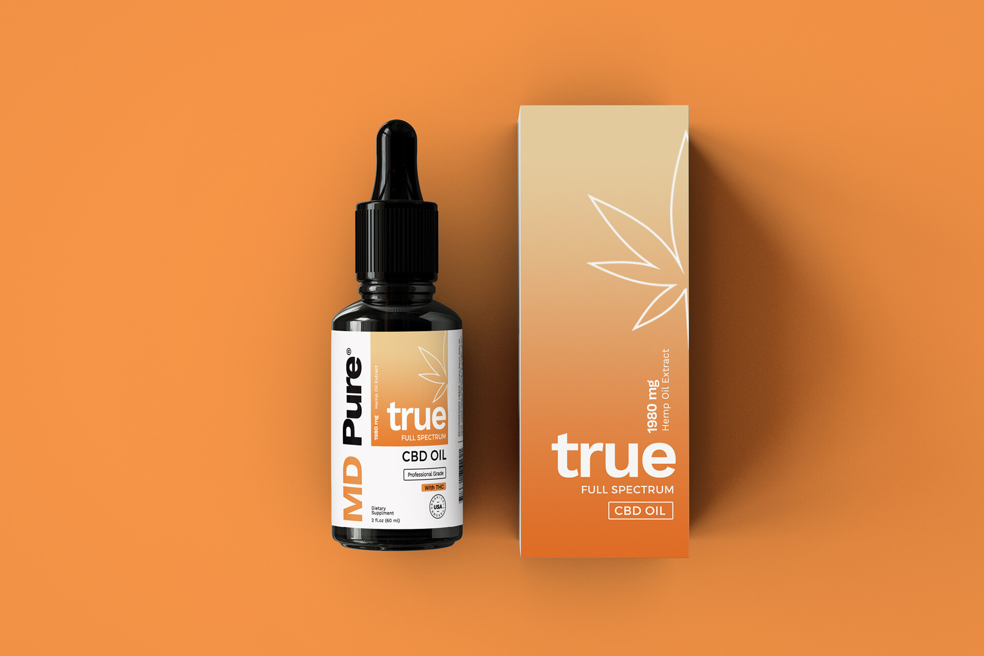
Tinctures carry a total content figure and a per-serving figure, and people confuse them constantly. That confusion is a design failure, not a customer failure. The two numbers usually look too similar and sit too close together.
We separate them structurally in keahi package design. Different zone, different treatment, different label above each. Size alone does not teach anyone what a number means. Position and structure do.
The unboxing sequence is a designed experience
Direct-to-consumer changed the first meeting. For a lot of customers the package arrives in a mailer instead of leaving a shelf, and the opening is the first physical contact with the brand. That sequence has an order, and the order is designable.
Outer mailer. Carton. Whatever surrounds the bottle. Tamper band. Cap. Each is a beat. Most brands design the first and last and let the middle happen by accident, which is where keahi package design tends to find its easiest wins.
Ritual starts at the seal
Tamper evidence is a functional requirement. It is also the first thing a person’s hands do with the product, which makes it the opening beat of the ritual whether anyone designed it or not.
A band that tears cleanly feels like the brand knew what it was doing. One that shreds and leaves adhesive behind is a small, real disappointment at the exact moment expectations peak. Keahi package design treats that seal as a designed moment.
The inside of the carton
Carton interiors are usually blank. That is a free surface most brands never spend. It costs an ink pass, and it is the one place where the brand gets a private word with someone who has already bought.
It does not need to be clever. A colour, a texture, a short honest line about use. Keahi package design uses that surface for something warm and plain rather than something performed.
Second use, and the drawer test
Most cartons are thrown out. Some are kept, and the ones that get kept are the ones that store the bottle well or simply feel too nice to bin. Keeping is a retention signal, and it is achievable at reasonable cost.
A carton that reopens without tearing, that fits the bottle snugly, that does not shout on a shelf, tends to survive. We build toward that, without pretending the outcome is guaranteed.
Rules, limits, and where our authority stops
This category sits on top of a regulatory landscape that varies by market and moves. In Canada, products inside the federal cannabis regime face prescriptive packaging and labelling rules covering panels, symbols, type sizes, colour, and imagery. That regime allows very little of what this page has described.
Wellness CBD sold outside that framework works under other rules entirely, which is why the shelf looks so varied. For anything inside the Canadian regime, the Health Canada packaging and labelling guide is the governing reference and it narrows the design space sharply.
We design, we do not advise on law. Keahi package design proceeds against constraints the client’s regulatory advisor confirms for the markets they actually sell in. We will not guess at a line, and we will not write copy that assumes a legal position nobody gave us.
Craft instead of claims
Not being able to promise anything is clarifying. It removes the shortcut. What remains is material, type, structure, and honesty about what is in the bottle, which is a better foundation than a promise nobody is allowed to make.
Brands that resist this end up with hedged copy that persuades nobody. Brands that accept it early get packaging that looks calm because it is not straining against a rule. That calm is the target of keahi package design.
Sustainability, said accurately or not at all
Warm, natural-feeling packaging invites an environmental read. Customers assume uncoated means recyclable, and often it is. Sometimes it is not, because a laminate, a foil, or an adhesive quietly compromised the stream it was supposed to enter.
So keahi package design checks the claim against the actual construction and the actual markets before anything gets printed. Recyclability depends on local facilities, not on intention. A claim that is true in one city and false in another is not a claim we will set in type.
Glass, board, and the parts that travel
Glass is heavy and recyclable. Board is light and recyclable. The dropper closure is usually mixed materials and is usually the weak link in the whole construction, which is worth knowing before a brand says anything sweeping.
Being specific beats being green. Naming which component does what is more credible than a leaf icon and a word. Keahi package design would rather be precise than reassuring.
Where the package meets the screen
Tactile brands have a specific problem online. Everything that makes them good is unavailable on a screen. Nobody can feel the deboss. Nobody can feel the tooth of the stock. The package’s best argument does not transmit.
Photography carries that burden, which means the shoot is part of keahi package design rather than something that happens after it. Raking light, real shadow, and close crops are how texture survives compression.
Thumbnails are unforgiving
A listing thumbnail is a few hundred pixels. Restrained warm design is exactly the design that struggles at that size, because low contrast and fine detail are the first things to disappear.
We test at thumbnail scale during the work, not after. If a strength cannot be identified there, keahi package design is not finished, however good the physical object feels in the hand.
One system, both surfaces
A package and a site that disagree cost a brand trust it never notices losing. The carton sets a register. If the storefront is louder or cheaper, the gap registers before anyone can name it.
We build one type scale, one colour system, and one photographic direction across both. You can see how that thinking runs through our case studies and our broader package design work.
How the work actually runs
We start with the physical facts and the boring constraints. Bottle and closure spec, converter capability, print method, markets, and whatever the regulatory advisor has confirmed about claim language. Those define the room. Everything else happens inside it.
Then information architecture, before aesthetics. What must be findable, in what order, at what distance. Only then does keahi package design start choosing materials, and by that point the choices have something to answer to.
Physical proofs, always
Screen approval is not approval. Uncoated stock, warm ink, and a deboss cannot be evaluated on a monitor. They have to be printed, folded, applied to the real bottle, and handled in ordinary light.
Nearly every revision worth making on keahi package design comes out of that first physical proof. It is the cheapest step in the process and the one clients are most often tempted to skip.
What gets handed over
Print-ready artwork on the converter’s dielines, a spec sheet covering stock, adhesive class, and finish, and the rules that let the system grow. New strengths. New formats. New markets.
A system that only fits today’s products gets rebuilt within a year. Keahi package design is meant to be built once and extended, which is a different deliverable than a set of beautiful files.
Start a keahi package design conversation
We build packaging and brand systems for wellness companies out of Vancouver. Tinctures, cartons, label architectures, tactile substrates, and the digital surfaces that have to agree with them. Warm, restrained, buildable work is what we are for.
If you have a line to build and want it to hold together from the mailer to the storefront, book a call and bring your bottle spec, your markets, and your strengths. Real constraints make keahi package design better, and they make it faster.
Related package design work